

ZoomableImage
A picture that zooms (pinch, ⌘-wheel, double-tap) and pans.
Group: Media · Kind: native
Preview
Section titled “Preview”
Platforms
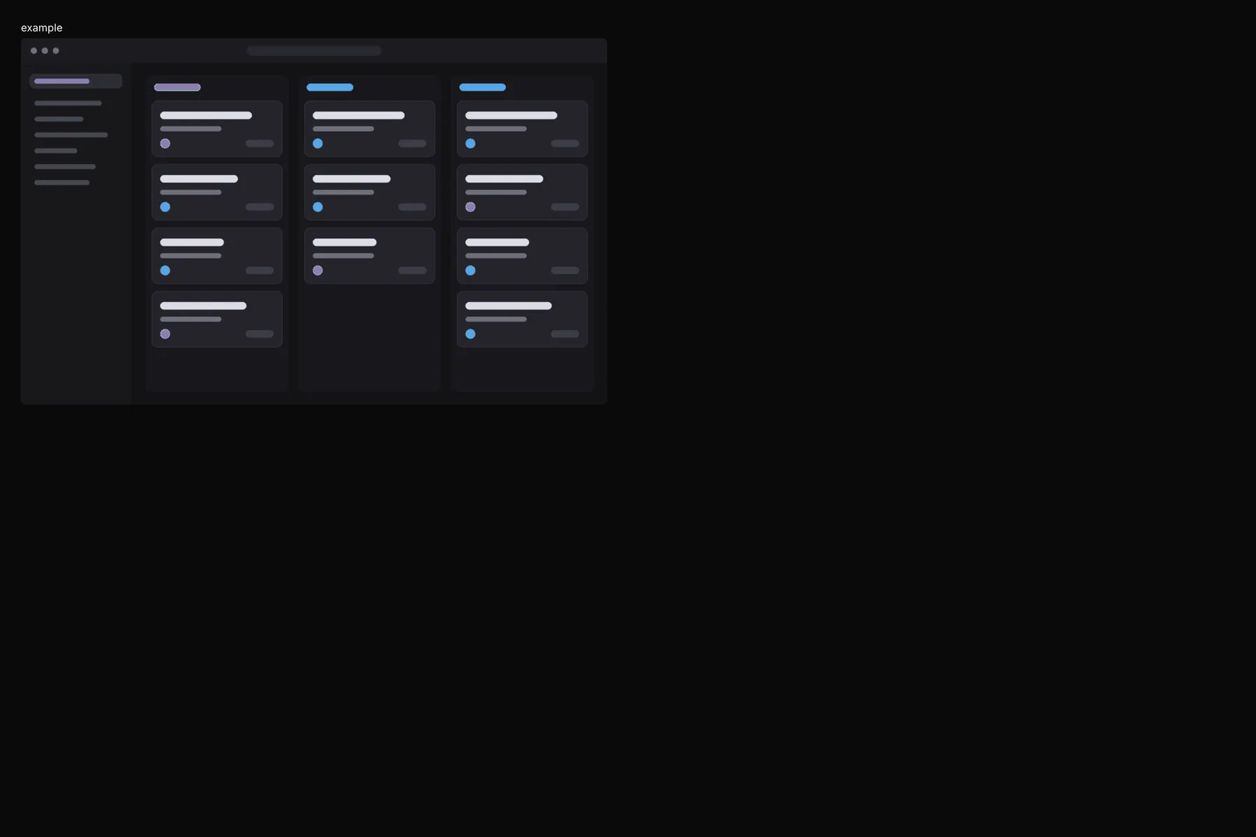
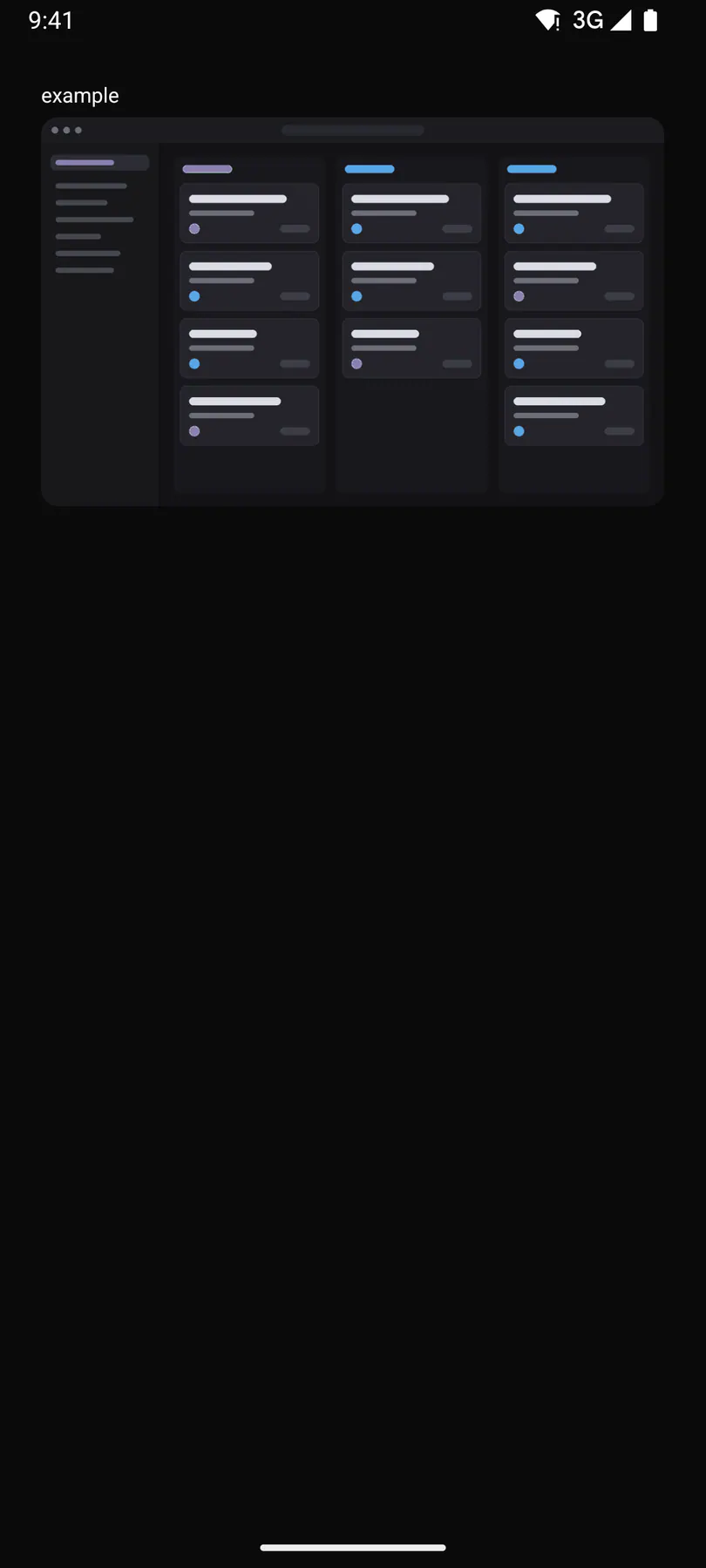
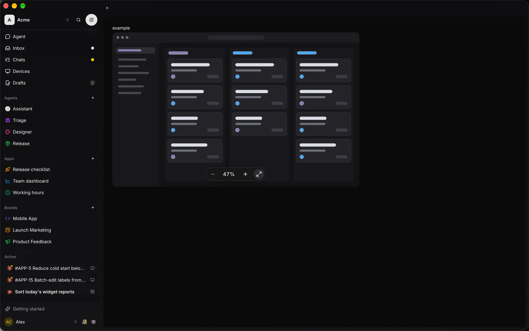
Section titled “Platforms”The same specimen painted by React, SwiftUI, Compose and gpui.

Variants
Section titled “Variants”| Prop | Type | Required | Bindable | Description |
|---|---|---|---|---|
src |
url |
yes | yes | The image URL. |
alt |
string |
yes | yes | The accessibility description. |
naturalWidth |
number |
– | – | Pixel width. |
naturalHeight |
number |
– | – | Pixel height. |
initial |
auto | fit | fitWidth | actual |
– | – | auto = fitWidth when tall. Default "auto". |
maxScale |
number |
– | – | Largest zoom. Default 8. |
controls |
auto | always | none |
– | – | The zoom pill. Default "auto". |
scale |
number |
– | yes | 1 = 100%. |
style |
style |
– | – | Extra Box styles for the viewport. |
Events
Section titled “Events”on.zoom: runs an actionon.tap: runs an action
None.
Children
Section titled “Children”none
A2UI basic mapping
Section titled “A2UI basic mapping”No basic catalog component maps here.
Built from
Section titled “Built from”A native component: every renderer paints it directly.
Accessibility
Section titled “Accessibility”Role: img
img (alt = name), focusable; the zoom pill’s buttons are named $string.zoomOut, $string.zoomIn, $string.zoomToFit (pressed while at rest) and the percent button $string.zoomLevel (its value = the percent, opening a menu whose first row is $string.zoomFit)
| Keys | Action |
|---|---|
+ = |
zoom in a step |
- |
zoom out a step |
0 |
back to the opening zoom |
1 |
100% |
Theming
Section titled “Theming”Recipe parts: ZoomableImage/root ZoomableImage/image ZoomableImage/pill ZoomableImage/zoomOut ZoomableImage/percent ZoomableImage/zoomIn ZoomableImage/divider ZoomableImage/fit
Keyed by: controls :hover :pressed :focus :disabled :checked :open :selected :invalid :dragover
Related
Section titled “Related”Image · Icon · Video · AudioPlayer · Avatar · QrCode · Carousel · Mosaic