

Table
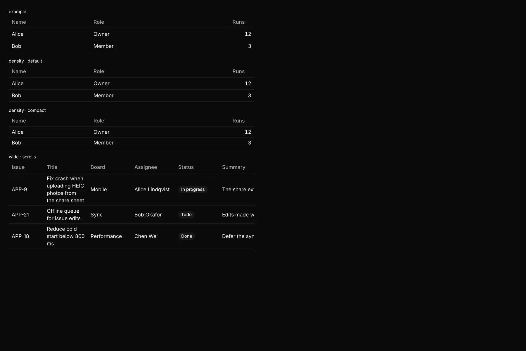
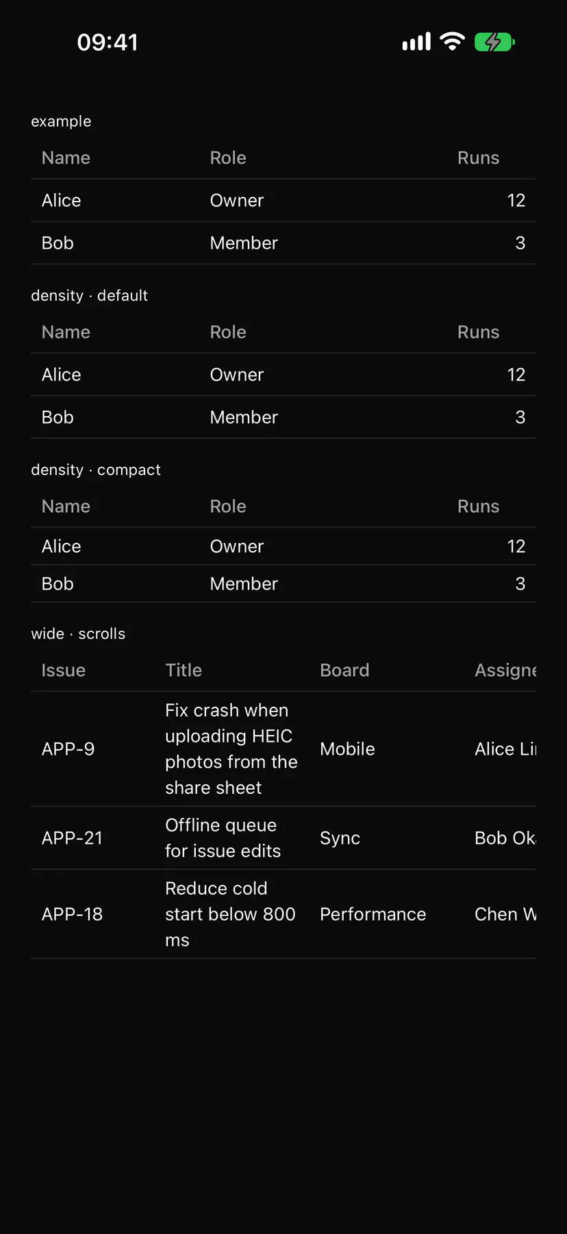
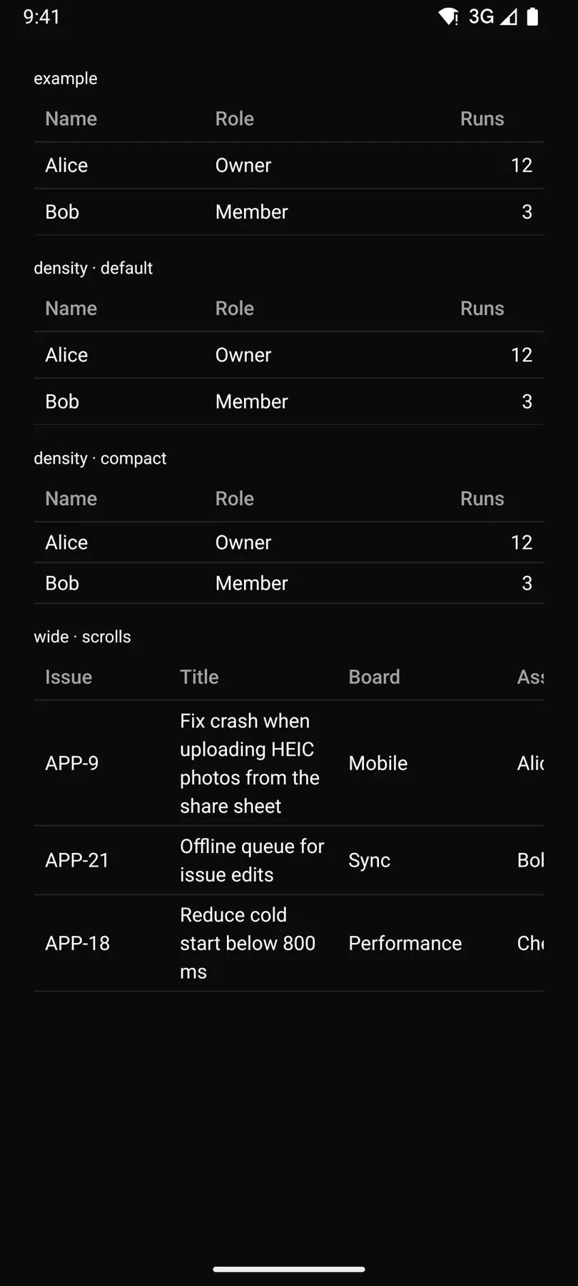
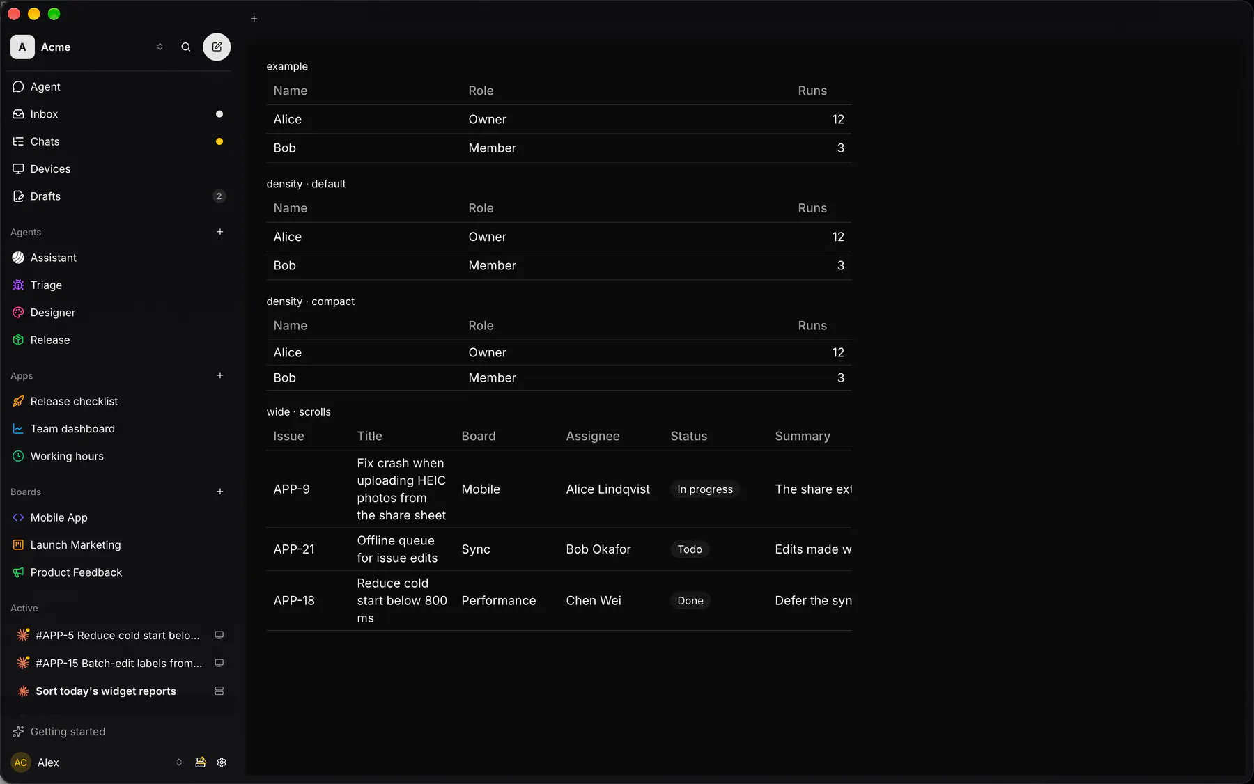
A table of typed columns: sorting, selection, widths, alignment, windowed; slot columns render components.
Group: Data · Kind: native
Preview
Section titled “Preview”example
Name
Role
Alice
Owner
12
Bob
Member
3
density · default
Name
Role
Alice
Owner
12
Bob
Member
3
density · compact
Name
Role
Alice
Owner
12
Bob
Member
3
wide · scrolls
Issue
Title
Board
Assignee
Status
Summary
Estimate
APP-9
Fix crash when uploading HEIC photos from the share sheet
Mobile
Alice Lindqvist
In progress
The share extension hands over a file URL the uploader cannot read once the sheet closes
3
APP-21
Offline queue for issue edits
Sync
Bob Okafor
Todo
Edits made without a connection are lost on relaunch
8
APP-18
Reduce cold start below 800 ms
Performance
Chen Wei
Done
Defer the sync bootstrap until after the first frame
5
Platforms
Section titled “Platforms”The same specimen painted by React, SwiftUI, Compose and gpui.
Variants
Section titled “Variants”striped
Name
Role
Alice
Owner
12
Bob
Member
3
| Prop | Type | Required | Bindable | Description |
|---|---|---|---|---|
columns |
[column] |
yes | – | The columns in order. |
rows |
[object] |
yes | yes | One object per row keyed by column key; bind it for live data. |
rowKey |
string |
– | – | The row field that identifies a row. Default "id". |
sort |
sort |
– | yes | The active sort; bound = you order rows, unbound = sorted locally. |
selectable |
none | single | multiple |
– | – | Row selection (many = a checkbox column). Default "none". |
selected |
[string] |
– | yes | The selected row keys; bind them. |
caption |
string |
– | – | A caption under the table. |
emptyText |
string |
– | – | Shown when there are no rows. Default "$string.noResults". |
striped |
boolean |
– | – | Alternates row fills. Default false. |
density |
default | compact |
– | – | Row height class. Default "default". |
stickyHeader |
boolean |
– | – | Pins the header while rows scroll. Default false. |
Events
Section titled “Events”on.sort: runs an actionon.select: runs an actionon.rowPress: runs an action
*: one component by id
Children
Section titled “Children”none
A2UI basic mapping
Section titled “A2UI basic mapping”No basic catalog component maps here.
Built from
Section titled “Built from”A native component: every renderer paints it directly.
Accessibility
Section titled “Accessibility”Role: table
table (grid when selectable): columnheader with aria-sort, row with aria-selected
| Keys | Action |
|---|---|
Enter Space on a sortable header |
cycle the sort (asc, desc) |
Space on a row checkbox |
toggle the row; on the header checkbox: select all |
Enter on a focused row |
rowPress |
| – | Tab moves through headers, checkboxes and cell controls |
Theming
Section titled “Theming”Recipe parts: Table/root Table/caption Table/header Table/headerCell Table/sortIcon Table/row Table/cell Table/checkbox Table/empty Table/body
Keyed by: selectable striped density stickyHeader align :hover :pressed :focus :disabled :checked :open :selected :invalid :dragover