

Resizable
Panels split by draggable handles; each child is one panel.
Group: Layout · Kind: native · in the lite catalog
Preview
Section titled “Preview”example
Boards
Drag the handle or use the arrow keys.
direction · vertical
Boards
Drag the handle or use the arrow keys.
Platforms
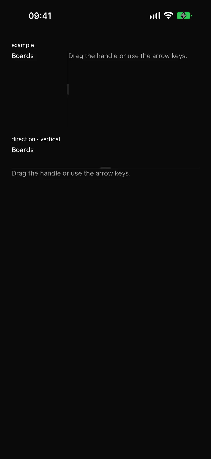
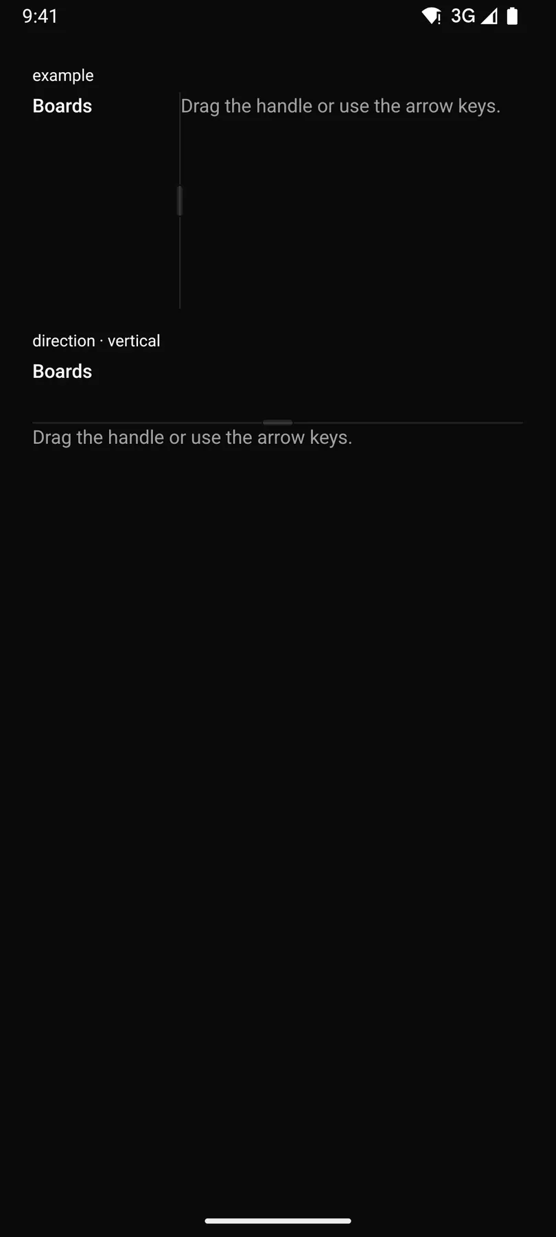
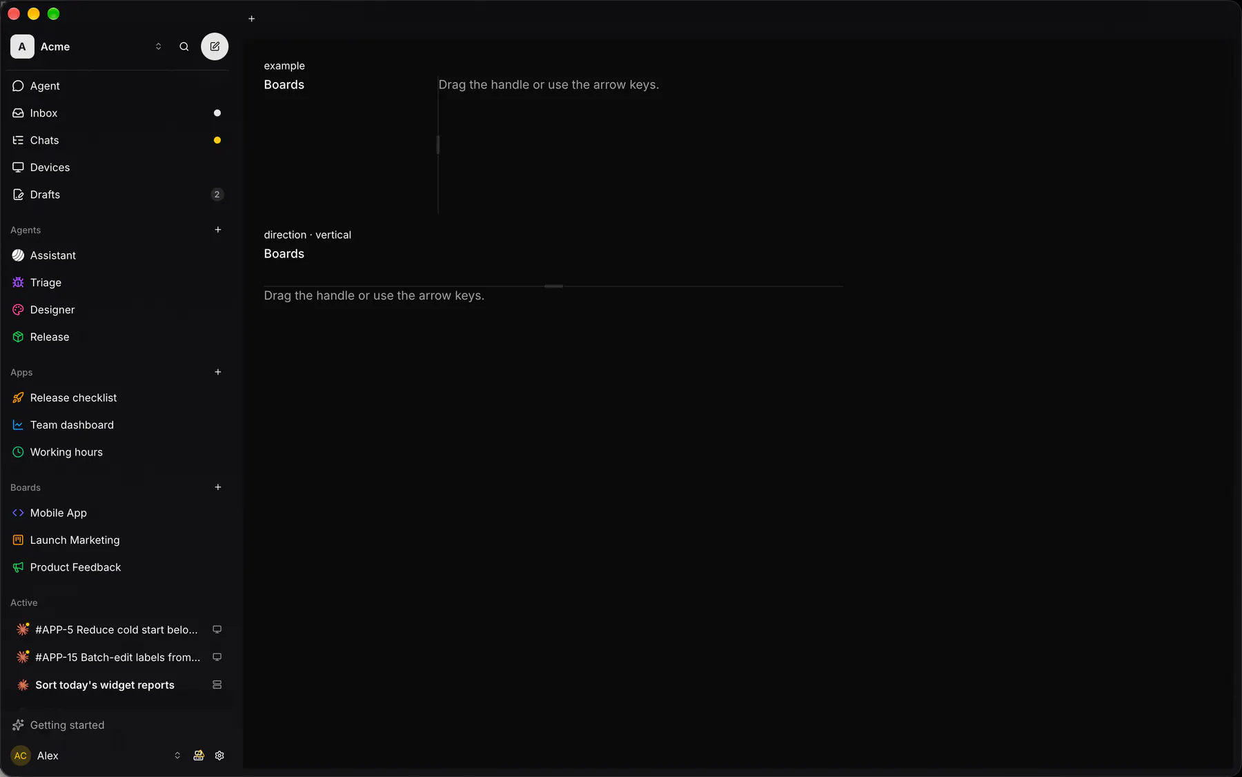
Section titled “Platforms”The same specimen painted by React, SwiftUI, Compose and gpui.

| Prop | Type | Required | Bindable | Description |
|---|---|---|---|---|
direction |
horizontal | vertical |
– | – | Side by side or stacked. Default "horizontal". Responsive: takes a per-breakpoint object. |
sizes |
[number] |
– | yes | Percent per panel; bind it. |
panels |
[panel] |
– | – | Per-panel limits, by index. |
handle |
boolean |
– | – | Draws a grip on each handle. Default false. |
style |
style |
– | – | Extra Box styles for the group box (give it a height). |
Events
Section titled “Events”on.change: runs an action
None.
Children
Section titled “Children”many
A2UI basic mapping
Section titled “A2UI basic mapping”No basic catalog component maps here.
Built from
Section titled “Built from”A native component: every renderer paints it directly.
Accessibility
Section titled “Accessibility”Role: group
group; each handle a focusable separator (aria-orientation = the line’s, valuenow = the size of the panel before it, valuemin/max = its limits, controls = that panel), named $string.resize
| Keys | Action |
|---|---|
Arrow keys on a handle |
move it on screen by 10 points (Left/Right horizontal, Up/Down vertical; rtl: ArrowRight shrinks the first panel) |
Home End |
the panel before the handle to its min / max |
Enter |
collapse or reopen a collapsible panel |
Theming
Section titled “Theming”Recipe parts: Resizable/root Resizable/panel Resizable/handle Resizable/grip
Keyed by: direction handle :hover :pressed :focus :disabled :checked :open :selected :invalid :dragover
Related
Section titled “Related”Box · Stack · Grid · Card · Separator · List · ScrollArea · Sidebar