

Segmented
ONE row or column of segments: a pill track, toggles, joined outline buttons, a bottom bar or a rail.
Group: Navigation · Kind: native · in the lite catalog
Preview
Section titled “Preview”Platforms
Section titled “Platforms”The same specimen painted by React, SwiftUI, Compose and gpui.
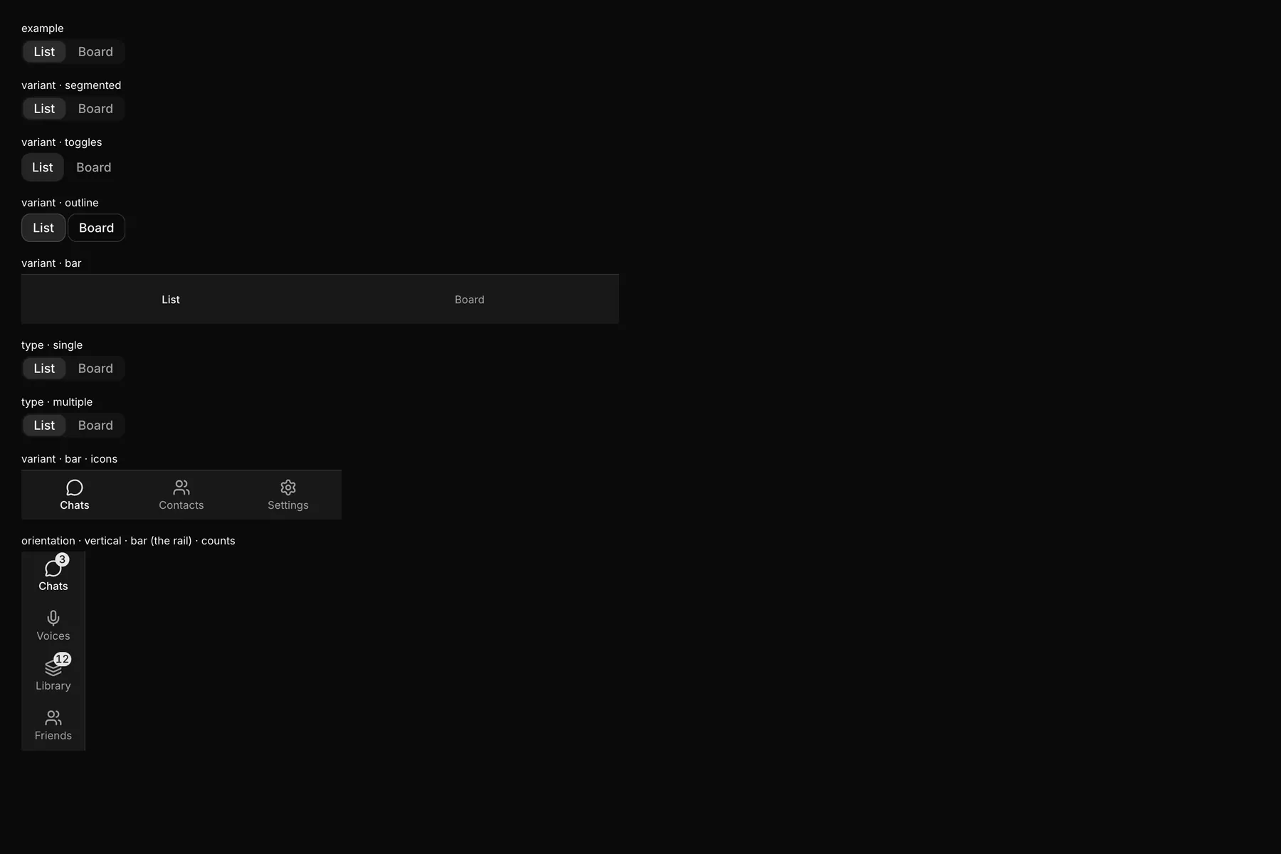
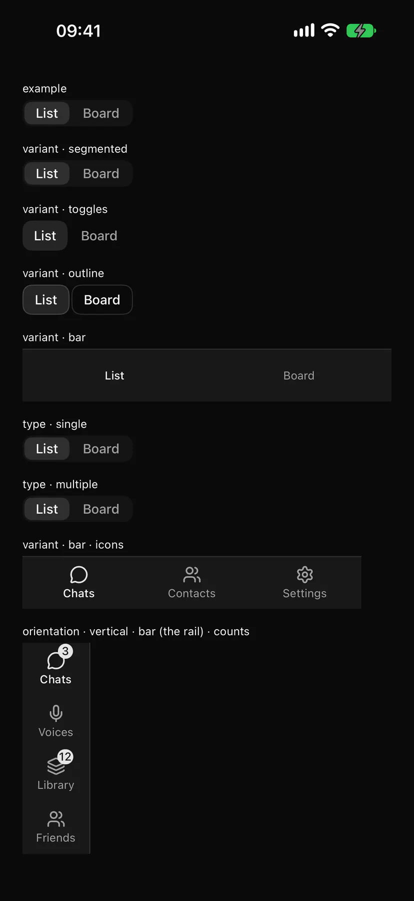
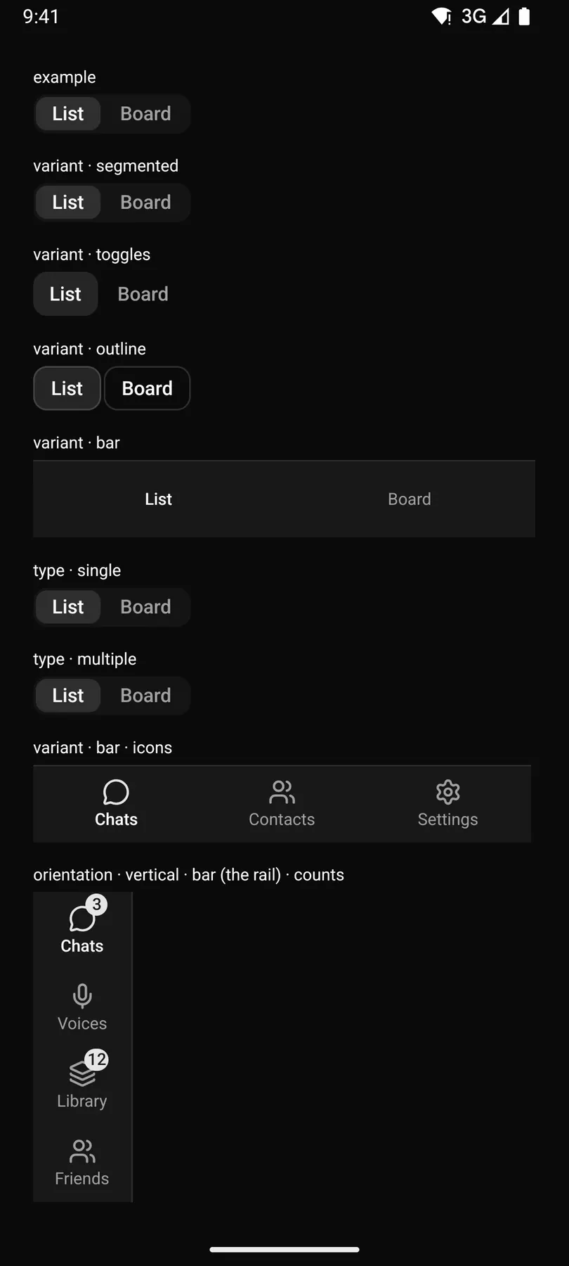
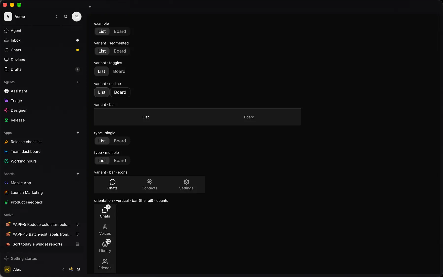
Variants
Section titled “Variants”| Prop | Type | Required | Bindable | Description |
|---|---|---|---|---|
items |
[option] |
yes | – | The segments in order. |
type |
single | multiple |
– | – | One active value or several. Default "single". |
value |
string |
– | yes | The selected value (comma-joined when multiple); bind it. |
variant |
segmented | toggles | outline | bar |
– | – | Pill track, bare toggles, joined outline buttons, or a full-width icon bar. Default "segmented". |
size |
sm | default | lg |
– | – | Control height class. Default "default". |
fill |
boolean |
– | – | Stretches the segments across the width (a bar always does). Default false. |
orientation |
horizontal | vertical |
– | – | vertical bar = a rail. Default "horizontal". |
Events
Section titled “Events”on.change: runs an action
None.
Children
Section titled “Children”none
A2UI basic mapping
Section titled “A2UI basic mapping”The basic catalog’s ChoicePicker (chips) renders as Segmented.
Built from
Section titled “Built from”A native component: every renderer paints it directly.
Accessibility
Section titled “Accessibility”Role: radiogroup
radiogroup (single) or toolbar of toggle buttons (multiple); bar = navigation of buttons, the selected one aria-current=page; orientation: vertical swaps the arrow keys to ArrowUp/ArrowDown; a count reads after the item label
| Keys | Action |
|---|---|
| – | Roving tab stop |
ArrowLeft ArrowRight (ArrowUp ArrowDown) |
move focus (wraps) |
Home End |
first/last |
Space Enter |
toggle the focused item |
Theming
Section titled “Theming”Recipe parts: Segmented/root Segmented/item Segmented/icon Segmented/label Segmented/badge
Keyed by: type variant size fill orientation :hover :pressed :focus :disabled :checked :open :selected :invalid :dragover
Related
Section titled “Related”Tabs · Accordion · Collapsible · Pagination · Breadcrumb · Outline · Stepper