

Toast
A transient notice in the toast layer; render one per notice with open bound.
Group: Overlays · Kind: native
Preview
Section titled “Preview”open
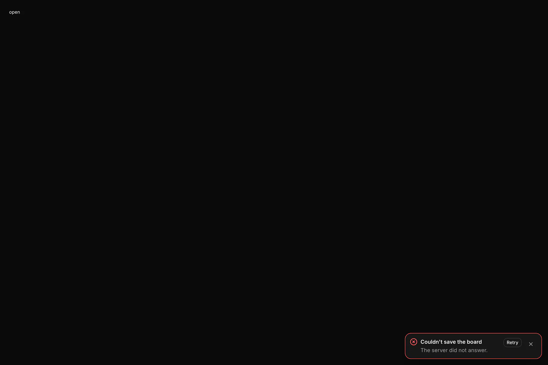
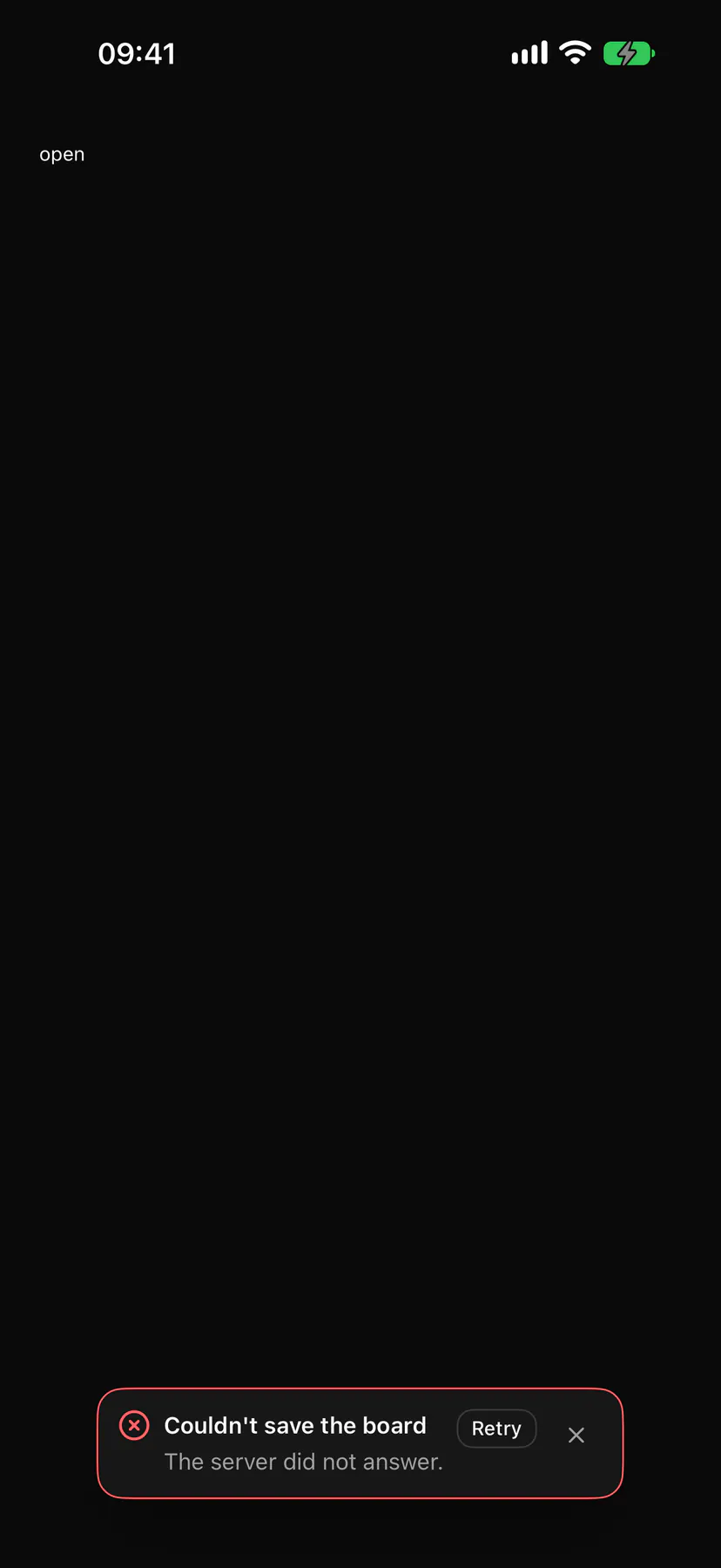
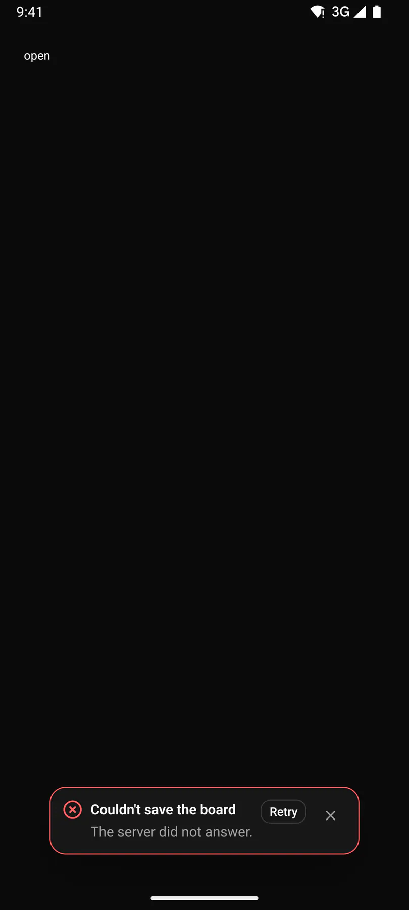
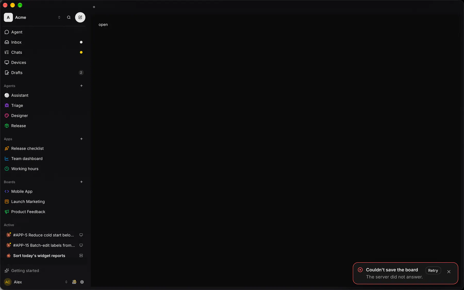
Couldn't save the boardThe server did not answer.
Platforms
Section titled “Platforms”The same specimen painted by React, SwiftUI, Compose and gpui.
| Prop | Type | Required | Bindable | Description |
|---|---|---|---|---|
title |
string |
yes | yes | The notice. |
description |
string |
– | yes | Detail under the notice. |
type |
info | success | warning | error |
– | – | Severity: icon and tone (error interrupts readers). Default "info". |
open |
boolean |
– | yes | Whether it shows; bind it so the host learns of a dismissal. Default true. |
duration |
number |
– | – | Ms until it dismisses itself; 0 = never. Default 5000. |
actionLabel |
string |
– | – | A button label; pressing it fires action. |
dismissible |
boolean |
– | – | Shows the close control. Default true. |
Events
Section titled “Events”on.dismiss: runs an actionon.action: runs an actionon.change: runs an action
None.
Children
Section titled “Children”none
A2UI basic mapping
Section titled “A2UI basic mapping”No basic catalog component maps here.
Built from
Section titled “Built from”A native component: every renderer paints it directly.
Accessibility
Section titled “Accessibility”Role: status
status (polite); alert (assertive) for type error
| Keys | Action |
|---|---|
| – | Never takes focus on appear; Tab reaches its action and close |
Escape on a focused toast |
dismiss |
| – | Hover or focus pauses the duration timer |
Theming
Section titled “Theming”Recipe parts: Toast/root Toast/icon Toast/title Toast/description Toast/action Toast/close
Keyed by: type :hover :pressed :focus :disabled :checked :open :selected :invalid :dragover
Related
Section titled “Related”Dialog · Drawer · DockCard · AlertDialog · Popover · Tooltip · Menu