

Progress
A horizontal progress bar with an optional label.
Group: Feedback · Kind: macro · in the lite catalog
Preview
Section titled “Preview”example
Upload
tone · neutral
Upload
tone · primary
Upload
tone · success
Upload
tone · warning
Upload
tone · danger
Upload
tone · info
Upload
Platforms
Section titled “Platforms”The same specimen painted by React, SwiftUI, Compose and gpui.
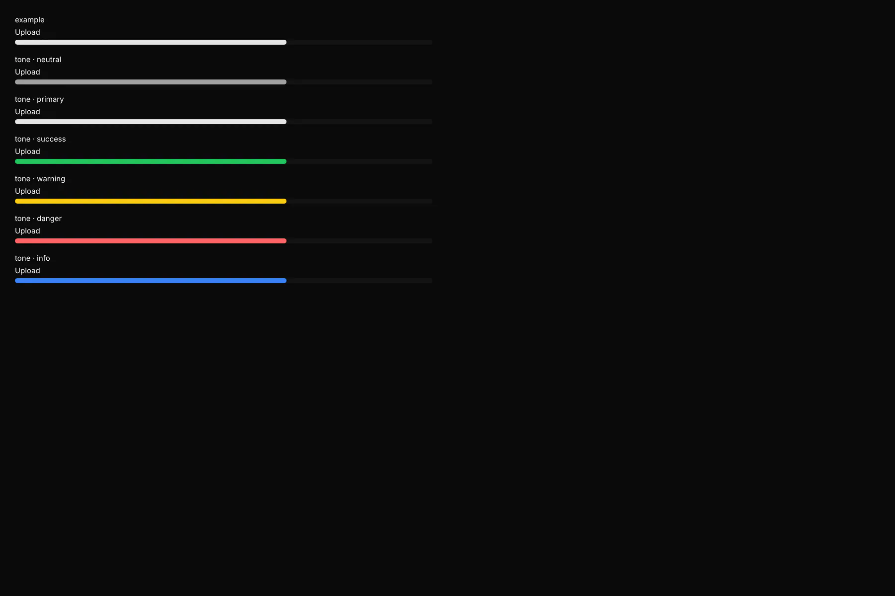
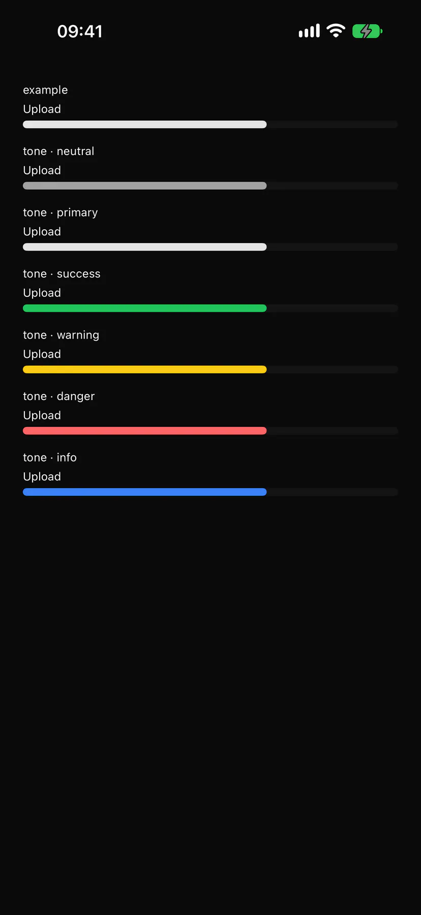
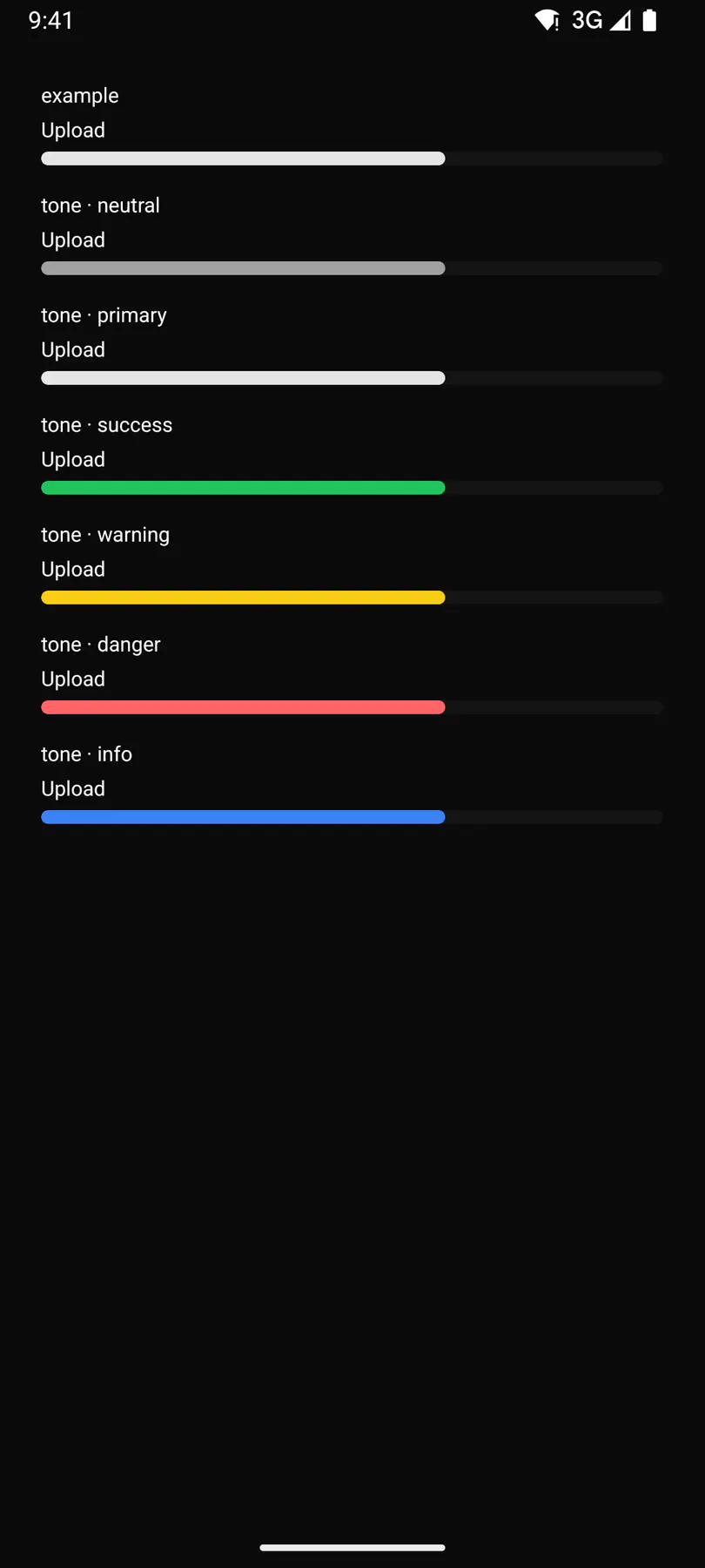
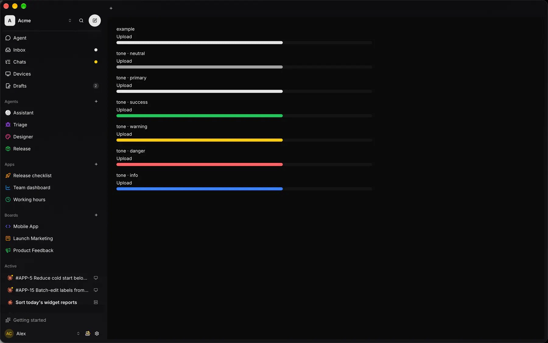
| Prop | Type | Required | Bindable | Description |
|---|---|---|---|---|
value |
number |
yes | yes | The current amount, 0 to max. |
max |
number |
– | – | The full amount. Default 100. |
label |
string |
– | – | A caption above the bar. |
tone |
neutral | primary | success | warning | danger | info |
– | – | The fill colour tone. Default "primary". |
Events
Section titled “Events”None.
None.
Children
Section titled “Children”none
A2UI basic mapping
Section titled “A2UI basic mapping”No basic catalog component maps here.
Built from
Section titled “Built from”Accessibility
Section titled “Accessibility”Role: progressbar
progressbar (valuenow/valuemax, labelled by its label)
Not focusable; no keys.
Theming
Section titled “Theming”Recipe parts: Progress/root Progress/label Progress/track Progress/fill
Keyed by: tone :hover :pressed :focus :disabled :checked :open :selected :invalid :dragover
Related
Section titled “Related”Text · Plan · Badge · Alert · Chip · EmptyState · Meter · Ring