

Toolbar
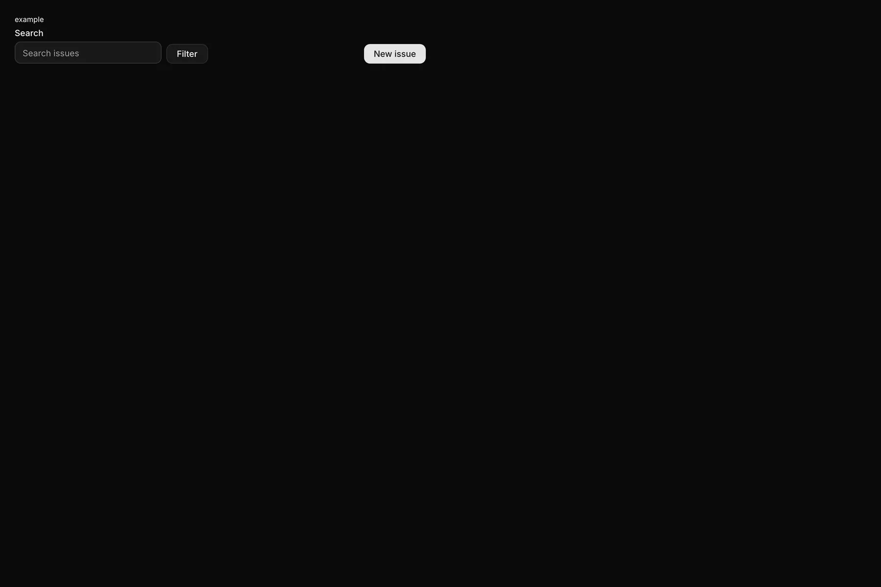
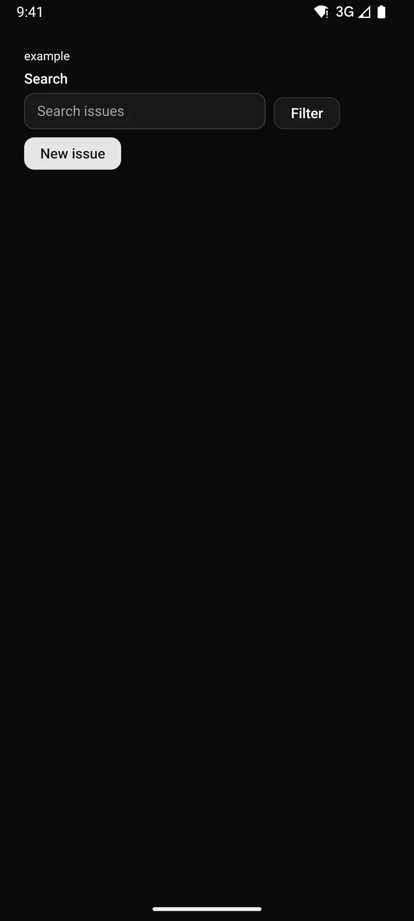
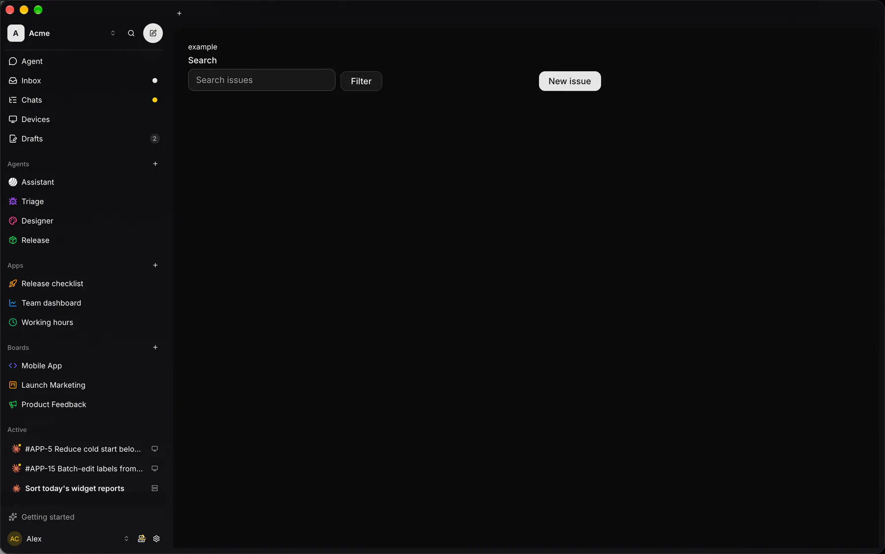
Controls in one row, bottoms aligned, wrapping on phones; trailing = the end action.
Group: Layout · Kind: macro · in the lite catalog
Preview
Section titled “Preview”Platforms
Section titled “Platforms”The same specimen painted by React, SwiftUI, Compose and gpui.

| Prop | Type | Required | Bindable | Description |
|---|---|---|---|---|
gap |
none | xs | sm | md | lg | xl |
– | – | The space between controls. Default "sm". |
Events
Section titled “Events”None.
trailing: one component by id
Children
Section titled “Children”many
A2UI basic mapping
Section titled “A2UI basic mapping”No basic catalog component maps here.
Built from
Section titled “Built from”Accessibility
Section titled “Accessibility”Role: group
group of controls in reading order; the trailing action last
Not focusable; no keys.
Theming
Section titled “Theming”Recipe parts: Toolbar/root Toolbar/spacer
Keyed by: :hover :pressed :focus :disabled :checked :open :selected :invalid :dragover
Related
Section titled “Related”Box · Stack · Grid · Card · Separator · List · Resizable · ScrollArea