

StatTile
A dashboard tile: label, big value, toned change, trend sparkline.
Group: Data · Kind: macro · in the lite catalog
Preview
Section titled “Preview”example
Active users+12 %
1,284tone · danger
Error rate+0.1 %
0.42 %no trend
Open issues
37Platforms
Section titled “Platforms”The same specimen painted by React, SwiftUI, Compose and gpui.
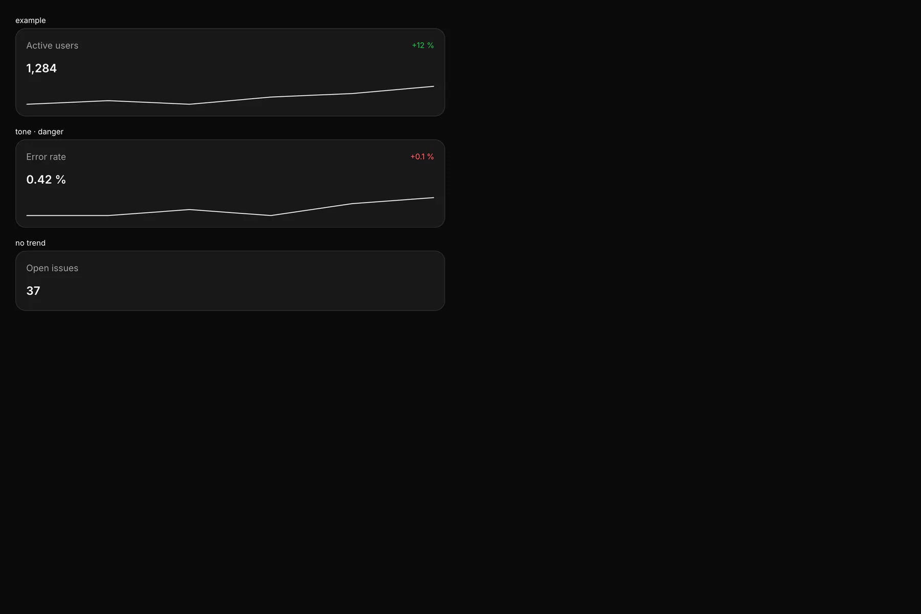
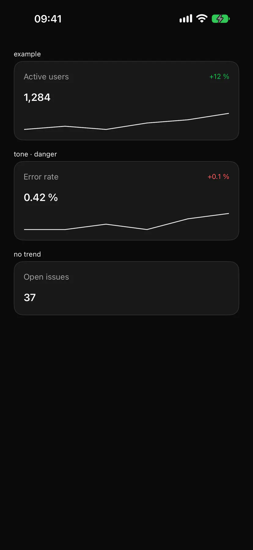
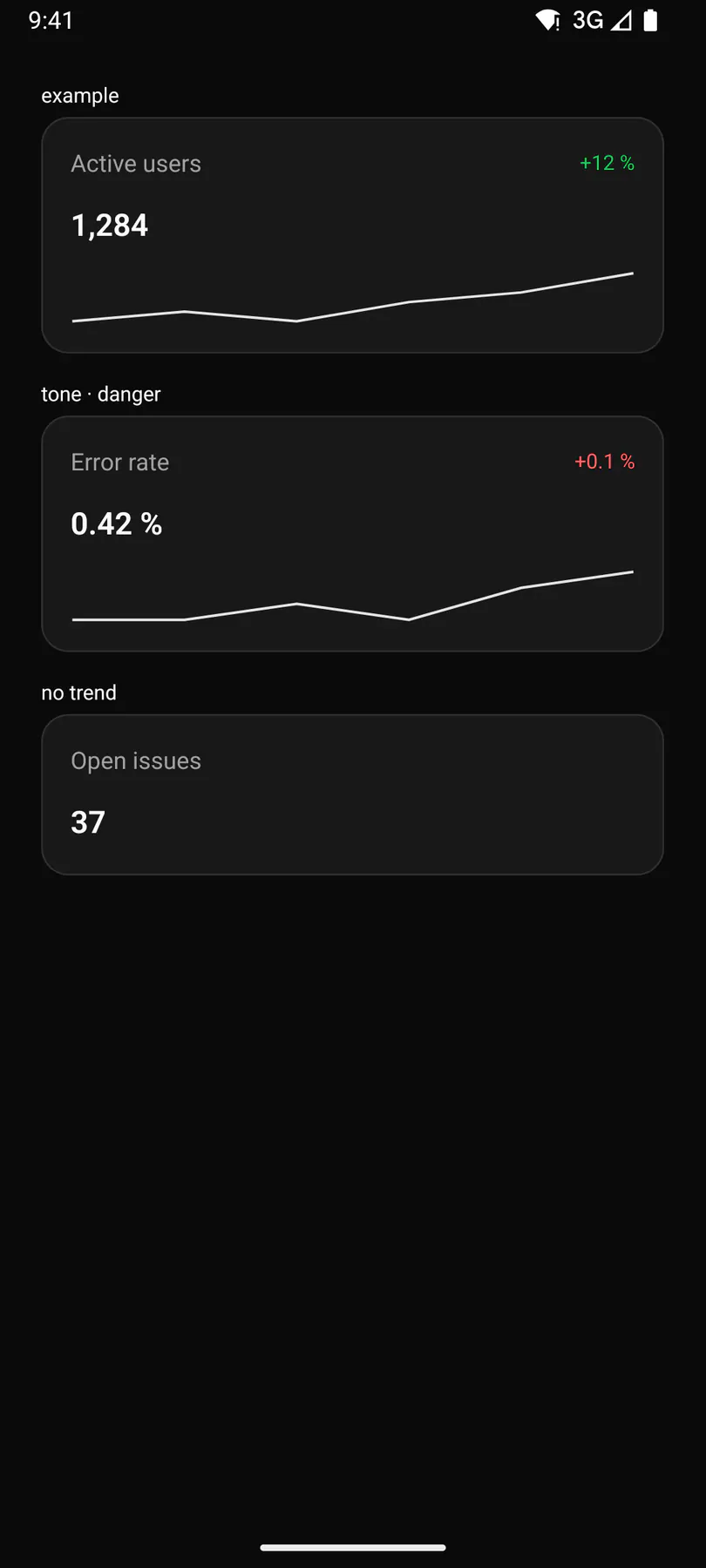
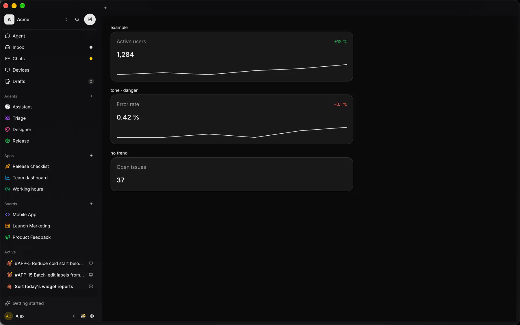
Variants
Section titled “Variants”tone · neutral
Active users+12 %
1,284tone · primary
Active users+12 %
1,284tone · warning
Active users+12 %
1,284tone · info
Active users+12 %
1,284| Prop | Type | Required | Bindable | Description |
|---|---|---|---|---|
label |
string |
yes | yes | What is measured. |
value |
string |
yes | yes | The formatted value. |
delta |
string |
– | yes | The change (+12 %). |
tone |
neutral | primary | success | warning | danger | info |
– | yes | The change’s tone. Default "neutral". |
trend |
[number] |
– | yes | Recent values (sparkline). |
Events
Section titled “Events”None.
None.
Children
Section titled “Children”none
A2UI basic mapping
Section titled “A2UI basic mapping”No basic catalog component maps here.
Built from
Section titled “Built from”Accessibility
Section titled “Accessibility”Role: group
group labelled by its label; the sparkline is an img with the generated summary
Not focusable; no keys.
Theming
Section titled “Theming”Recipe parts: StatTile/root StatTile/card StatTile/header StatTile/label StatTile/delta StatTile/value StatTile/trend
Keyed by: :hover :pressed :focus :disabled :checked :open :selected :invalid :dragover