

Badge
A small count or status label.
Group: Feedback · Kind: macro · in the lite catalog
Preview
Section titled “Preview”example
Active
variant · secondary
Active
variant · outline
Active
variant · ghost
Active
variant · destructive
Active
variant · link
Active
Platforms
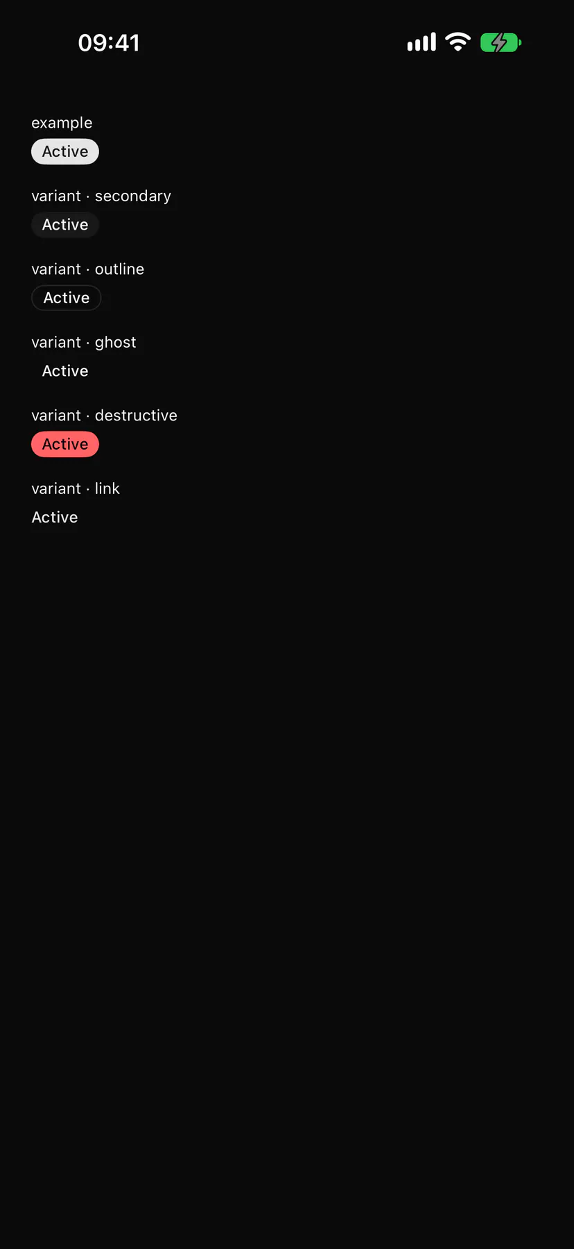
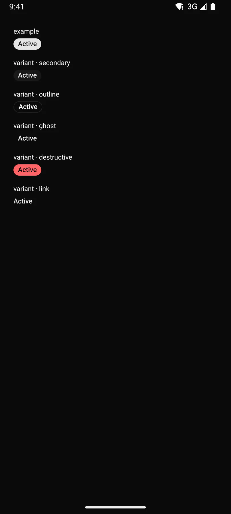
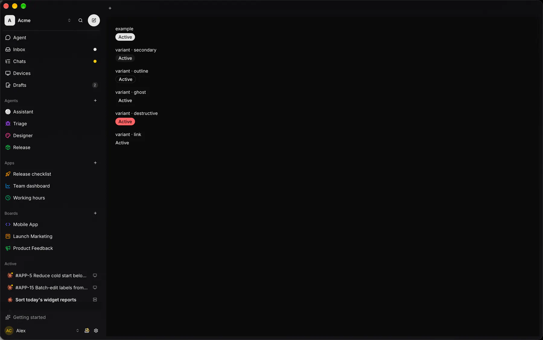
Section titled “Platforms”The same specimen painted by React, SwiftUI, Compose and gpui.

| Prop | Type | Required | Bindable | Description |
|---|---|---|---|---|
text |
string |
yes | yes | The label or number. |
variant |
default | secondary | outline | ghost | destructive | link |
– | yes | Filled, secondary, outlined or destructive. Default "default". |
icon |
icon |
– | – | An icon before the text. |
Events
Section titled “Events”None.
None.
Children
Section titled “Children”none
A2UI basic mapping
Section titled “A2UI basic mapping”No basic catalog component maps here.
Built from
Section titled “Built from”Accessibility
Section titled “Accessibility”Role: text
text (status)
Not focusable; no keys.
Theming
Section titled “Theming”Recipe parts: Badge/root Badge/icon Badge/label
Keyed by: variant :hover :pressed :focus :disabled :checked :open :selected :invalid :dragover
Related
Section titled “Related”Icon · Text · Alert · Chip · EmptyState · Progress · Meter · Ring