

Grid
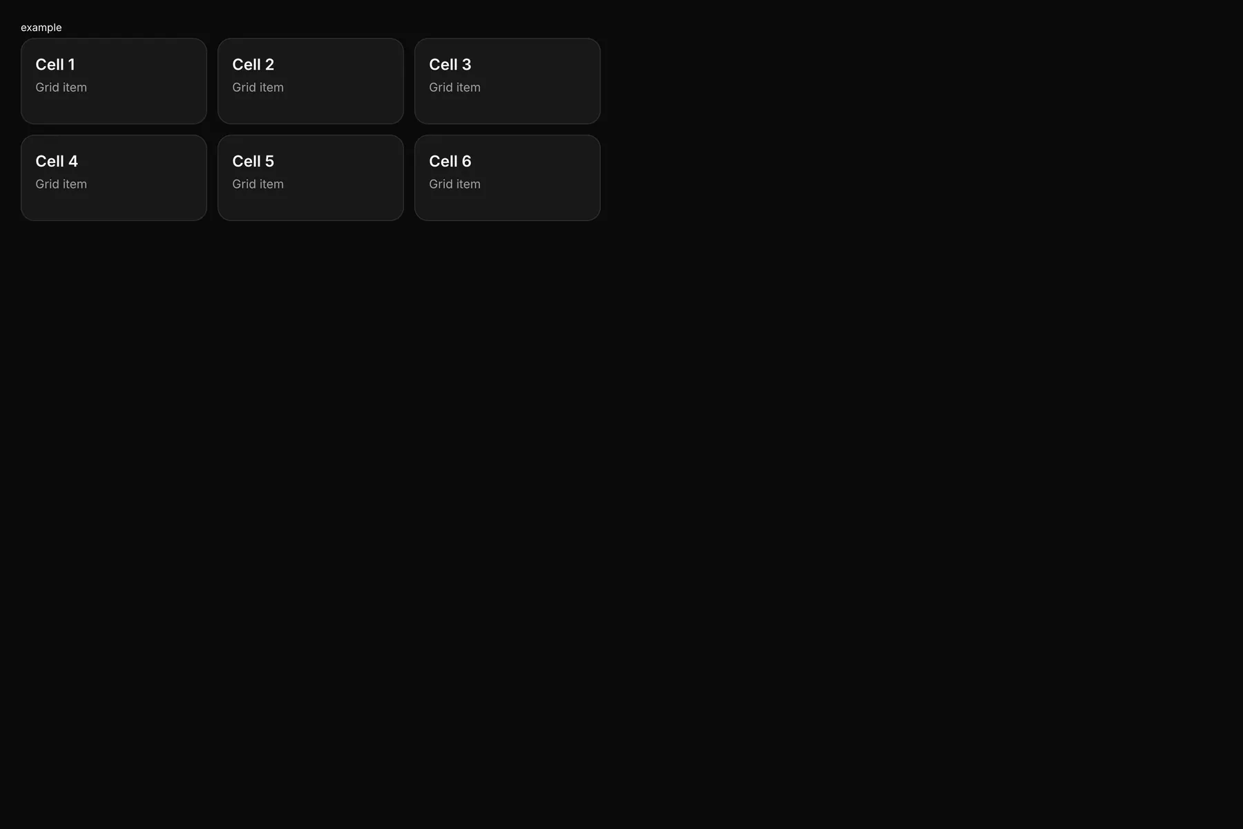
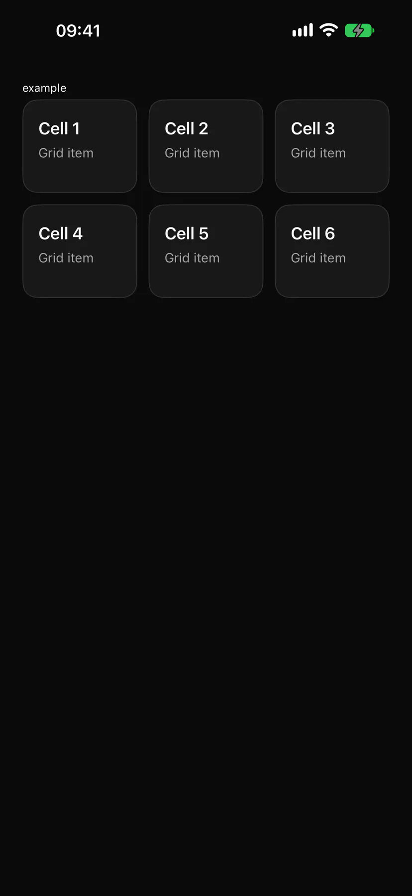
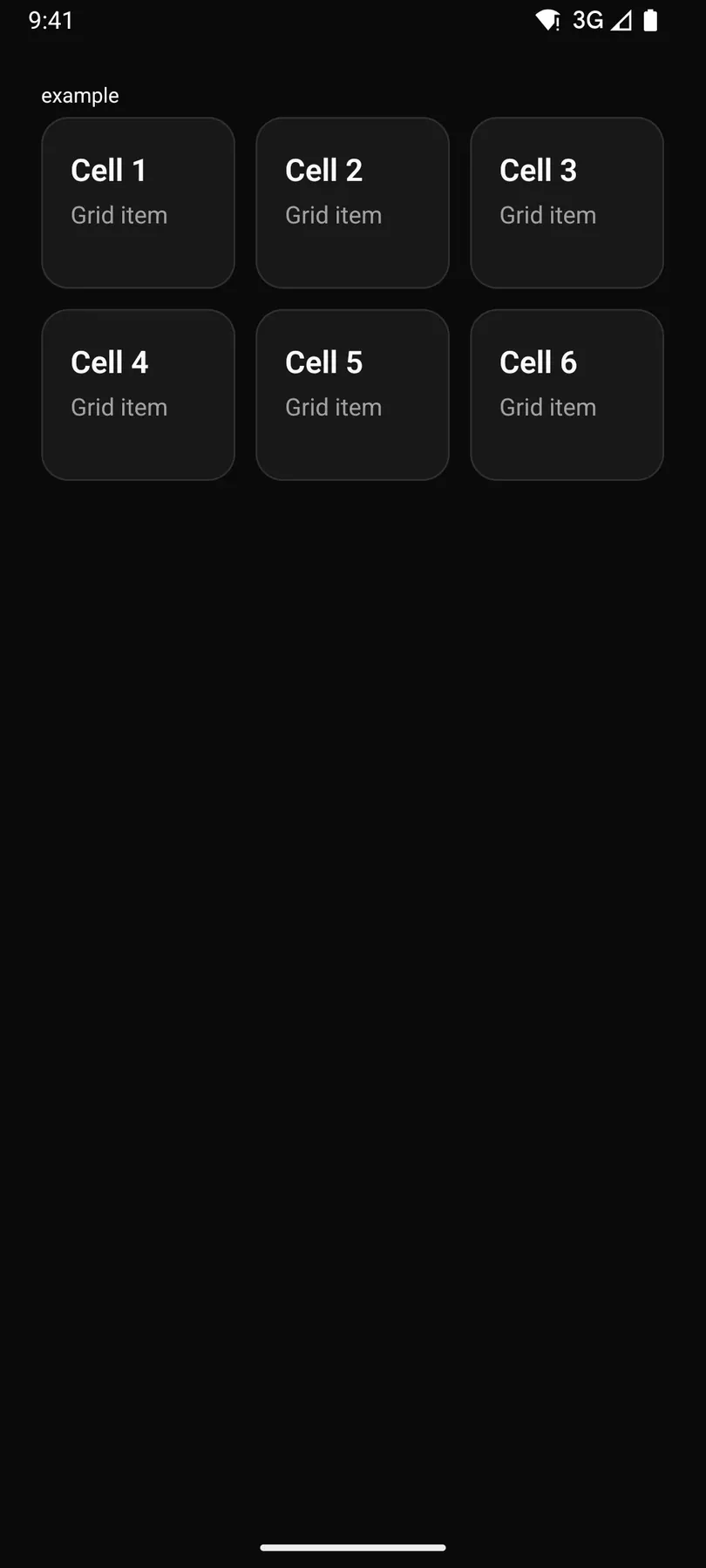
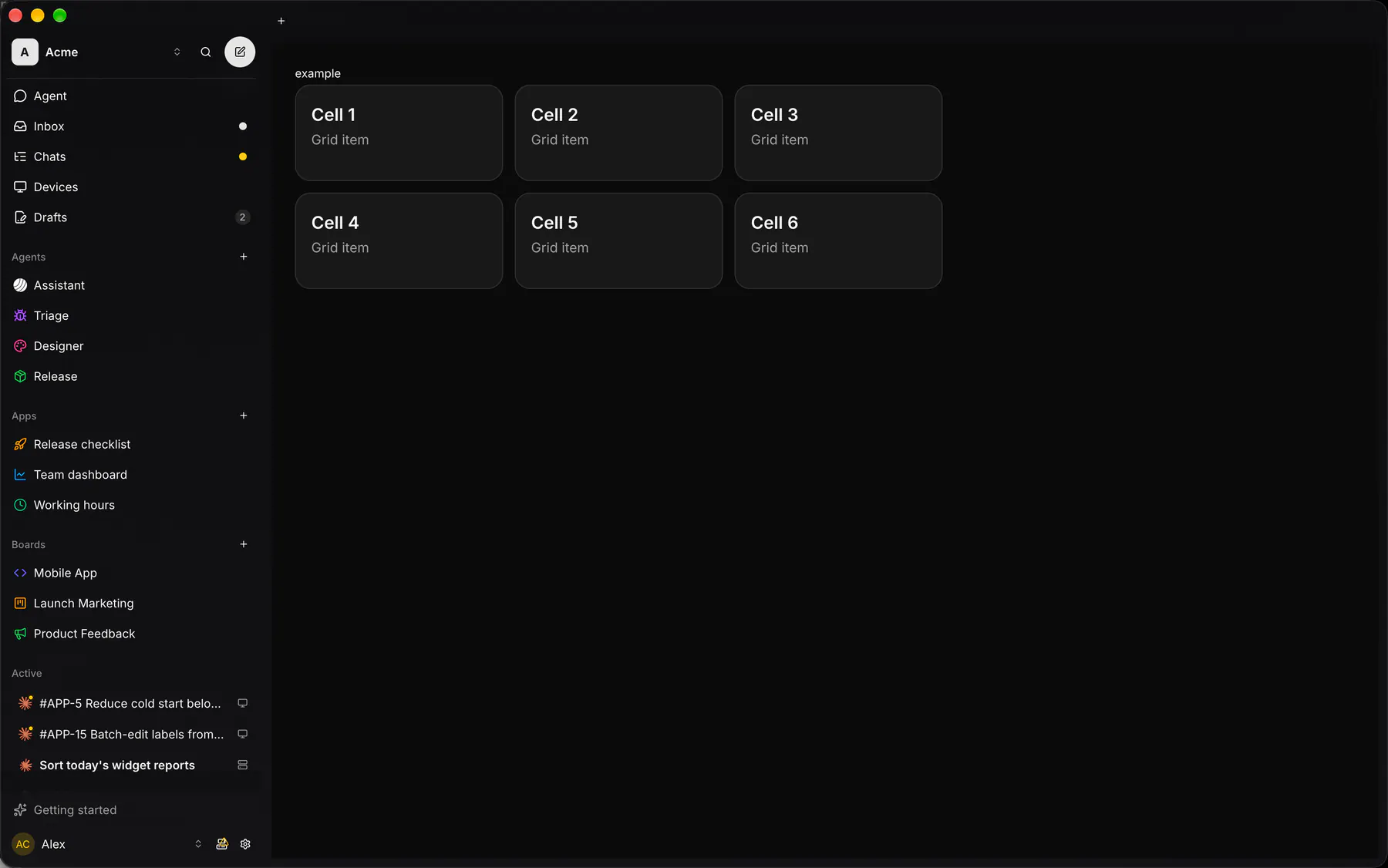
An equal-column grid for cards and tiles.
Group: Layout · Kind: macro · in the lite catalog
Preview
Section titled “Preview”example
Cell 1Grid item
Cell 2Grid item
Cell 3Grid item
Cell 4Grid item
Cell 5Grid item
Cell 6Grid item
Platforms
Section titled “Platforms”The same specimen painted by React, SwiftUI, Compose and gpui.
| Prop | Type | Required | Bindable | Description |
|---|---|---|---|---|
columns |
number |
– | – | Equal columns 1–6 ({base: 1, md: 2, lg: 3}). Default 2. Responsive: takes a per-breakpoint object. |
gap |
none | xs | sm | md | lg | xl |
– | – | The space between cells. Default "md". Responsive: takes a per-breakpoint object. |
style |
style |
– | – | Extra Box styles merged over the grid’s own. |
Events
Section titled “Events”None.
None.
Children
Section titled “Children”many
A2UI basic mapping
Section titled “A2UI basic mapping”No basic catalog component maps here.
Built from
Section titled “Built from”Accessibility
Section titled “Accessibility”Role: none
none (layout only)
Not focusable; no keys.
Theming
Section titled “Theming”Recipe parts: Grid/root
Keyed by: :hover :pressed :focus :disabled :checked :open :selected :invalid :dragover
Related
Section titled “Related”Box · Stack · Card · Separator · List · Resizable · ScrollArea · Sidebar