

Select
A dropdown picker of one or many options; searchable = a filtering combobox, source = a host list.
Group: Inputs · Kind: native · in the lite catalog
Preview
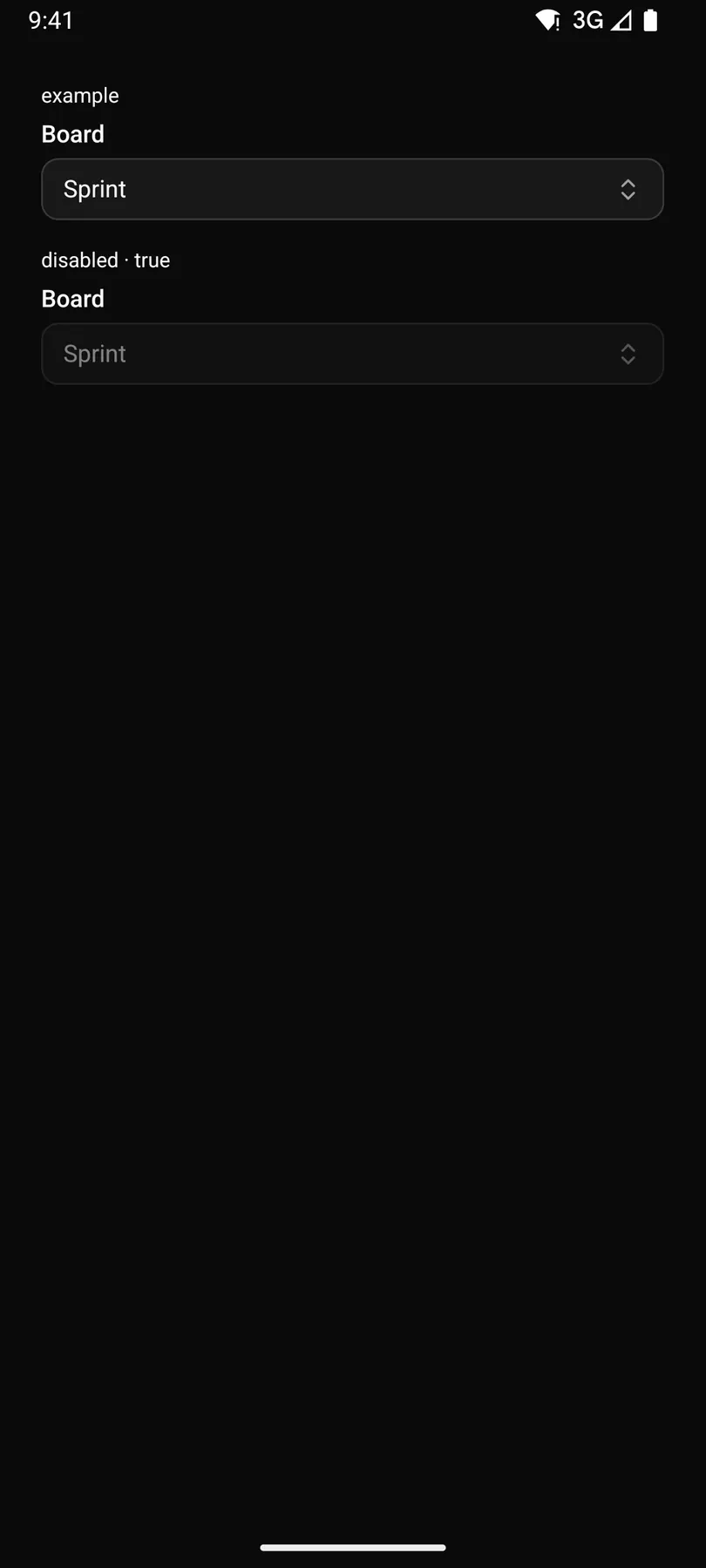
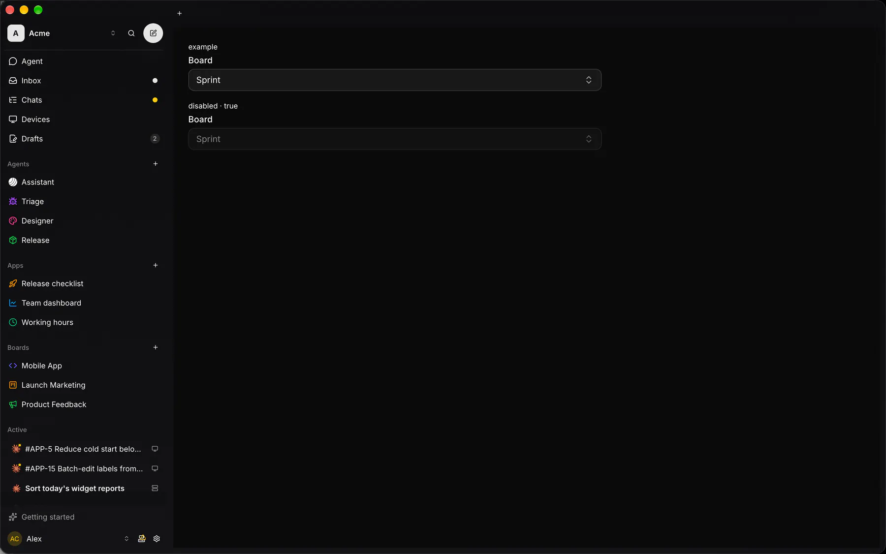
Section titled “Preview”example
disabled · true
Platforms
Section titled “Platforms”The same specimen painted by React, SwiftUI, Compose and gpui.


| Prop | Type | Required | Bindable | Description |
|---|---|---|---|---|
label |
string |
– | – | The field label. |
name |
string |
yes | – | The field’s key in the submitted data. |
options |
[option] |
– | yes | Inline choices, or a path the host refills on search; omit with source. |
source |
string |
– | – | A host list id (e.g. exp:statuses) that supplies the options. |
placeholder |
string |
– | – | Shown while nothing is chosen. |
value |
string |
– | yes | The chosen value (comma-joined when multiple); bind it. |
multiple |
boolean |
– | – | Allows several values. Default false. |
searchable |
boolean |
– | – | Adds a filter field; typing fires search. Default false. |
emptyText |
string |
– | – | Shown when the search matches nothing. Default "$string.noResults". |
disabled |
boolean |
– | – | Shows it inert. Default false. |
checks |
[check] |
– | – | Validation rules. |
validateOn |
change | blur | submit |
– | – | When the checks run. Default "change". |
Events
Section titled “Events”on.change: runs an actionon.search: runs an action
None.
Children
Section titled “Children”none
A2UI basic mapping
Section titled “A2UI basic mapping”The basic catalog’s ChoicePicker (filterable, multipleSelection) renders as Select.
Built from
Section titled “Built from”A native component: every renderer paints it directly.
Accessibility
Section titled “Accessibility”Role: combobox
combobox + listbox / option
| Keys | Action |
|---|---|
Enter Space ArrowDown |
open on the selected option |
ArrowDown ArrowUp |
move the active option; Home/End: first/last |
Enter |
choose (multiple: toggle and stay open) |
Escape |
close without change |
Typing |
jump to the next matching option; with searchable, typing filters, focus stays in the search field and arrows move the active option (aria-activedescendant) |
Theming
Section titled “Theming”Recipe parts: Select/root Select/label Select/trigger Select/placeholder Select/content Select/search Select/item Select/check Select/empty
Keyed by: multiple searchable disabled :hover :pressed :focus :disabled :checked :open :selected :invalid :dragover
Related
Section titled “Related”Form · FieldGroup · FormActions · Input · Textarea · NumberField · Checkbox · Radio