

Video
A video player: the poster until play, then the platform player with its controls.
Group: Media · Kind: native
Preview
Section titled “Preview”example
0:12
Platforms
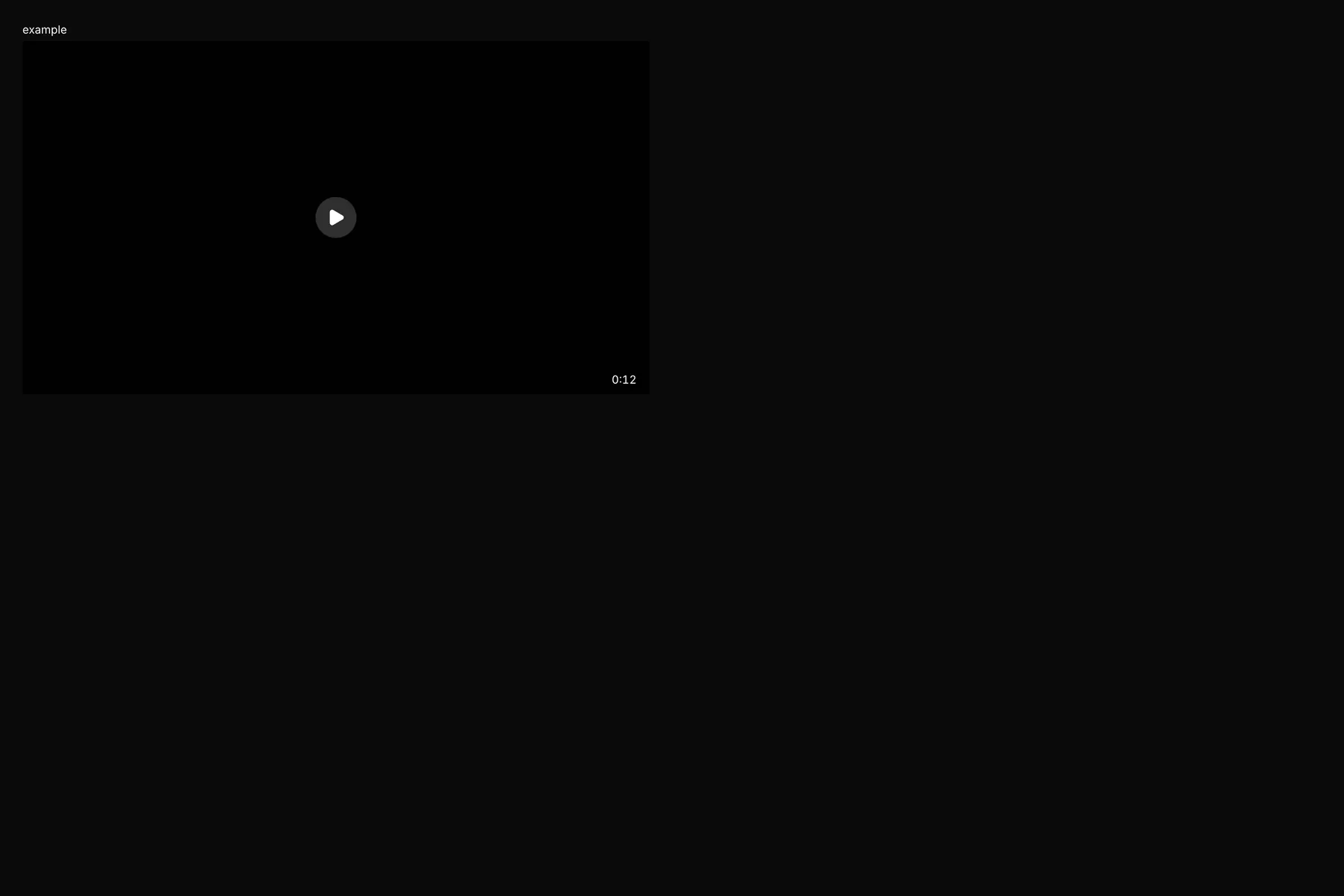
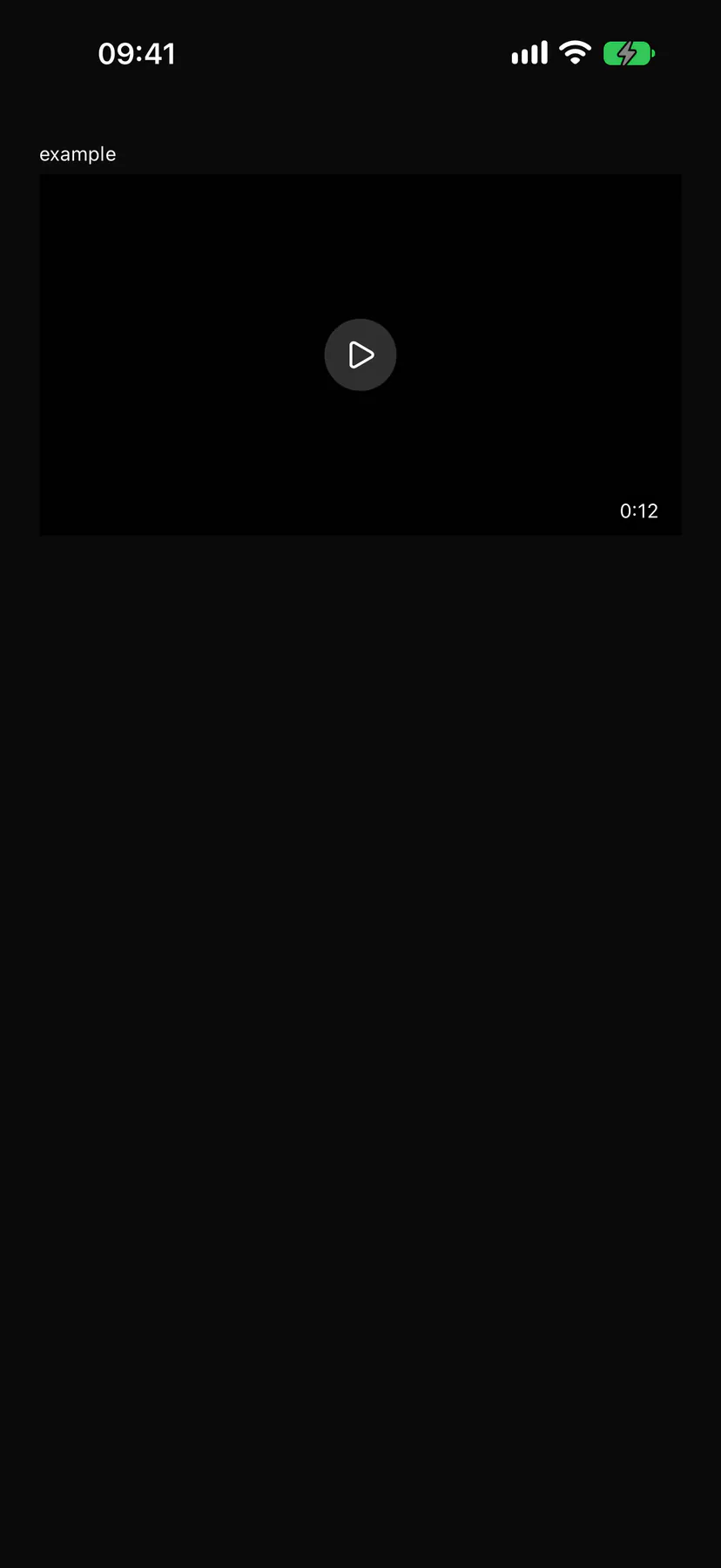
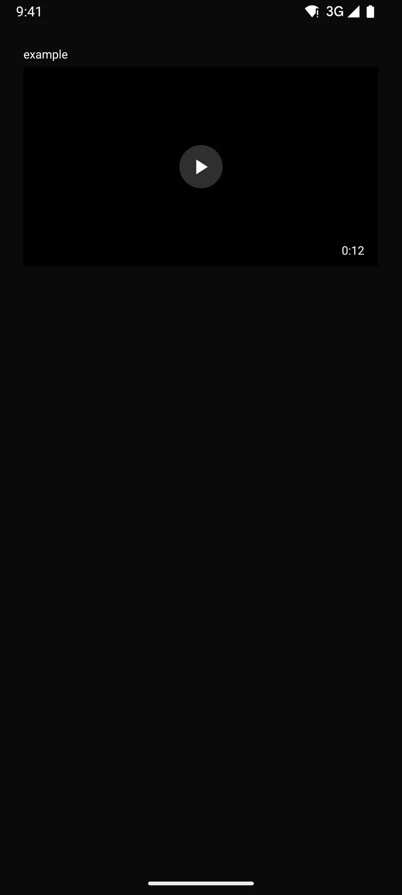
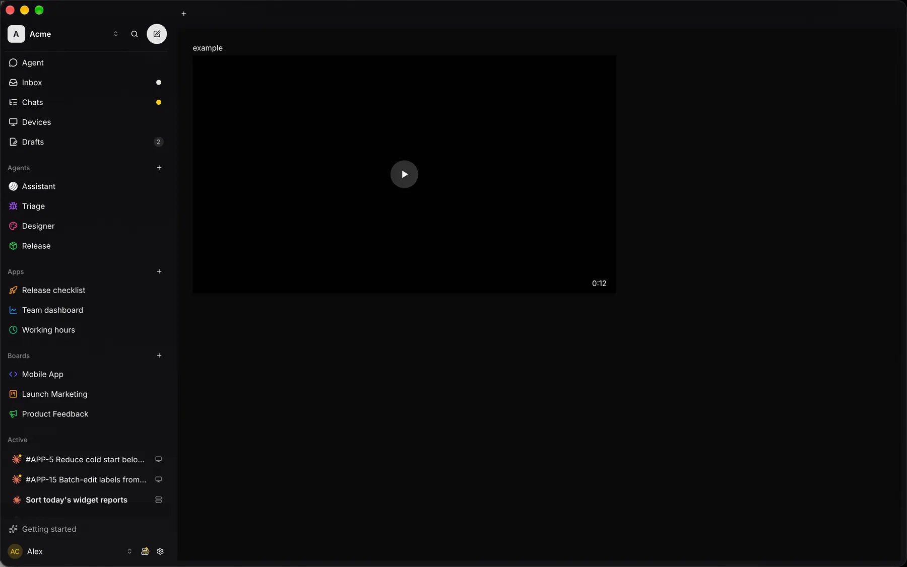
Section titled “Platforms”The same specimen painted by React, SwiftUI, Compose and gpui.
| Prop | Type | Required | Bindable | Description |
|---|---|---|---|---|
src |
url |
yes | yes | The video URL (H.264 + AAC MP4 plays everywhere). |
poster |
url |
– | – | A still shown before playback. |
durationMs |
number |
– | – | Known length for the scrubber. |
autoplay |
boolean |
– | – | Starts muted playback on appear. Default false. |
aspectRatio |
number |
– | – | Width over height of the player box. Default 1.7777778. |
style |
style |
– | – | Extra Box styles for the player box. |
Events
Section titled “Events”None.
None.
Children
Section titled “Children”none
A2UI basic mapping
Section titled “A2UI basic mapping”The basic catalog’s Video renders as Video.
Built from
Section titled “Built from”A native component: every renderer paints it directly.
Accessibility
Section titled “Accessibility”Role: group
video with the platform’s controls
| Keys | Action |
|---|---|
Space |
play/pause; ArrowLeft/ArrowRight: seek 5 s |
Theming
Section titled “Theming”Recipe parts: Video/root Video/controls Video/poster
Keyed by: autoplay :hover :pressed :focus :disabled :checked :open :selected :invalid :dragover
Related
Section titled “Related”Image · ZoomableImage · Icon · AudioPlayer · Avatar · QrCode · Carousel · Mosaic