

EmptyState
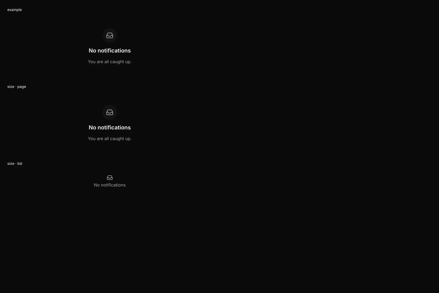
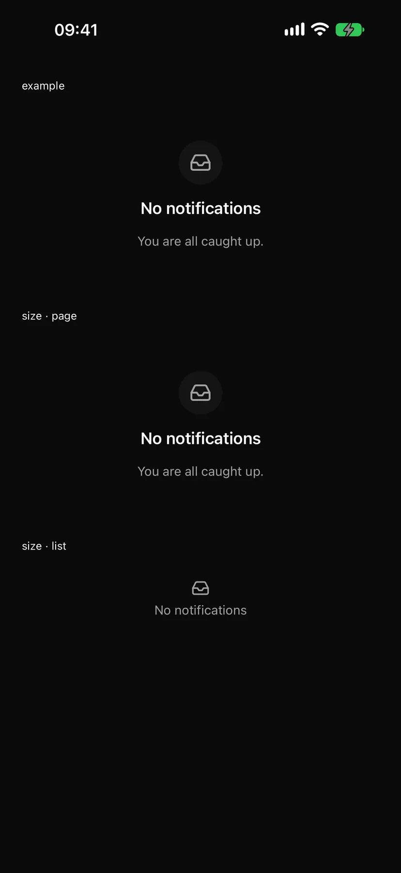
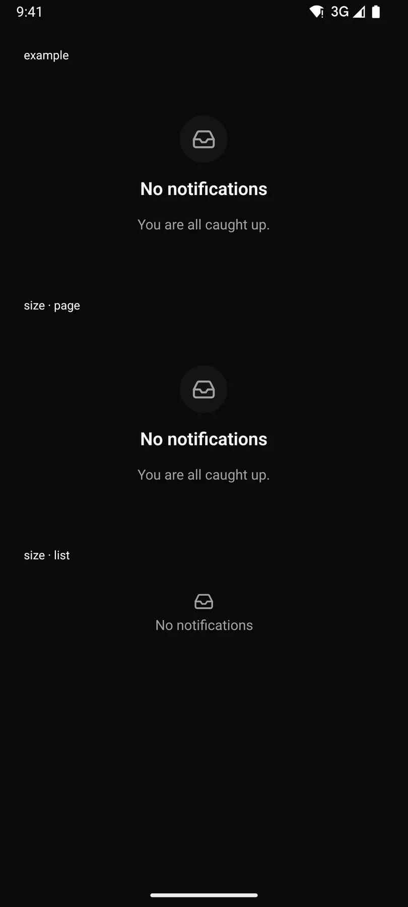
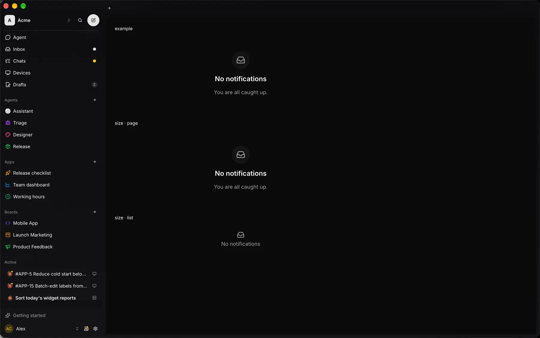
What an empty screen or list says: a short title; page adds the icon disc, a sentence and an action, list one muted line.
Group: Feedback · Kind: macro · in the lite catalog
Preview
Section titled “Preview”example
No notificationsYou are all caught up.
size · page
No notificationsYou are all caught up.
size · list
No notifications
Platforms
Section titled “Platforms”The same specimen painted by React, SwiftUI, Compose and gpui.
| Prop | Type | Required | Bindable | Description |
|---|---|---|---|---|
icon |
icon |
yes | – | The glyph: in the disc on page, bare on list. |
title |
string |
yes | – | What is empty. |
description |
string |
– | – | The next step, page only. |
actionLabel |
string |
– | – | A button label, page only; pressing it fires press. |
size |
page | list |
– | – | page = a whole screen’s empty state with disc, sentence and action; list = one muted line under a bare glyph, no description, no action. Default "page". |
Events
Section titled “Events”on.press: runs an action
None.
Children
Section titled “Children”none
A2UI basic mapping
Section titled “A2UI basic mapping”No basic catalog component maps here.
Built from
Section titled “Built from”Accessibility
Section titled “Accessibility”Role: status
status; the action = button
| Keys | Action |
|---|---|
| – | Enter, Space on the action |
Theming
Section titled “Theming”Recipe parts: EmptyState/root EmptyState/disc EmptyState/icon EmptyState/title EmptyState/description EmptyState/action
Keyed by: size :hover :pressed :focus :disabled :checked :open :selected :invalid :dragover
Related
Section titled “Related”Button · Icon · Text · Badge · Alert · Chip · Progress · Meter