

List
A windowed scrolling list for anything longer than a screen; children may come from a data template.
Group: Layout · Kind: native · in the lite catalog
Preview
Section titled “Preview”Platforms
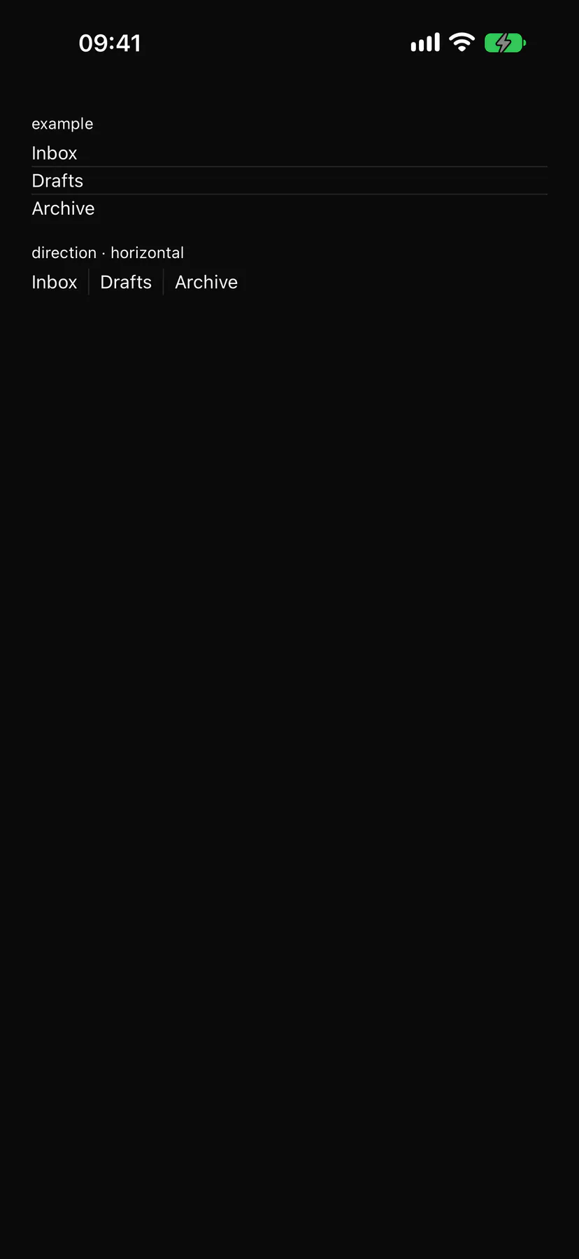
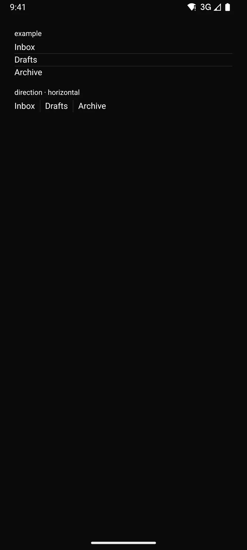
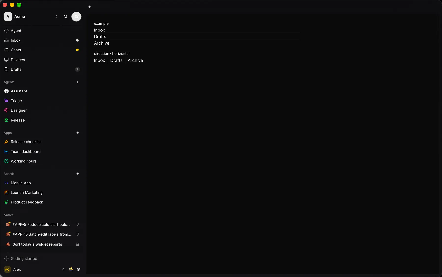
Section titled “Platforms”The same specimen painted by React, SwiftUI, Compose and gpui.

| Prop | Type | Required | Bindable | Description |
|---|---|---|---|---|
direction |
vertical | horizontal |
– | – | Scroll axis. Default "vertical". |
gap |
none | xs | sm | md | lg | xl |
– | – | The space between items. Default "none". |
divided |
boolean |
– | – | Draws a hairline between items. Default false. |
sectionBy |
string |
– | – | Groups consecutive items by this field; slot section = each header ({value, count}). |
stickyHeaders |
boolean |
– | – | Pins the current section header. Default false. |
style |
style |
– | – | Extra Box styles for the list frame. |
Events
Section titled “Events”None.
section: one component by id
Children
Section titled “Children”many
A2UI basic mapping
Section titled “A2UI basic mapping”The basic catalog’s List renders as List.
Built from
Section titled “Built from”A native component: every renderer paints it directly.
Accessibility
Section titled “Accessibility”Role: list
list; each item a listitem with its position in the WHOLE list (aria-setsize/posinset, also when windowed); a section header is a heading (level 3) and stays first in reading order while pinned
| Keys | Action |
|---|---|
| – | Tab moves through the rows’ controls; the list itself is one scroll region |
Theming
Section titled “Theming”Recipe parts: List/root List/divider List/section
Keyed by: direction divided stickyHeaders :hover :pressed :focus :disabled :checked :open :selected :invalid :dragover
Related
Section titled “Related”Section · Box · Stack · Grid · Card · Separator · Resizable · ScrollArea