

Carousel
A horizontally paging scroller; each child is one page.
Group: Media · Kind: native
Preview
Section titled “Preview”Platforms
Section titled “Platforms”The same specimen painted by React, SwiftUI, Compose and gpui.
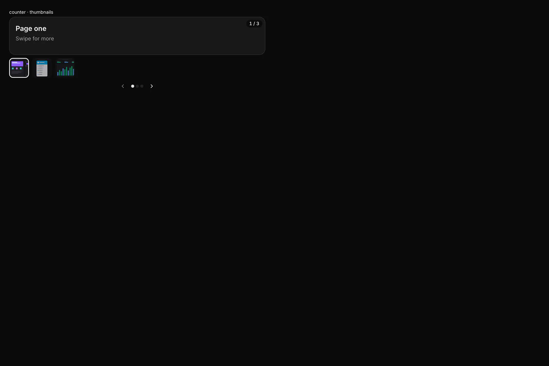
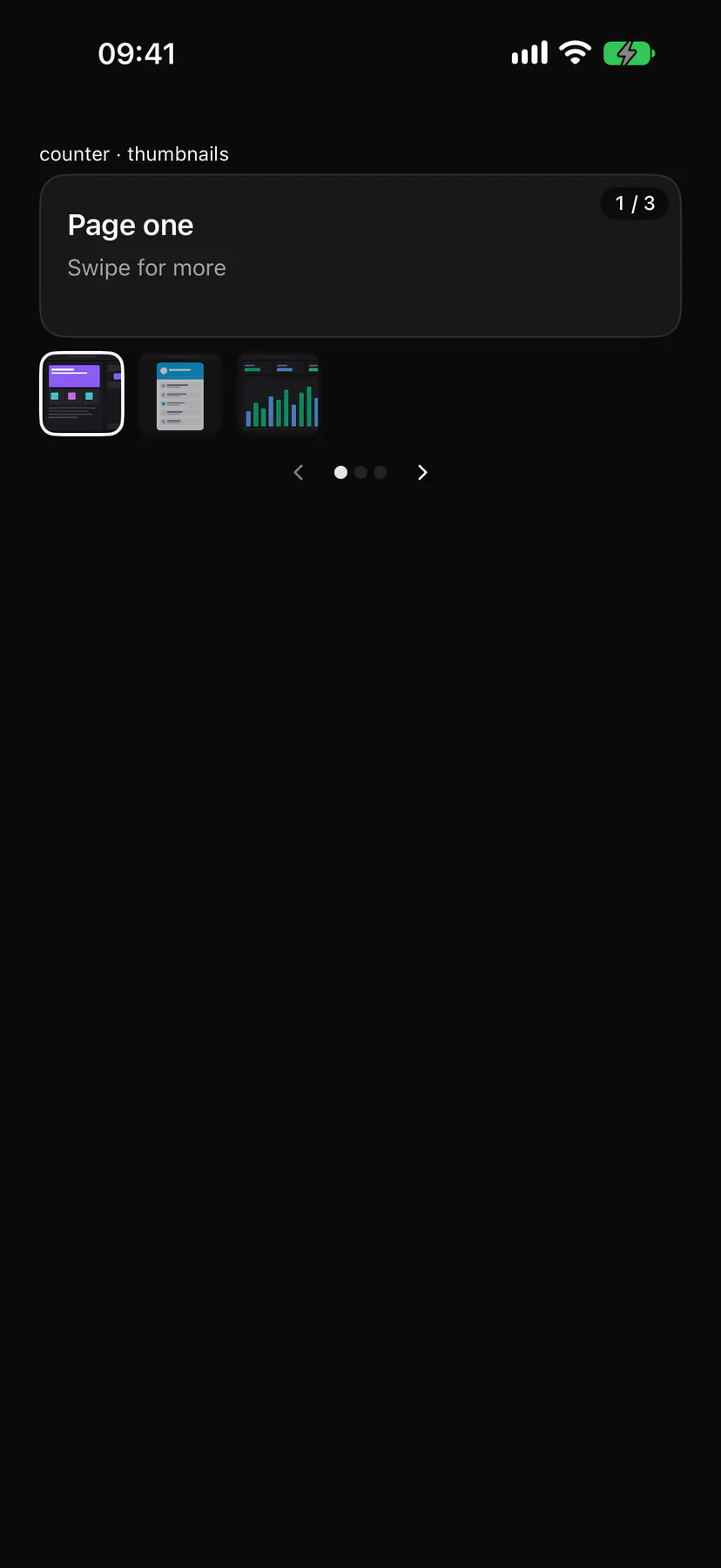
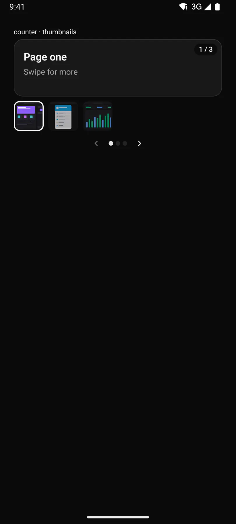
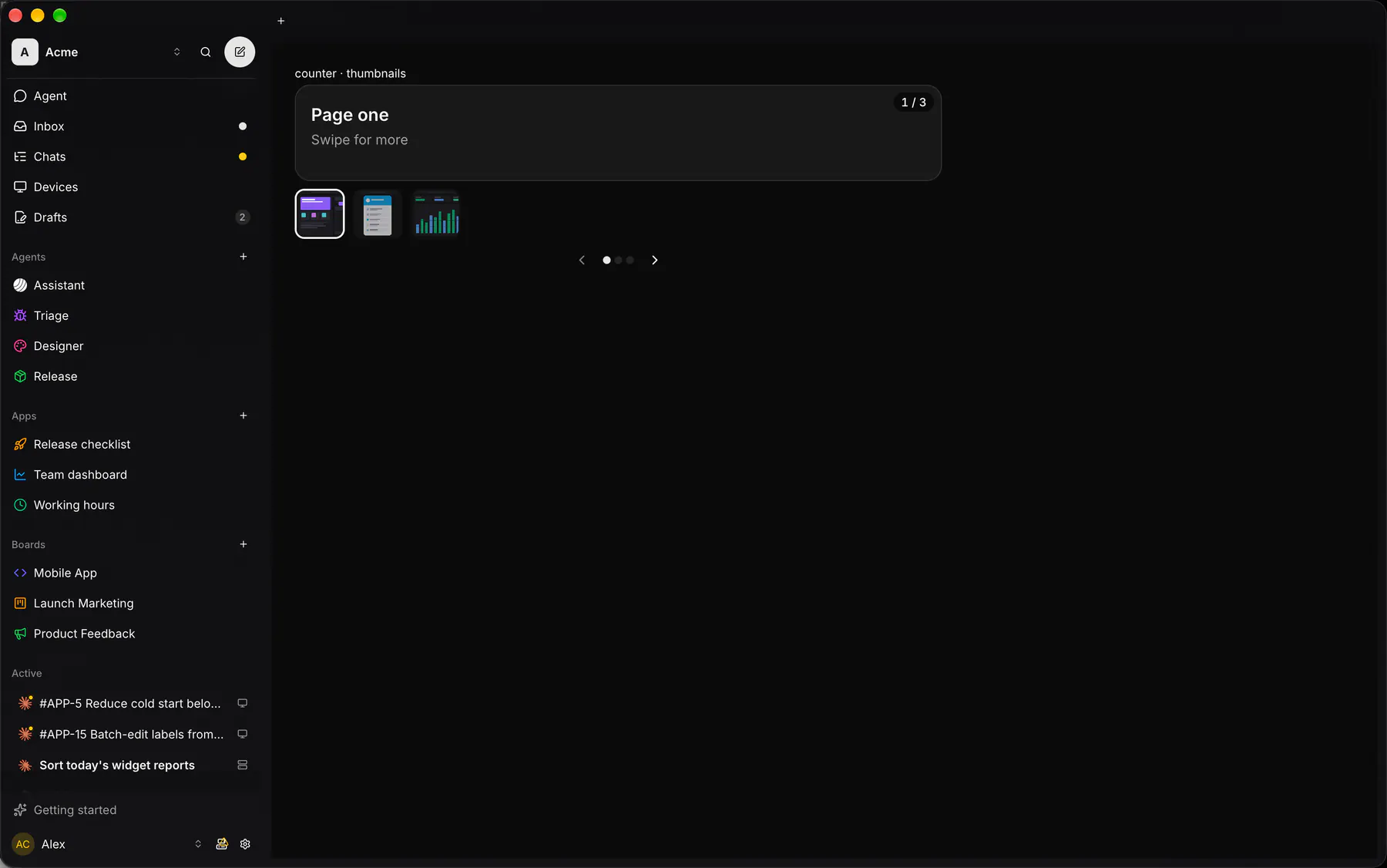
| Prop | Type | Required | Bindable | Description |
|---|---|---|---|---|
page |
number |
– | yes | The active page index. Default 0. |
loop |
boolean |
– | – | Wraps from the last page to the first. Default false. |
indicators |
boolean |
– | – | Shows the page dots. Default true. |
counter |
boolean |
– | – | Shows i / n. Default false. |
thumbnails |
[url] |
– | – | A thumbnail URL per page. |
Events
Section titled “Events”on.change: runs an action
None.
Children
Section titled “Children”many
A2UI basic mapping
Section titled “A2UI basic mapping”No basic catalog component maps here.
Built from
Section titled “Built from”A native component: every renderer paints it directly.
Accessibility
Section titled “Accessibility”Role: region
region, roledescription carousel; each page a group page i of n; the counter $string.pageCounter is hidden (each page already says page i of n); each thumbnail a button page i of n, aria-current on the current one
| Keys | Action |
|---|---|
ArrowLeft ArrowRight |
previous/next page while focus is inside |
Home End |
first/last page |
Theming
Section titled “Theming”Recipe parts: Carousel/root Carousel/page Carousel/indicator Carousel/controls Carousel/previous Carousel/next Carousel/counter Carousel/thumbnails Carousel/thumbnail
Keyed by: loop indicators counter :hover :pressed :focus :disabled :checked :open :selected :invalid :dragover
Related
Section titled “Related”Image · ZoomableImage · Icon · Video · AudioPlayer · Avatar · QrCode · Mosaic