

Textarea
A multi-line text field.
Group: Inputs · Kind: native · in the lite catalog
Preview
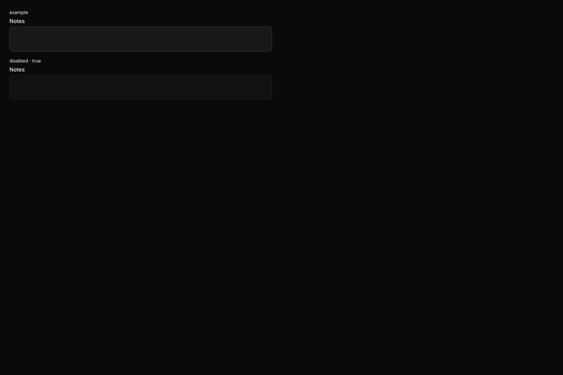
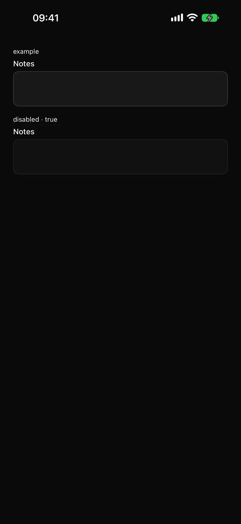
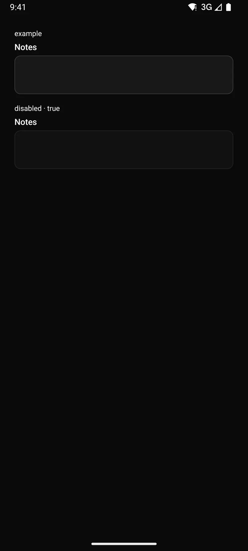
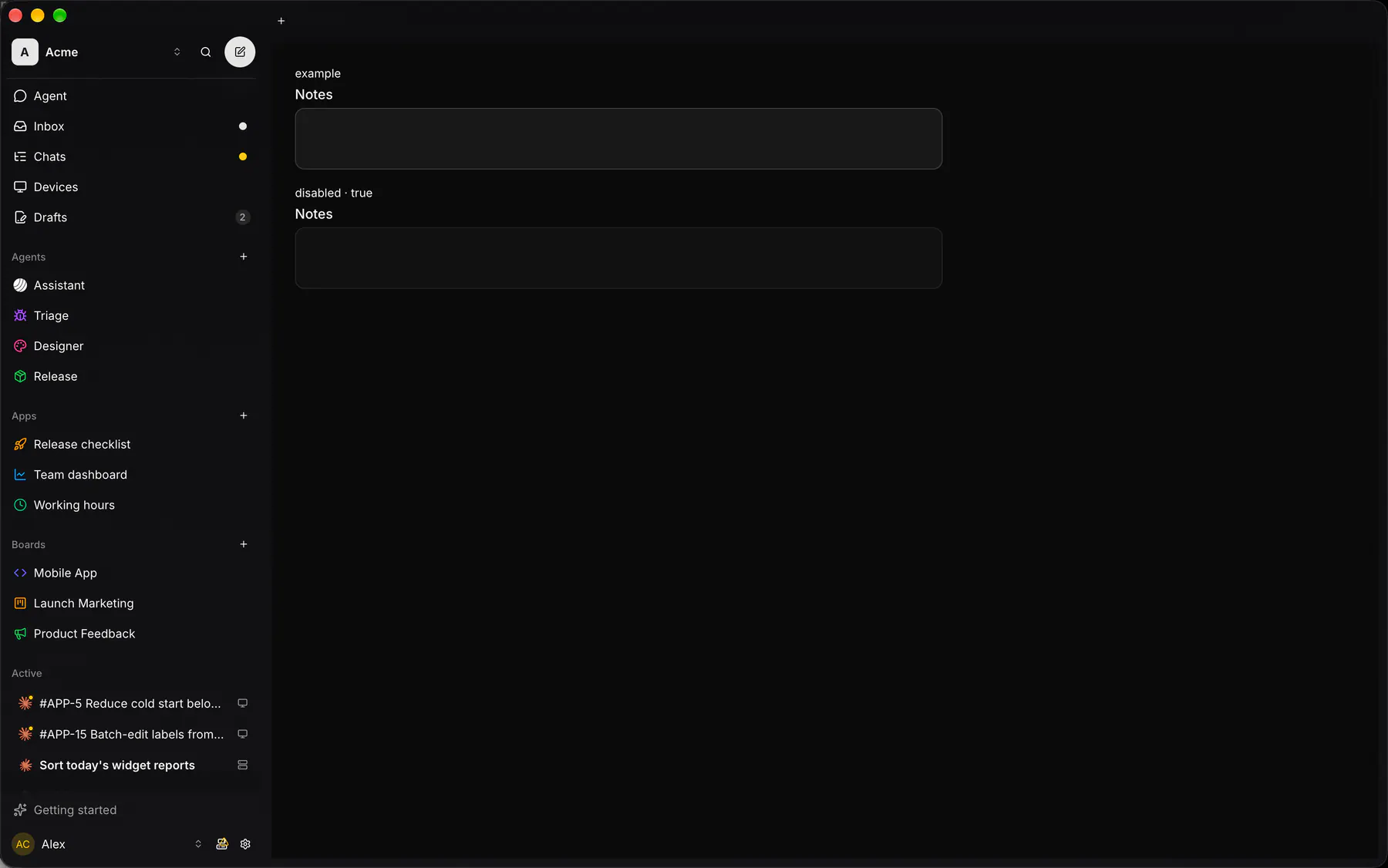
Section titled “Preview”example
disabled · true
Platforms
Section titled “Platforms”The same specimen painted by React, SwiftUI, Compose and gpui.
| Prop | Type | Required | Bindable | Description |
|---|---|---|---|---|
label |
string |
yes | – | The field label. |
name |
string |
yes | – | The field’s key in the submitted data. |
placeholder |
string |
– | – | Hint text while empty. |
rows |
number |
– | – | Visible lines (the minimum when autosizing). Default 3. |
autosize |
boolean |
– | – | Grows with the text from rows up to maxRows. Default false. |
maxRows |
number |
– | – | Autosize stops growing here and scrolls. |
value |
string |
– | yes | The text; bind it to a data path. |
disabled |
boolean |
– | – | Shows it inert. Default false. |
checks |
[check] |
– | – | Validation rules. |
validateOn |
change | blur | submit |
– | – | When the checks run. Default "blur". |
Events
Section titled “Events”on.change: runs an actionon.focus: runs an actionon.blur: runs an action
None.
Children
Section titled “Children”none
A2UI basic mapping
Section titled “A2UI basic mapping”The basic catalog’s TextField (longText) renders as Textarea.
Built from
Section titled “Built from”A native component: every renderer paints it directly.
Accessibility
Section titled “Accessibility”Role: textbox
textbox (multiline)
| Keys | Action |
|---|---|
Enter |
newline |
Theming
Section titled “Theming”Recipe parts: Textarea/root Textarea/label Textarea/field Textarea/placeholder Textarea/description Textarea/error
Keyed by: disabled :hover :pressed :focus :disabled :checked :open :selected :invalid :dragover
Related
Section titled “Related”Form · FieldGroup · FormActions · Input · NumberField · Checkbox · Radio · ChoiceTiles