

Stack
A flex container that lays its children out in one direction with a gap.
Group: Layout · Kind: macro · in the lite catalog
Preview
Section titled “Preview”example
ALAda Lovelace
Owner
direction · vertical
ALAda Lovelace
Owner
Platforms
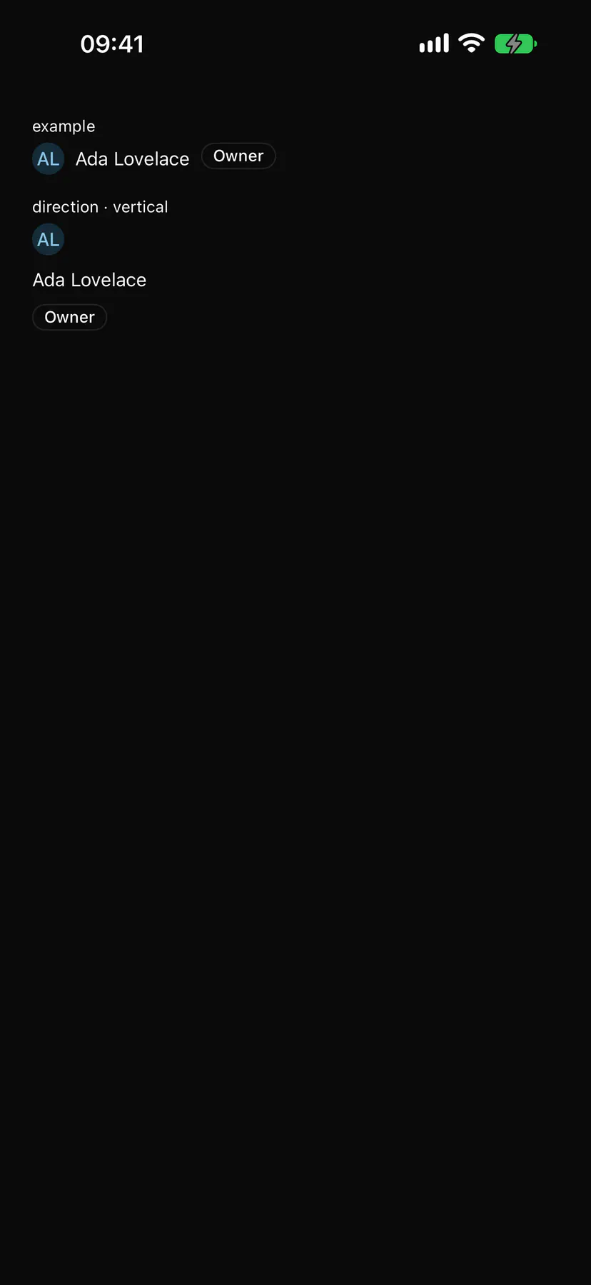
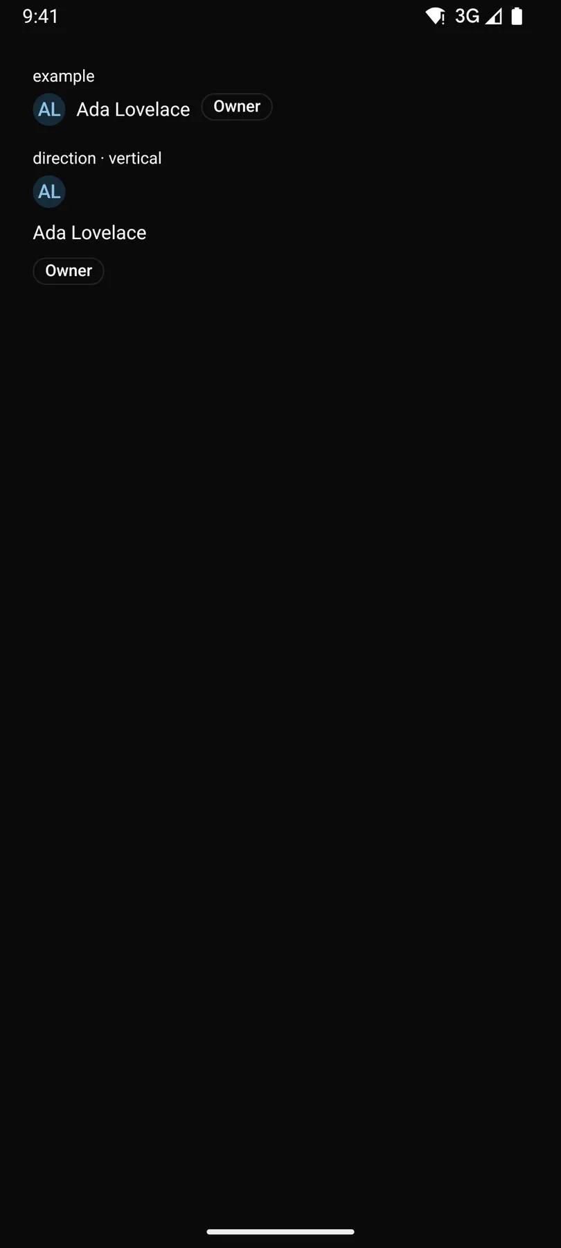
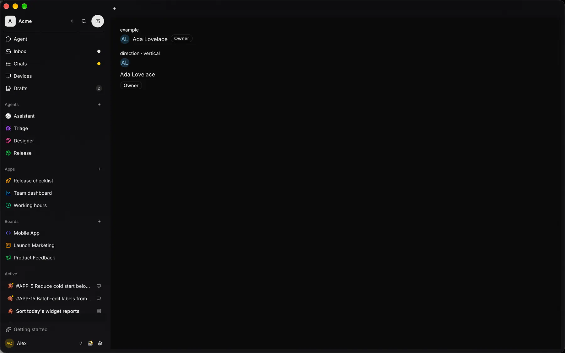
Section titled “Platforms”The same specimen painted by React, SwiftUI, Compose and gpui.

Variants
Section titled “Variants”wrap
ALAda Lovelace
Owner
| Prop | Type | Required | Bindable | Description |
|---|---|---|---|---|
direction |
horizontal | vertical |
– | yes | A row or a column ({base: "vertical", md: "horizontal"}). Default "vertical". Responsive: takes a per-breakpoint object. |
gap |
none | xs | sm | md | lg | xl |
– | – | The space between children. Default "md". Responsive: takes a per-breakpoint object. |
align |
start | center | end | stretch |
– | yes | Unset: center in a row, stretch in a column. Responsive: takes a per-breakpoint object. |
justify |
start | center | end | between | around | evenly |
– | yes | Main-axis distribution. Default "start". Responsive: takes a per-breakpoint object. |
wrap |
boolean |
– | – | Lets children wrap onto new lines. Default false. Responsive: takes a per-breakpoint object. |
style |
style |
– | – | Extra Box styles merged over the stack’s own. |
Events
Section titled “Events”None.
None.
Children
Section titled “Children”many
A2UI basic mapping
Section titled “A2UI basic mapping”The basic catalog’s Row, Column render as Stack.
Built from
Section titled “Built from”Accessibility
Section titled “Accessibility”Role: none
none (layout only)
Not focusable; no keys.
Theming
Section titled “Theming”Recipe parts: Stack/root
Keyed by: :hover :pressed :focus :disabled :checked :open :selected :invalid :dragover
Related
Section titled “Related”Box · Grid · Card · Separator · List · Resizable · ScrollArea · Sidebar