

Label
A caption for a control that has no label of its own, with an optional required mark.
Group: Text · Kind: macro · in the lite catalog
Preview
Section titled “Preview”example
Visibility
Platforms
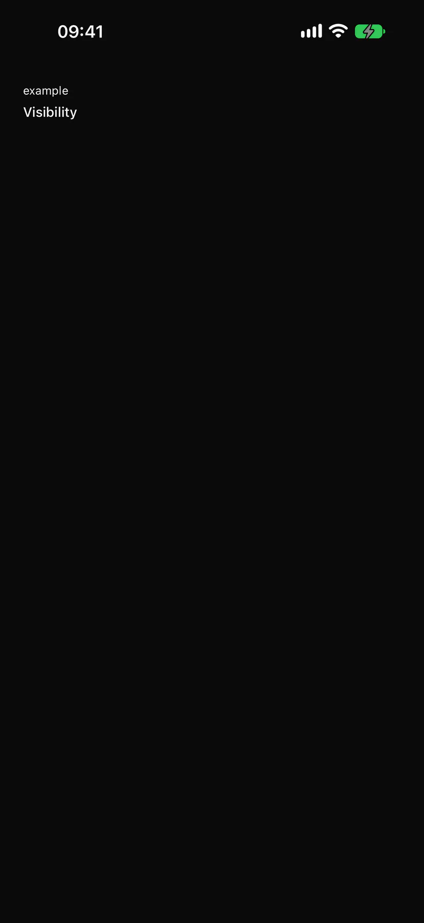
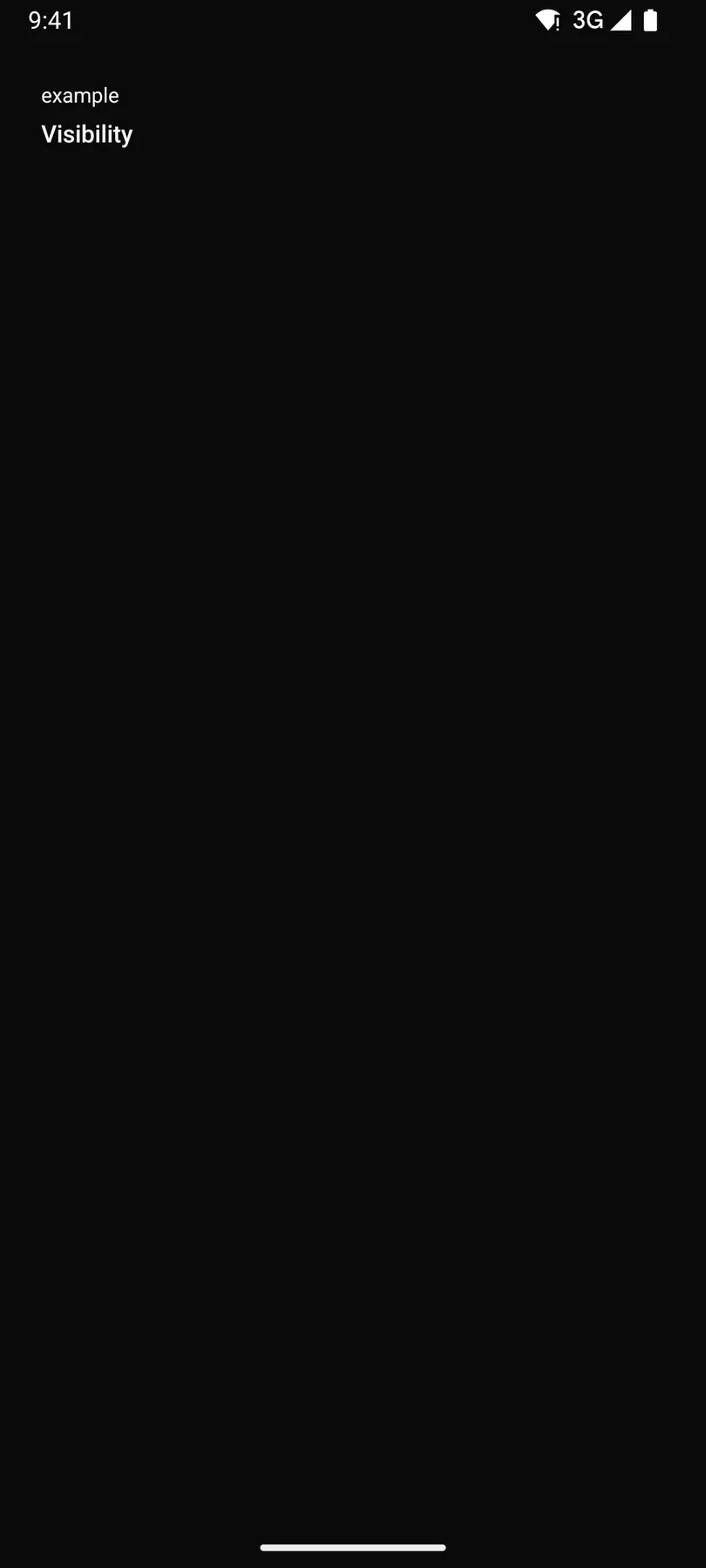
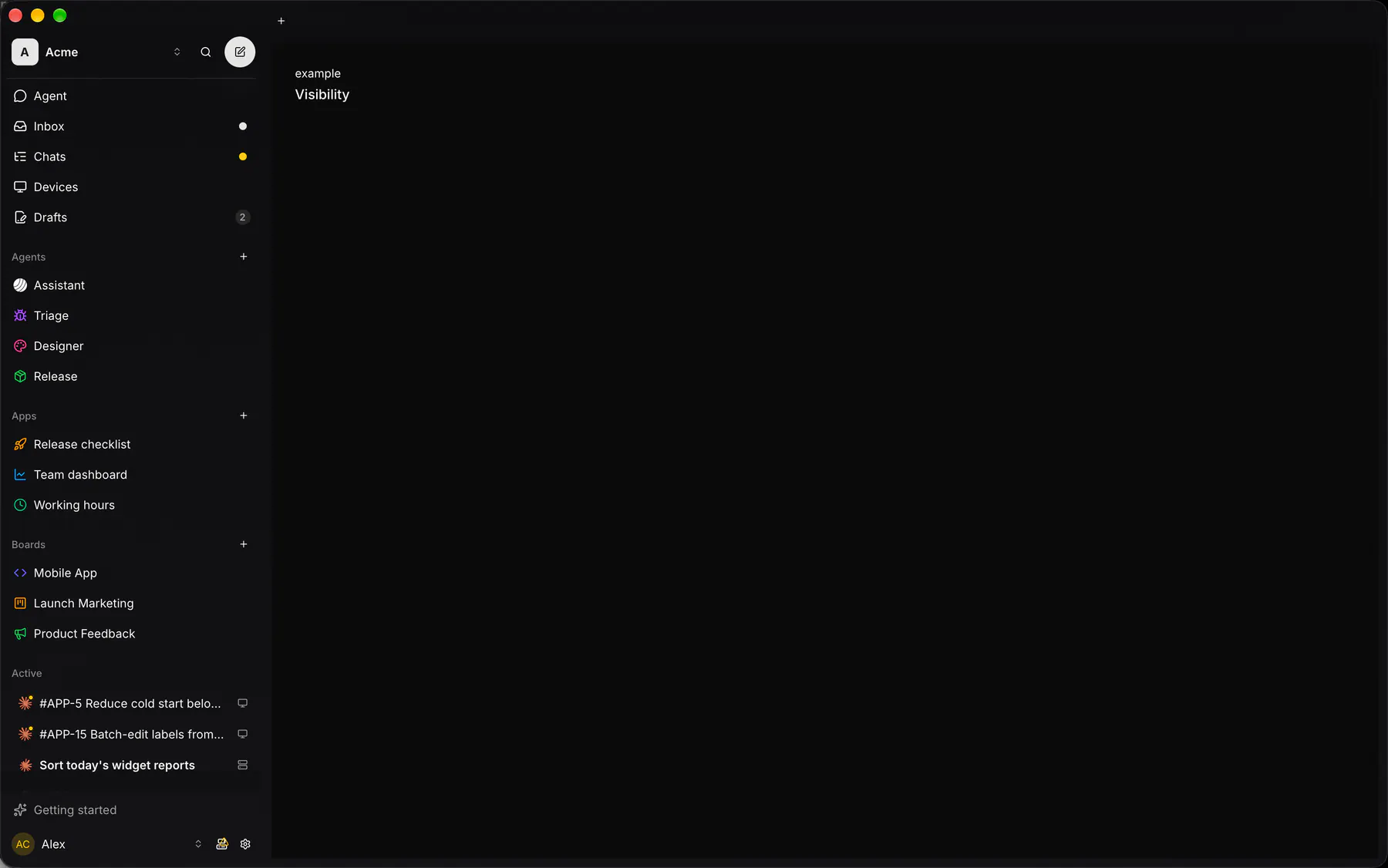
Section titled “Platforms”The same specimen painted by React, SwiftUI, Compose and gpui.

Variants
Section titled “Variants”required
Visibility*
| Prop | Type | Required | Bindable | Description |
|---|---|---|---|---|
text |
string |
yes | yes | The caption. |
for |
string |
– | – | The id of the control it labels. |
required |
boolean |
– | – | Adds the required mark. Default false. |
Events
Section titled “Events”None.
None.
Children
Section titled “Children”none
A2UI basic mapping
Section titled “A2UI basic mapping”No basic catalog component maps here.
Built from
Section titled “Built from”Accessibility
Section titled “Accessibility”Role: text
label of the control named by for
| Keys | Action |
|---|---|
| – | Pressing it focuses that control |
Theming
Section titled “Theming”Recipe parts: Label/root Label/text Label/mark
Keyed by: required :hover :pressed :focus :disabled :checked :open :selected :invalid :dragover