

Page
A screen: an AppBar row (back, title, trailing actions) over a padded scrolling body.
Group: Layout · Kind: macro · in the lite catalog
Preview
Section titled “Preview”example
SettingsAcme
General
Team nameAcme
TimezoneEurope/Vienna
padded · false
Members
General
Team nameAcme
TimezoneEurope/Vienna
Platforms
Section titled “Platforms”The same specimen painted by React, SwiftUI, Compose and gpui.
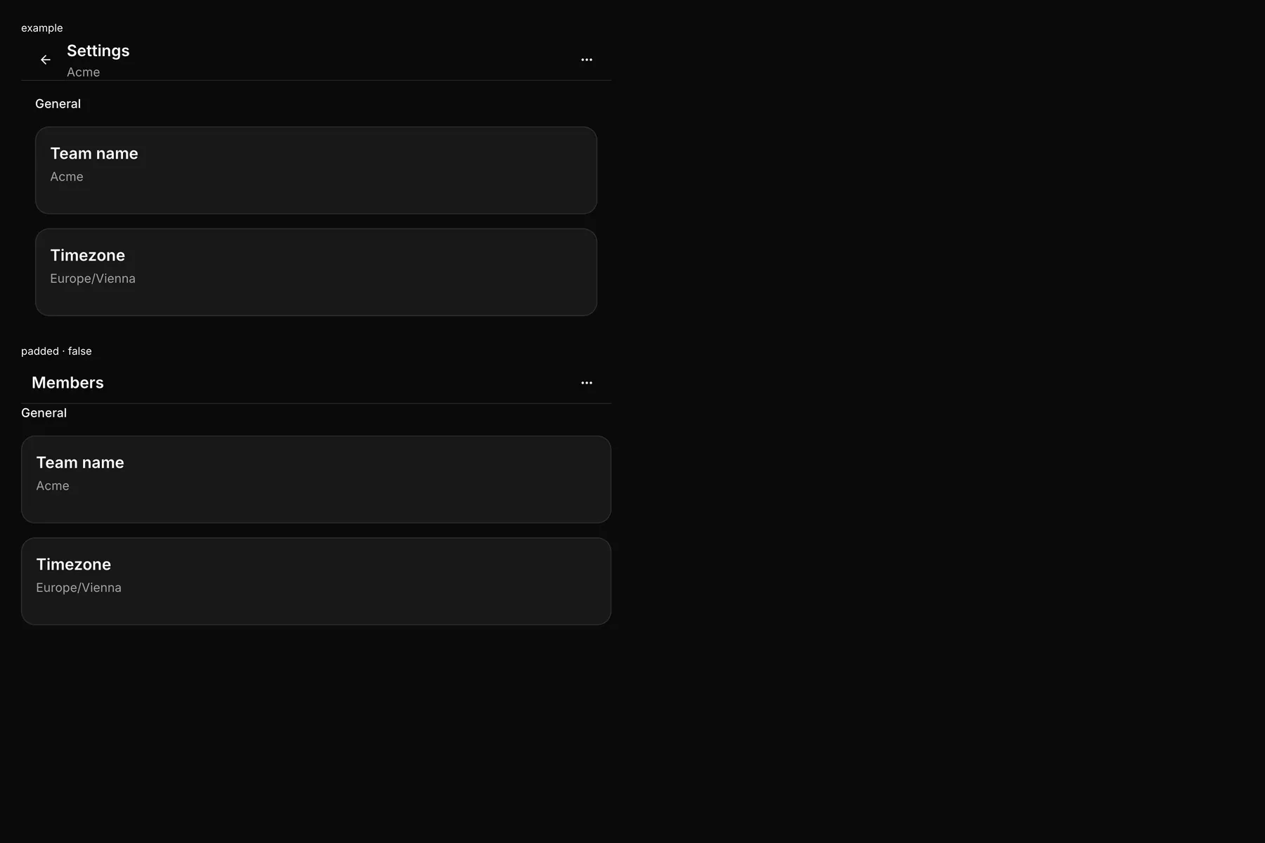
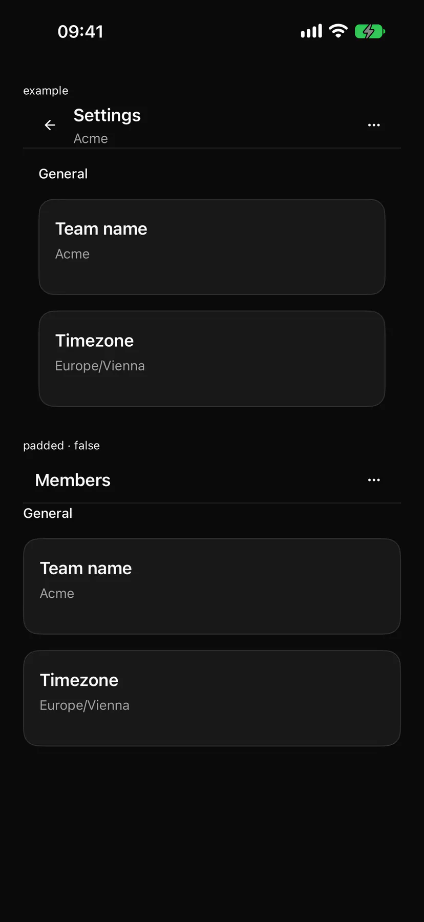
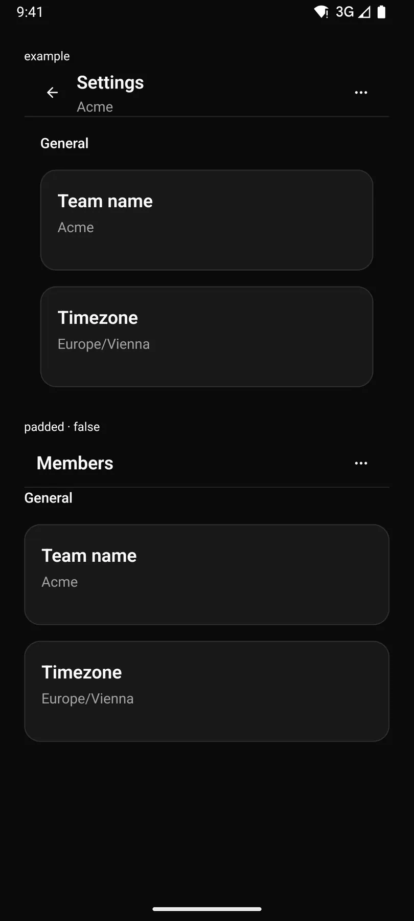
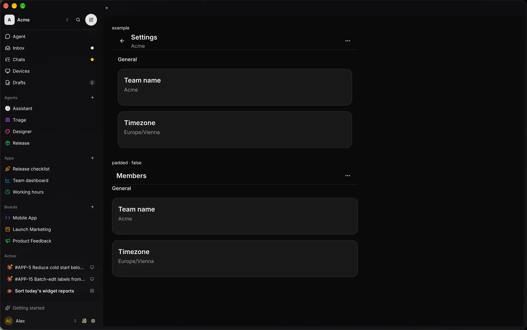
| Prop | Type | Required | Bindable | Description |
|---|---|---|---|---|
title |
string |
yes | yes | The screen title. |
subtitle |
string |
– | yes | A muted line under the title. |
back |
boolean |
– | – | Shows a back button that fires back. Default false. |
padded |
boolean |
– | – | Pads the body; off for edge-to-edge lists. Default true. |
Events
Section titled “Events”on.back: runs an action
leading: one component by idtrailing: one component by id
Children
Section titled “Children”many
A2UI basic mapping
Section titled “A2UI basic mapping”No basic catalog component maps here.
Built from
Section titled “Built from”Accessibility
Section titled “Accessibility”Role: none
Layout only: its header is the AppBar (banner, the title heading level 1), its body the main landmark ($a11y).
| Keys | Action |
|---|---|
| – | Enter, Space on back |
Theming
Section titled “Theming”Recipe parts: Page/root Page/header Page/body
Keyed by: :hover :pressed :focus :disabled :checked :open :selected :invalid :dragover
Related
Section titled “Related”AppBar · Box · Stack · Grid · Card · Separator · List · Resizable