

CodeBlock
Source code in a mono block: syntax colouring, optional line numbers, a copy button.
Group: Text · Kind: native · in the lite catalog
Preview
Section titled “Preview”example
ts
const answer = 42 // the answer
variant · default
ts
const answer = 42 // the answer
variant · destructive
ts
const answer = 42 // the answer
size · default
ts
const answer = 42 // the answer
size · sm
ts
const answer = 42 // the answer
Platforms
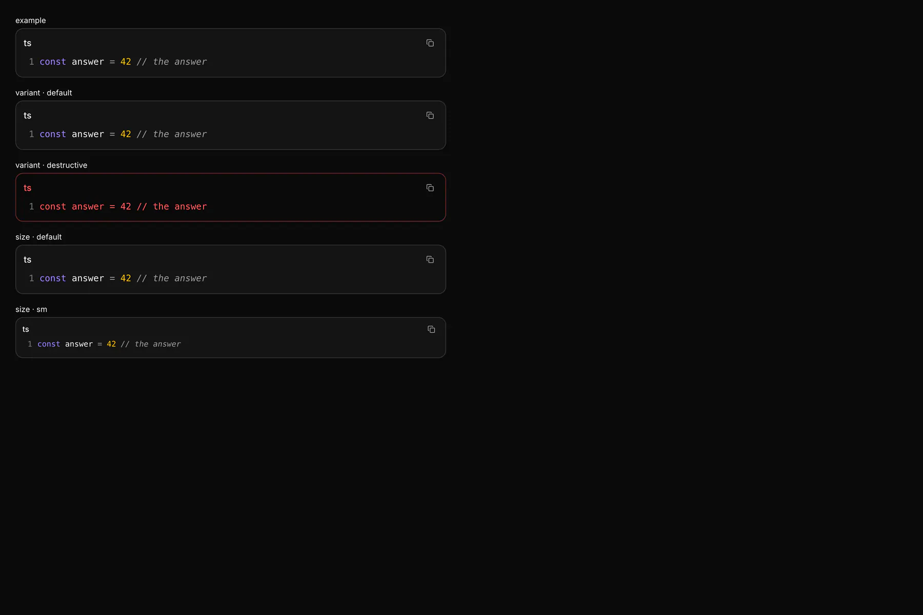
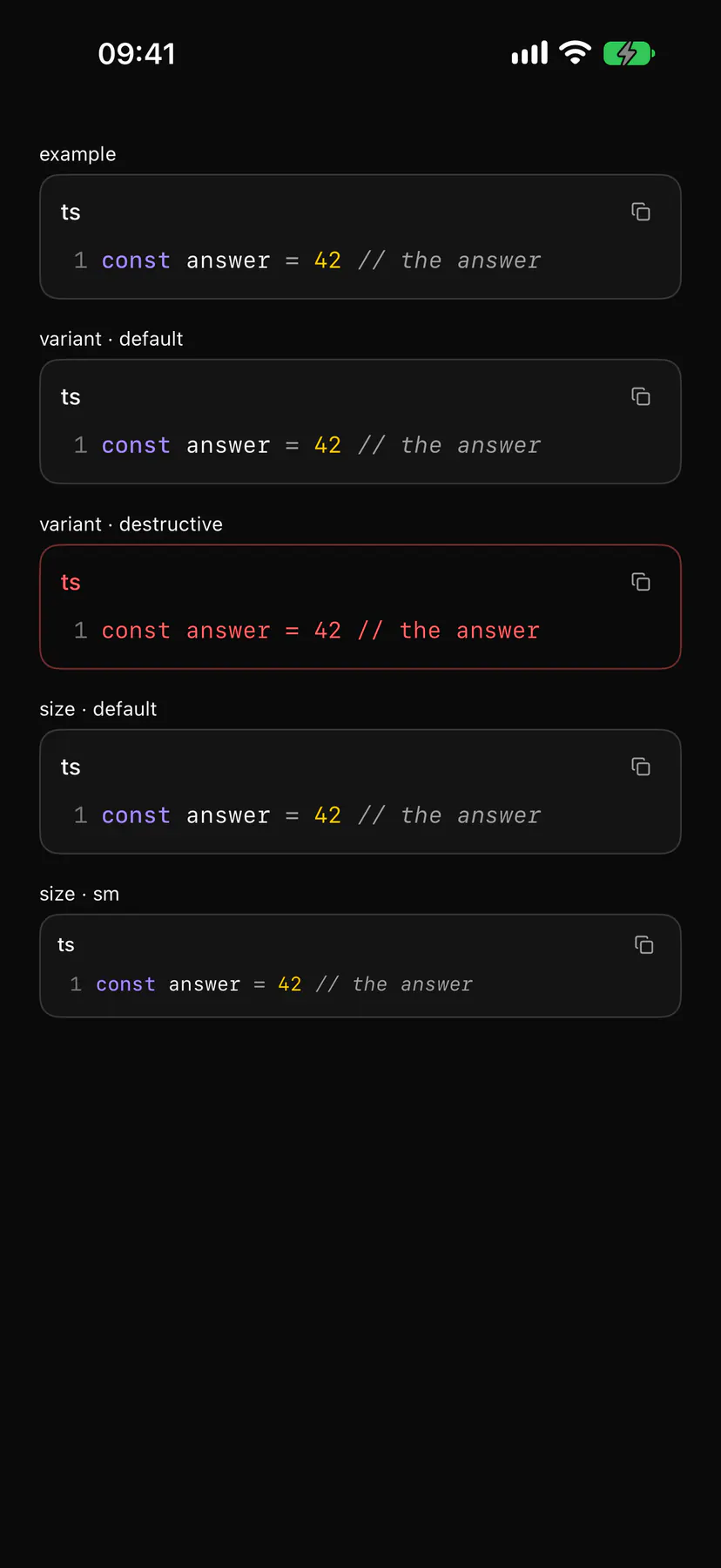
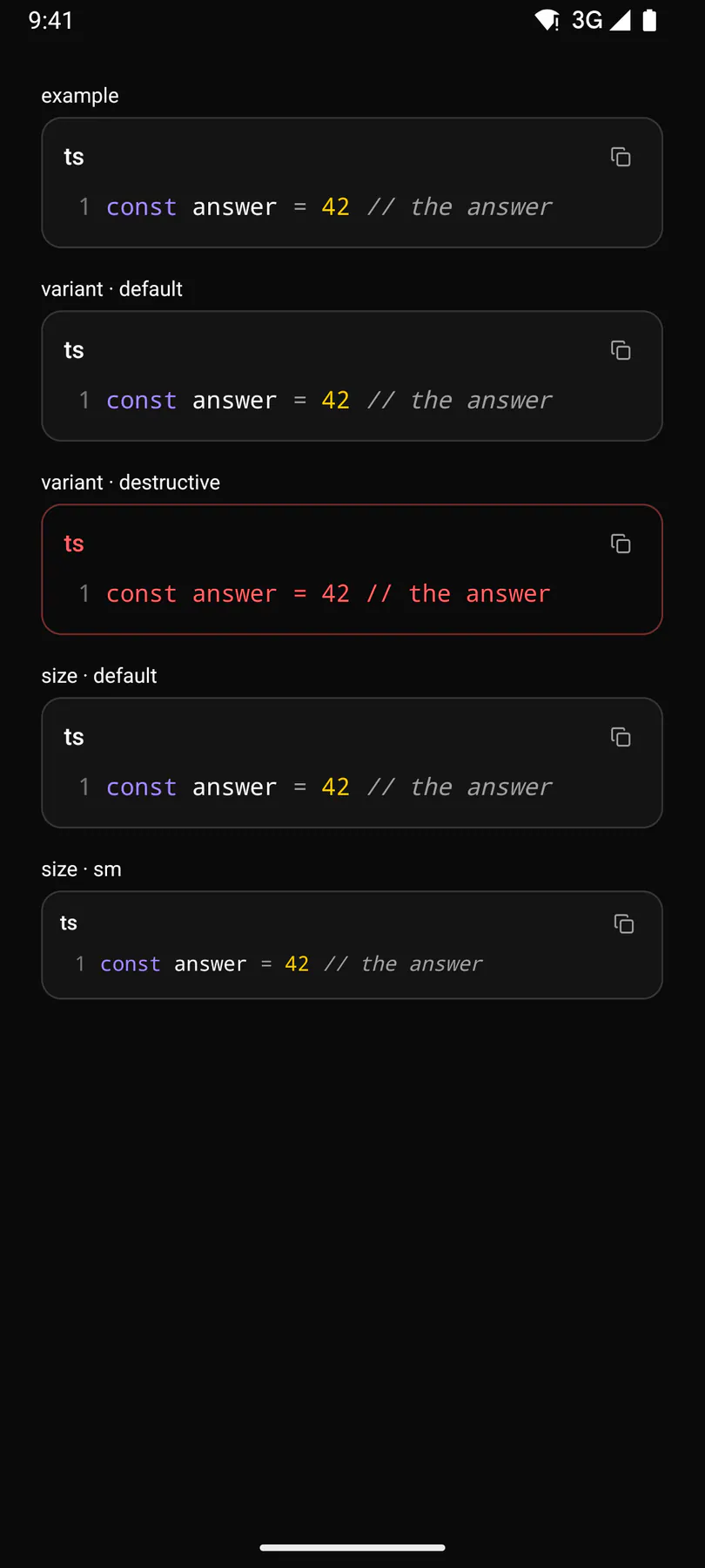
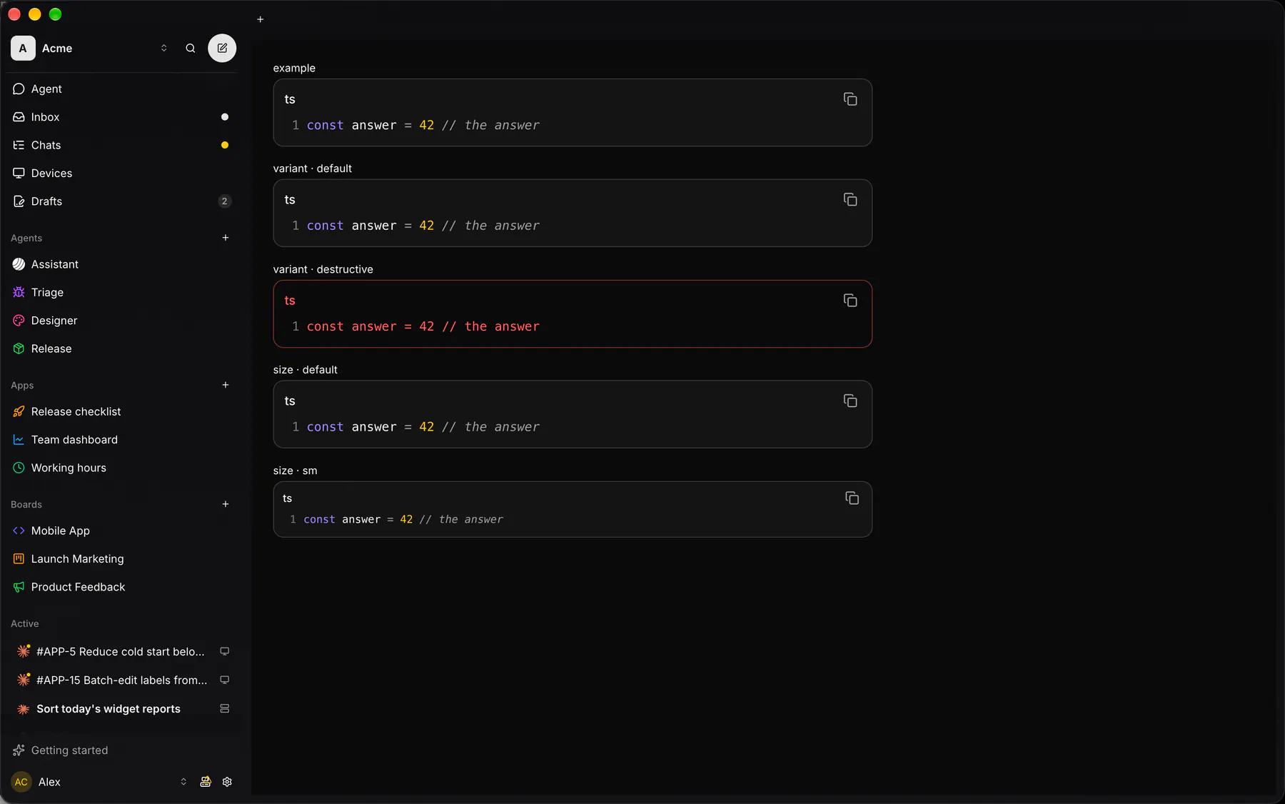
Section titled “Platforms”The same specimen painted by React, SwiftUI, Compose and gpui.
Variants
Section titled “Variants”wrap
ts
const answer = 42 // the answer
| Prop | Type | Required | Bindable | Description |
|---|---|---|---|---|
code |
string |
yes | yes | The source text. |
language |
plain | json | js | ts | tsx | rust | swift | kotlin | python | bash | html | css | sql | yaml | markdown | ansi |
– | – | The syntax colouring. Default "plain". |
title |
string |
– | – | A header line (a file name). |
lineNumbers |
boolean |
– | – | Shows a line-number gutter. Default false. |
wrap |
boolean |
– | – | Wraps long lines instead of scrolling sideways. Default false. |
copyable |
boolean |
– | – | Shows the copy-to-clipboard button. Default true. |
highlight |
[number] |
– | – | 1-based line numbers to emphasise. |
maxLines |
number |
– | – | Lines shown before the block scrolls. |
variant |
default | destructive |
– | yes | destructive = failed output. Default "default". |
size |
default | sm |
– | – | sm = compact. Default "default". |
Events
Section titled “Events”None.
None.
Children
Section titled “Children”none
A2UI basic mapping
Section titled “A2UI basic mapping”No basic catalog component maps here.
Built from
Section titled “Built from”A native component: every renderer paints it directly.
Accessibility
Section titled “Accessibility”Role: region
region (code), copy = button
| Keys | Action |
|---|---|
Tab reaches the copy button; Enter Space |
copy and announce copied |
Theming
Section titled “Theming”Recipe parts: CodeBlock/root CodeBlock/header CodeBlock/title CodeBlock/copy CodeBlock/gutter CodeBlock/line CodeBlock/lineNumber CodeBlock/token CodeBlock/body CodeBlock/code
Keyed by: lineNumbers wrap kind variant size :hover :pressed :focus :disabled :checked :open :selected :invalid :dragover