

Chip
A small token: a pill (filter, label, state) or a rect naming an entity with a glyph or image; removable.
Group: Feedback · Kind: macro · in the lite catalog
Preview
Section titled “Preview”example
Drafts
shape · pill
Drafts
shape · rect
Drafts
tone · neutral
Drafts
tone · primary
Drafts
tone · success
Drafts
tone · warning
Drafts
tone · danger
Drafts
Platforms
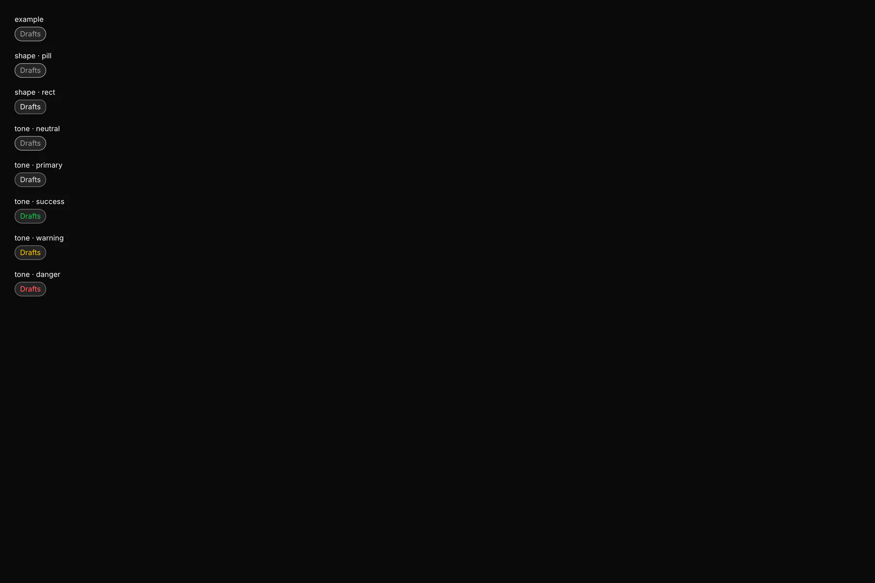
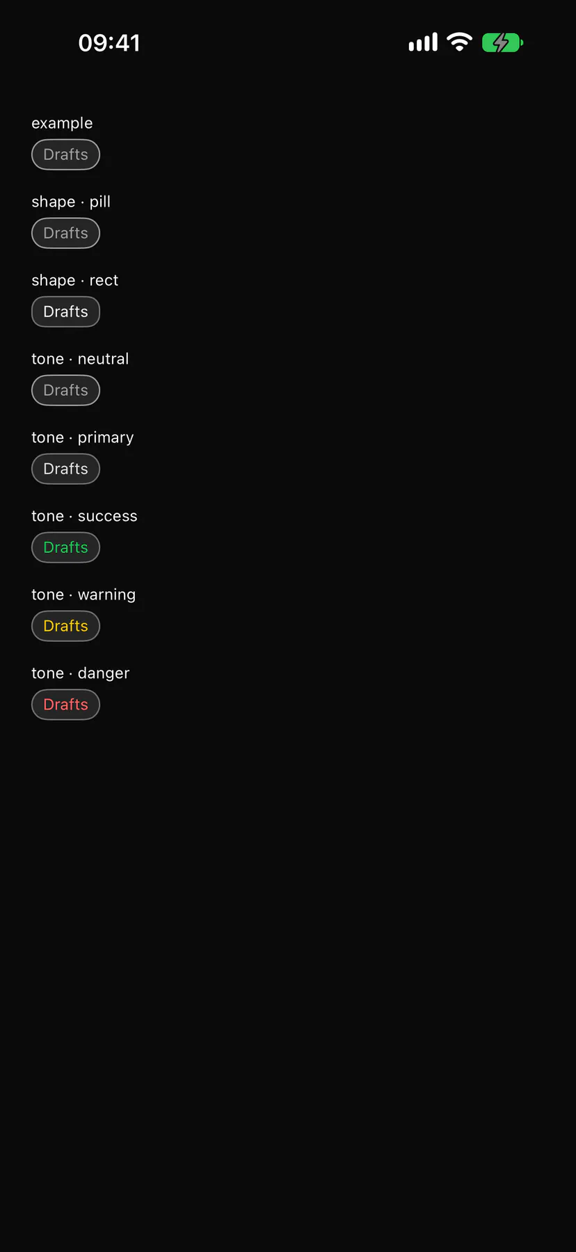
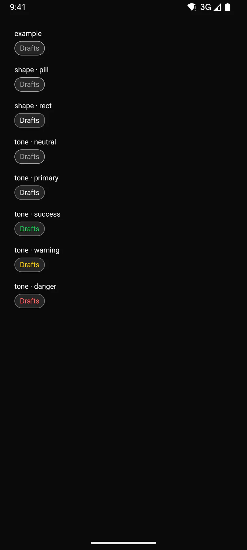
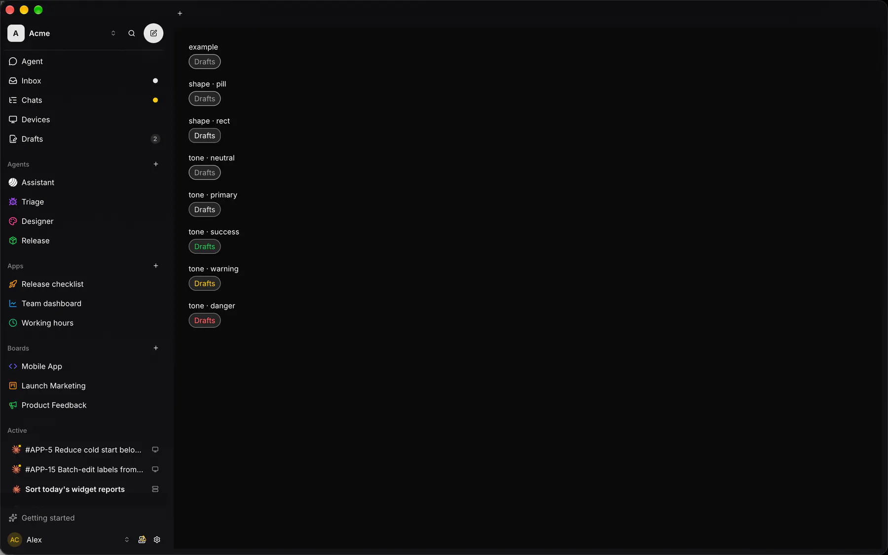
Section titled “Platforms”The same specimen painted by React, SwiftUI, Compose and gpui.
Variants
Section titled “Variants”tone · info
Drafts
removable
Drafts
| Prop | Type | Required | Bindable | Description |
|---|---|---|---|---|
label |
string |
yes | yes | The chip text. |
shape |
pill | rect |
– | – | A rounded pill or a squarer entity chip. Default "pill". |
selected |
boolean |
– | – | Draws it as the active choice. Default false. |
tone |
neutral | primary | success | warning | danger | info |
– | yes | Colour tone of the chip. Default "neutral". |
dot |
color |
– | – | A colour dot before the text (a label chip). |
icon |
icon |
– | – | An icon before the text. |
image |
url |
– | – | A round picture instead of the icon. |
detail |
string |
– | – | Muted text after the label. |
removable |
boolean |
– | – | Shows a remove control that fires remove. Default false. |
pressable |
boolean |
– | – | Makes it a press target that fires press. Default false. |
Events
Section titled “Events”on.press: runs an actionon.remove: runs an action
leading: one component by id
Children
Section titled “Children”none
A2UI basic mapping
Section titled “A2UI basic mapping”No basic catalog component maps here.
Built from
Section titled “Built from”Box · Button · Icon · Image · Text
Accessibility
Section titled “Accessibility”Role: button
button with aria-pressed (= selected) when pressable, text otherwise ($a11y); remove = button labelled remove
| Keys | Action |
|---|---|
Enter Space |
press; Delete, Backspace: remove when removable |
Theming
Section titled “Theming”Recipe parts: Chip/root Chip/dot Chip/image Chip/icon Chip/label Chip/detail Chip/remove
Keyed by: shape selected tone :hover :pressed :focus :disabled :checked :open :selected :invalid :dragover
Related
Section titled “Related”Button · Icon · Image · Text · Badge · Alert · EmptyState · Progress