

Rating
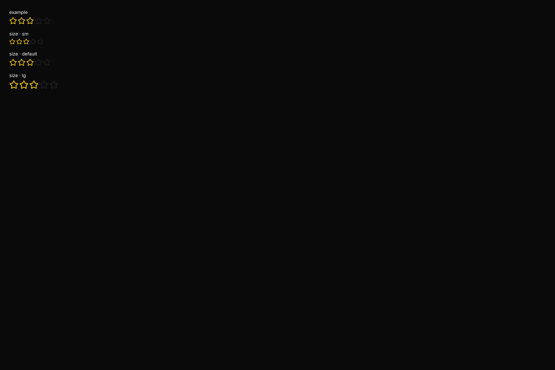
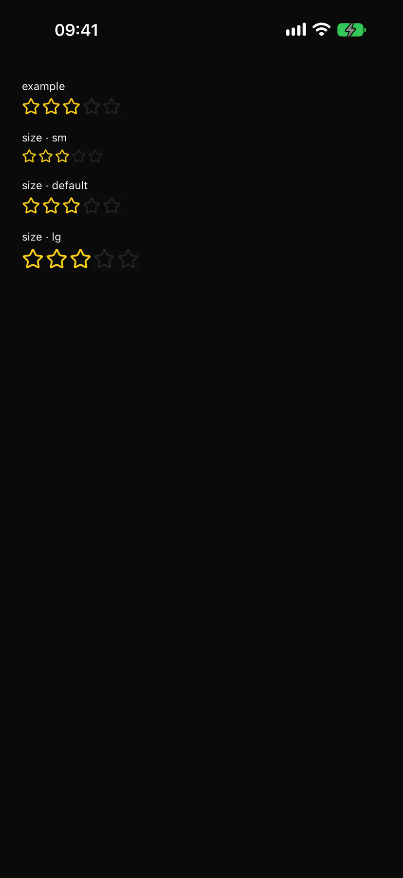
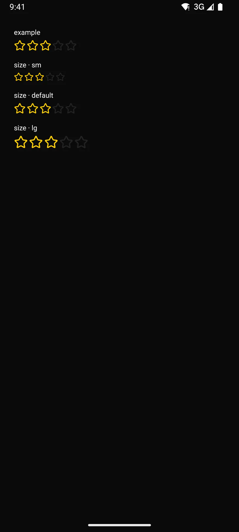
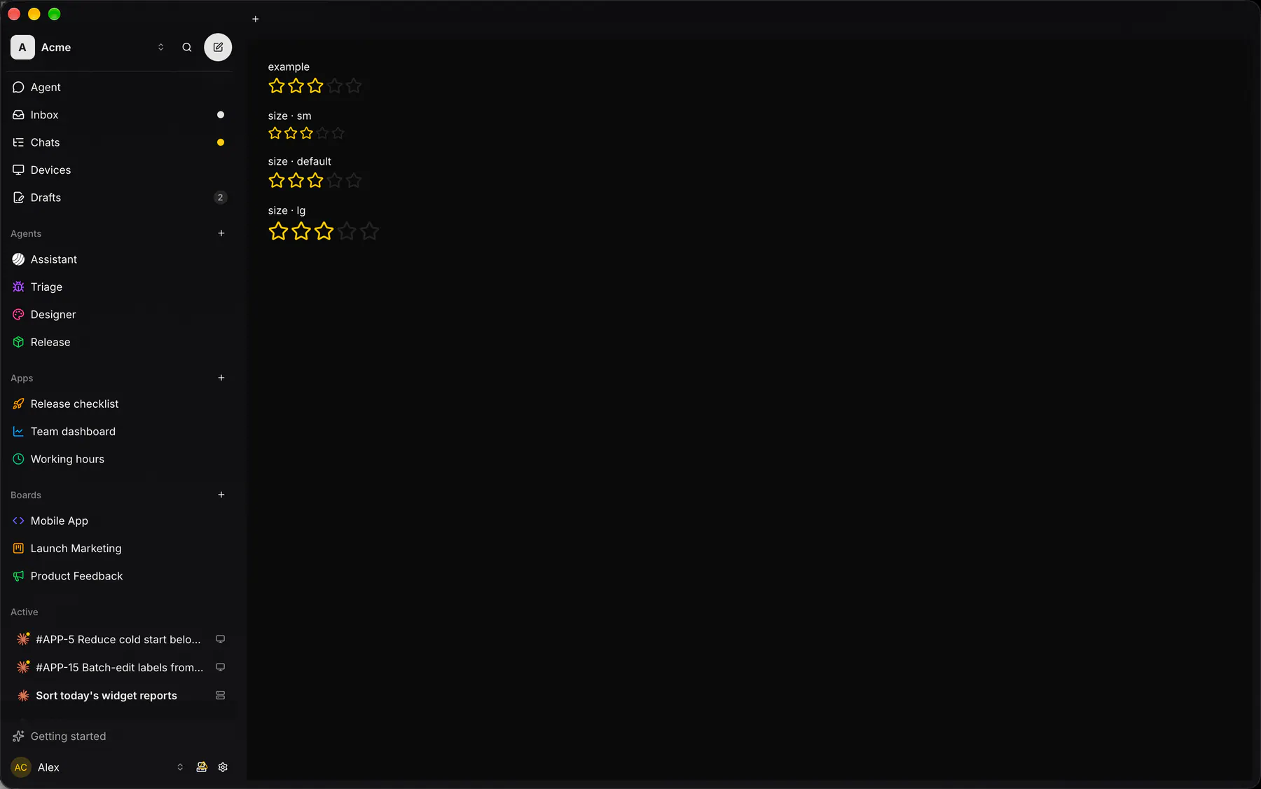
A row of stars scoring out of max; readOnly only displays.
Group: Inputs · Kind: macro · in the lite catalog
Preview
Section titled “Preview”Platforms
Section titled “Platforms”The same specimen painted by React, SwiftUI, Compose and gpui.
Variants
Section titled “Variants”| Prop | Type | Required | Bindable | Description |
|---|---|---|---|---|
value |
number |
– | yes | The score, 0 to max. Default 0. |
max |
number |
– | – | How many stars (1 to 100). Default 5. |
readOnly |
boolean |
– | – | Display only; no presses. Default false. |
size |
sm | default | lg |
– | – | Star size. Default "default". |
Events
Section titled “Events”on.change: runs an action
None.
Children
Section titled “Children”none
A2UI basic mapping
Section titled “A2UI basic mapping”No basic catalog component maps here.
Built from
Section titled “Built from”Accessibility
Section titled “Accessibility”Role: group
A group of star buttons: each labelled ratingStar (“3 of 5”), the chosen one aria-pressed; read-only stars leave the tree and the group is an img labelled ratingValue ($a11y).
| Keys | Action |
|---|---|
Tab through the stars; Enter Space |
rate |
Theming
Section titled “Theming”Recipe parts: Rating/root Rating/star Rating/icon
Keyed by: size readOnly filled :hover :pressed :focus :disabled :checked :open :selected :invalid :dragover
Related
Section titled “Related”Icon · Form · FieldGroup · FormActions · Input · Textarea · NumberField · Checkbox