

Tooltip
A short hint shown on hover or long-press over its children.
Group: Overlays · Kind: native
Preview
Section titled “Preview”example
Copy linkCopy link
Platforms
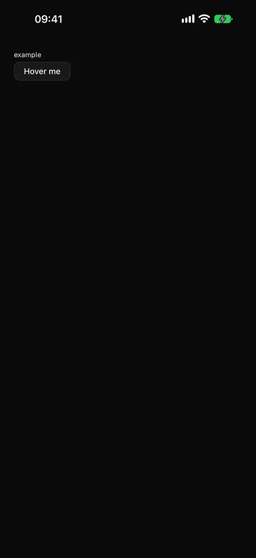
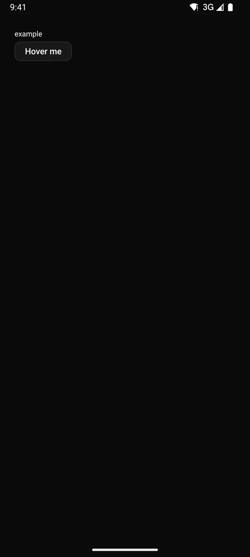
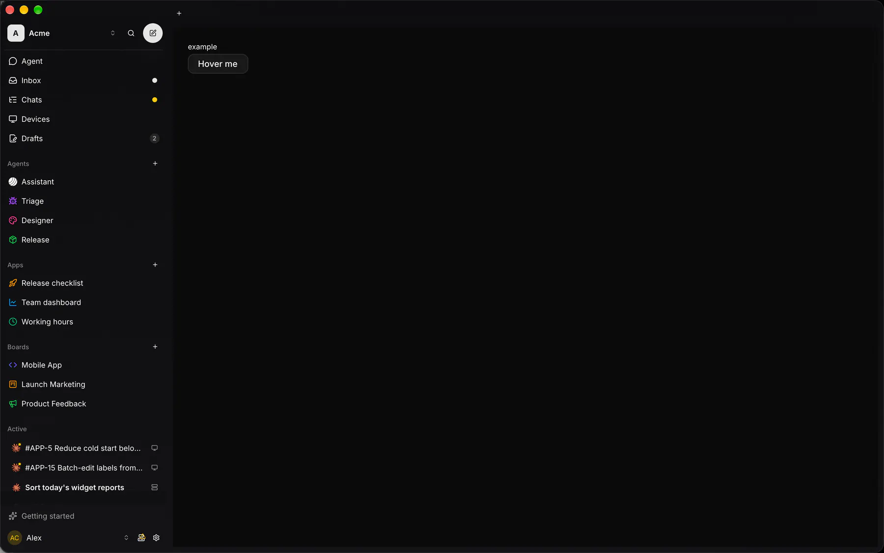
Section titled “Platforms”The same specimen painted by React, SwiftUI, Compose and gpui.

| Prop | Type | Required | Bindable | Description |
|---|---|---|---|---|
content |
string |
yes | – | The hint text. |
side |
top | right | bottom | left |
– | – | Preferred side of the anchor. Default "top". |
Events
Section titled “Events”None.
None.
Children
Section titled “Children”many
A2UI basic mapping
Section titled “A2UI basic mapping”No basic catalog component maps here.
Built from
Section titled “Built from”A native component: every renderer paints it directly.
Accessibility
Section titled “Accessibility”Role: tooltip
tooltip describing its anchor
| Keys | Action |
|---|---|
| – | Shows on hover AND keyboard focus of the anchor (after the platform delay); Escape hides |
Theming
Section titled “Theming”Recipe parts: Tooltip/content Tooltip/arrow Tooltip/anchor
Keyed by: side :hover :pressed :focus :disabled :checked :open :selected :invalid :dragover
Related
Section titled “Related”CallSurface · Dialog · Drawer · DockCard · AlertDialog · Popover · Menu · Toast