

Tabs
Tab navigation; the child at index i is the panel of tab i.
Group: Navigation · Kind: native · in the lite catalog
Preview
Section titled “Preview”example
The issue panel.
Platforms
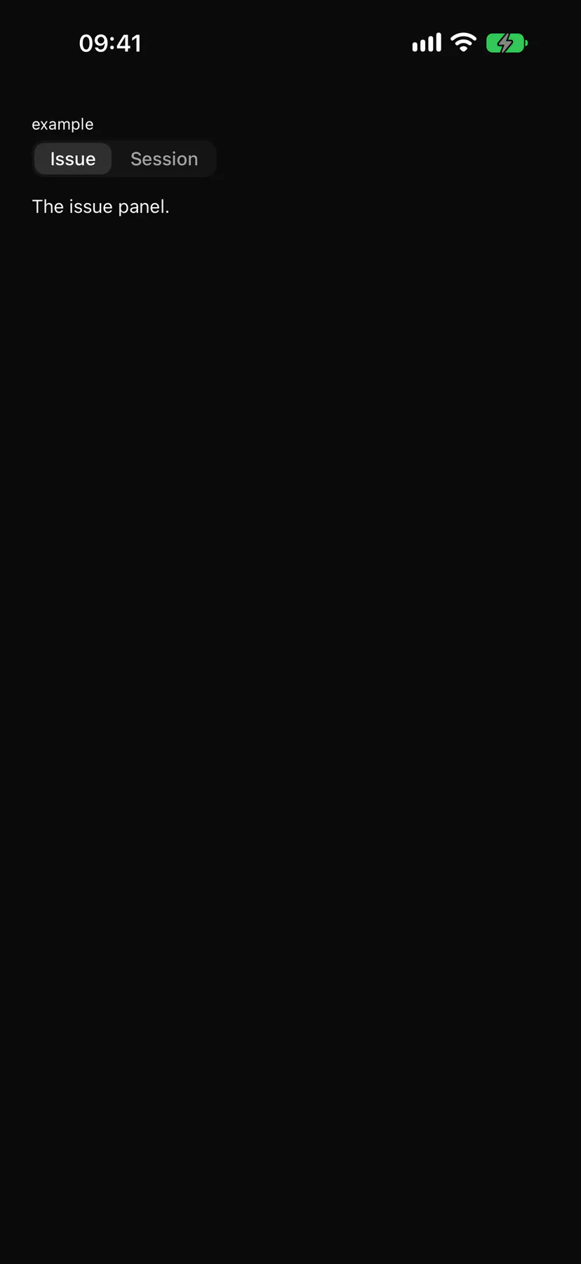
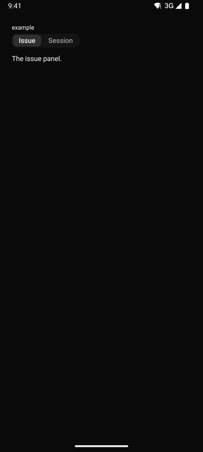
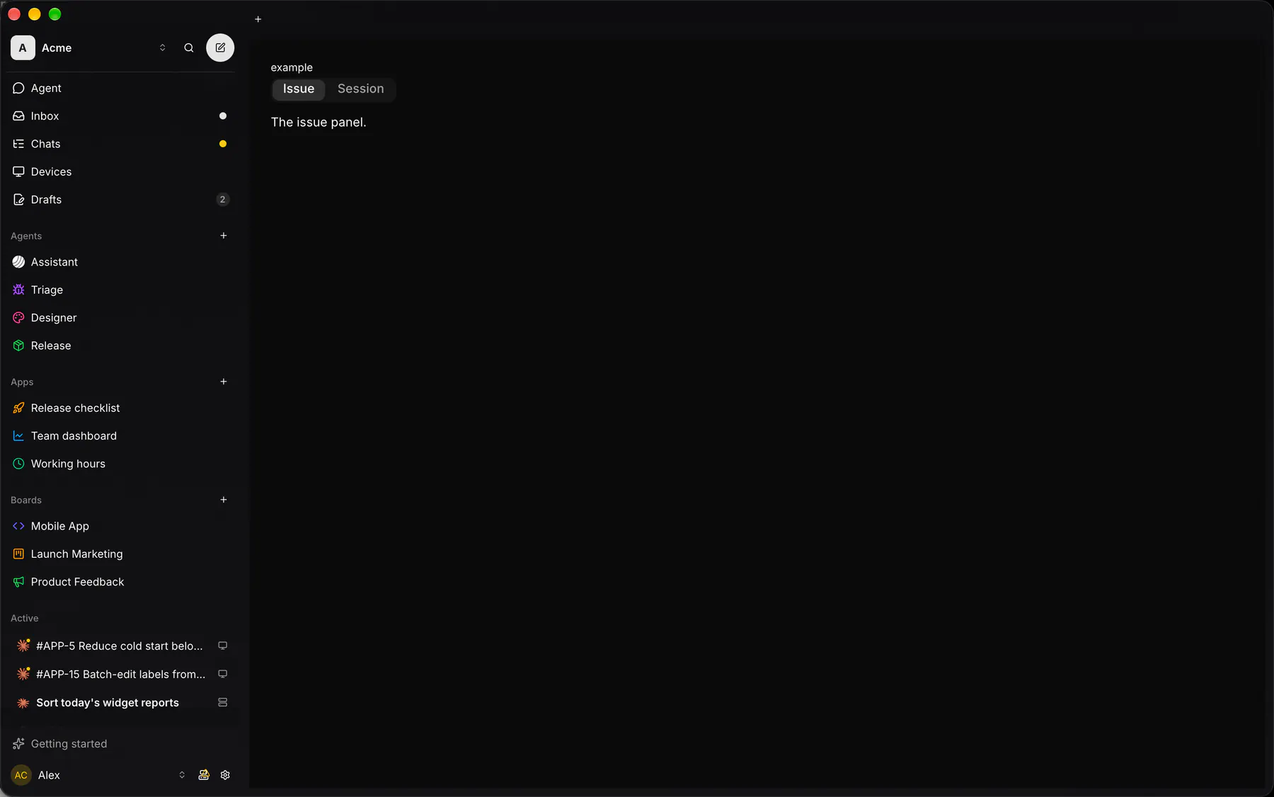
Section titled “Platforms”The same specimen painted by React, SwiftUI, Compose and gpui.

Variants
Section titled “Variants”fill
The issue panel.
closable · none
The issue panel.
closable · hover
The issue panel.
closable · always
The issue panel.
addable
The issue panel.
| Prop | Type | Required | Bindable | Description |
|---|---|---|---|---|
tabs |
[tab] |
yes | – | The tab headers in order. |
value |
string |
– | yes | The active tab’s value; bind it for two-way state. |
fill |
boolean |
– | – | Stretches the headers across the width. Default false. |
closable |
none | hover | always |
– | – | Close glyphs firing close; hover = on hover. Default "none". |
addable |
boolean |
– | – | A + button firing new. Default false. |
Events
Section titled “Events”on.change: runs an actionon.close: runs an actionon.new: runs an action
None.
Children
Section titled “Children”many
A2UI basic mapping
Section titled “A2UI basic mapping”The basic catalog’s Tabs renders as Tabs.
Built from
Section titled “Built from”A native component: every renderer paints it directly.
Accessibility
Section titled “Accessibility”Role: tablist
tablist / tab / tabpanel
| Keys | Action |
|---|---|
| – | Roving tab stop on the tabs |
ArrowLeft ArrowRight |
previous/next tab, activating it (wraps) |
Home End |
first/last tab |
Tab |
into the active panel |
| – | Each close glyph (labelled closeTab, revealed by keyboard focus too) is a button after its tab; the + button (labelled newTab) follows the last tab |
Theming
Section titled “Theming”Recipe parts: Tabs/root Tabs/list Tabs/tab Tabs/indicator Tabs/content Tabs/close Tabs/new
Keyed by: fill closable addable :hover :pressed :focus :disabled :checked :open :selected :invalid :dragover
Related
Section titled “Related”Segmented · Accordion · Collapsible · Pagination · Breadcrumb · Outline · Stepper