

Alert
An inline banner with an icon, a title and a message.
Group: Feedback · Kind: macro · in the lite catalog
Preview
Section titled “Preview”example
Saved
type · info
Saved
type · warning
Saved
type · error
Saved
Platforms
Section titled “Platforms”The same specimen painted by React, SwiftUI, Compose and gpui.
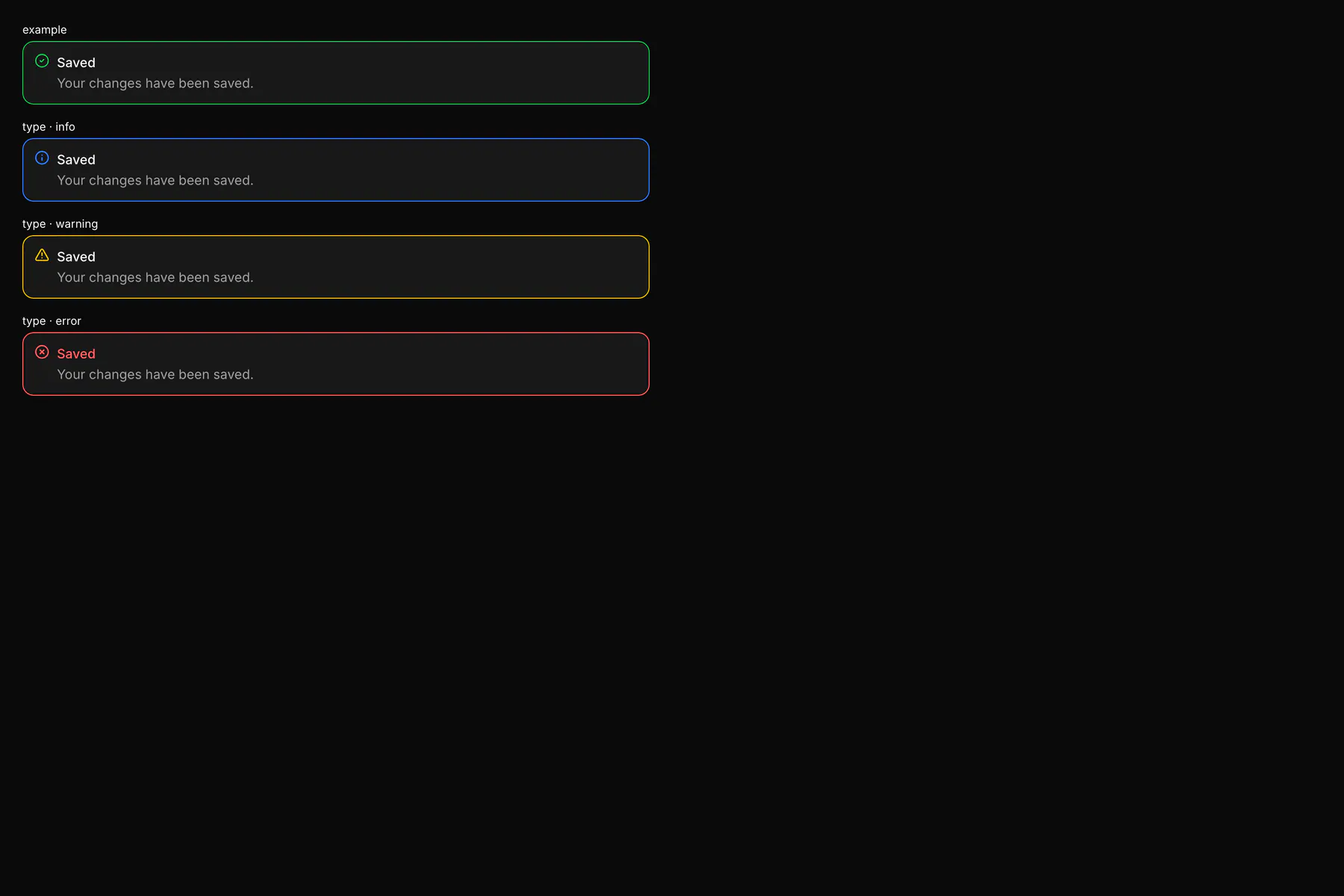
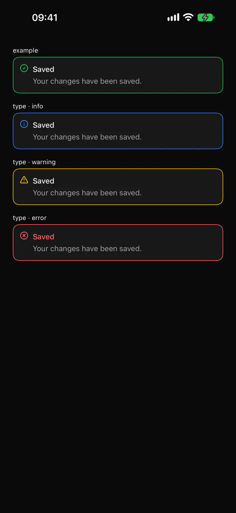
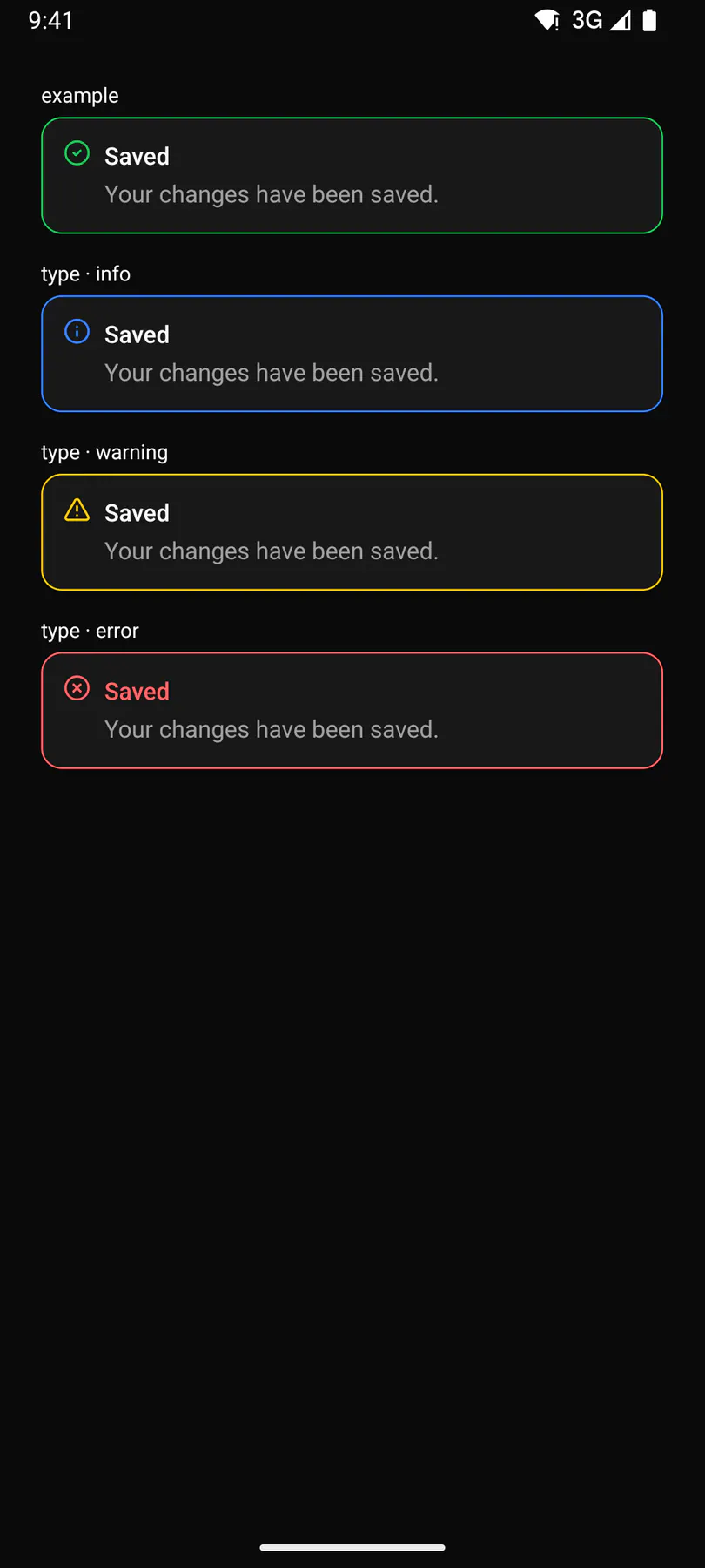
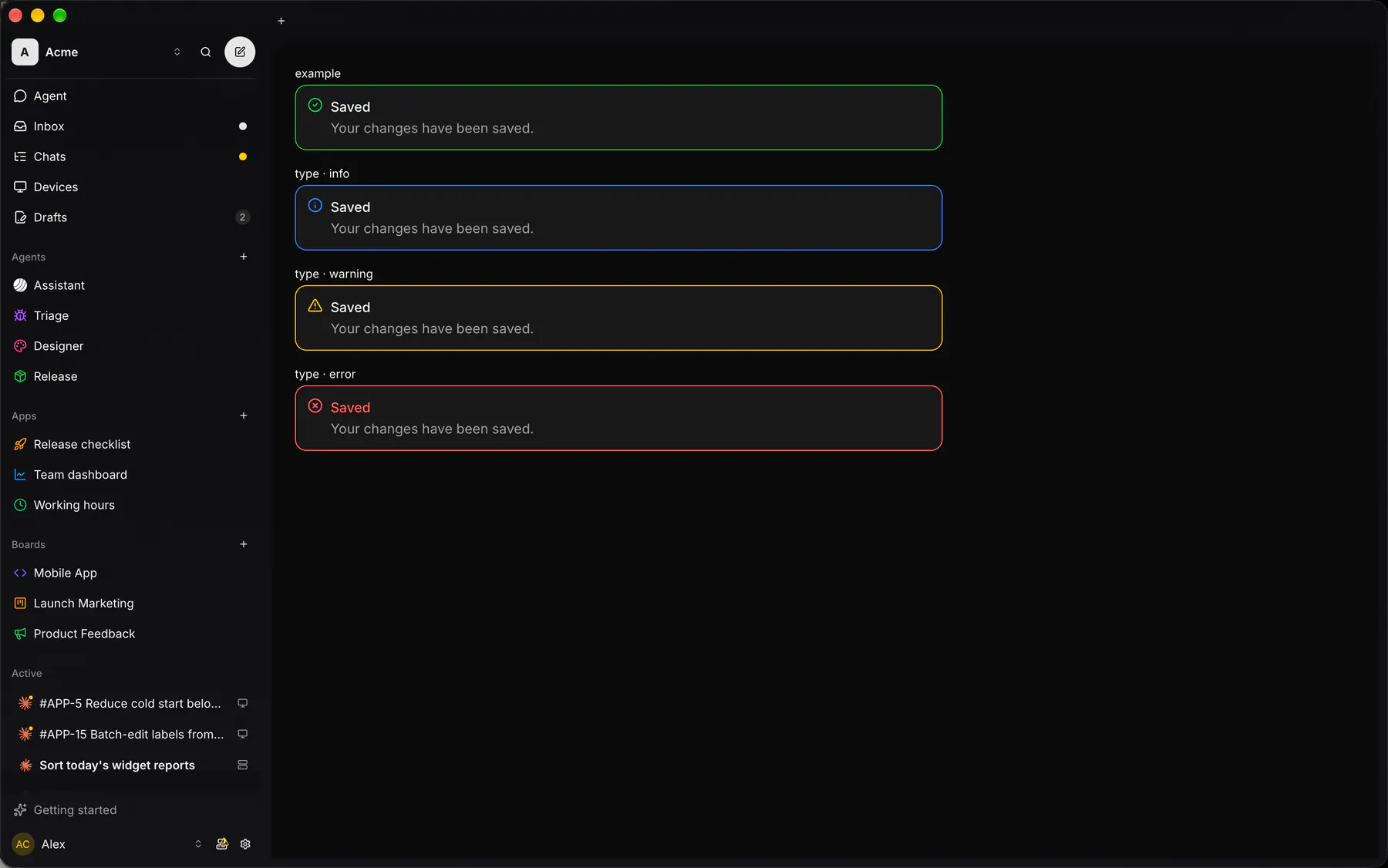
| Prop | Type | Required | Bindable | Description |
|---|---|---|---|---|
title |
string |
yes | – | The banner heading. |
message |
string |
– | – | The detail under the heading. |
type |
info | success | warning | error |
– | – | The severity, which picks the icon and tone. Default "info". |
Events
Section titled “Events”None.
None.
Children
Section titled “Children”none
A2UI basic mapping
Section titled “A2UI basic mapping”No basic catalog component maps here.
Built from
Section titled “Built from”Accessibility
Section titled “Accessibility”Role: alert
alert for warning/error, status otherwise. alert for warning/error, status otherwise ($a11y).
Not focusable; no keys.
Theming
Section titled “Theming”Recipe parts: Alert/root Alert/icon Alert/body Alert/title Alert/message
Keyed by: type :hover :pressed :focus :disabled :checked :open :selected :invalid :dragover
Related
Section titled “Related”Icon · Text · Badge · Chip · EmptyState · Progress · Meter · Ring