

Drawer
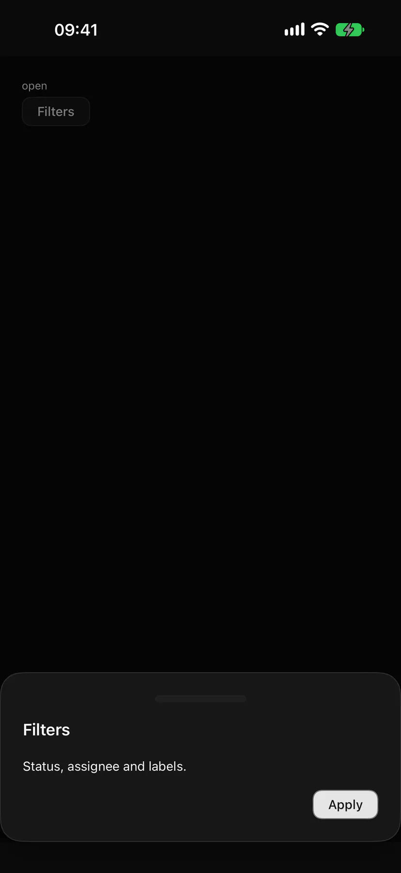
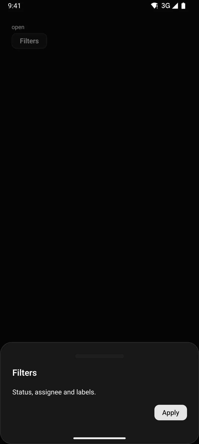
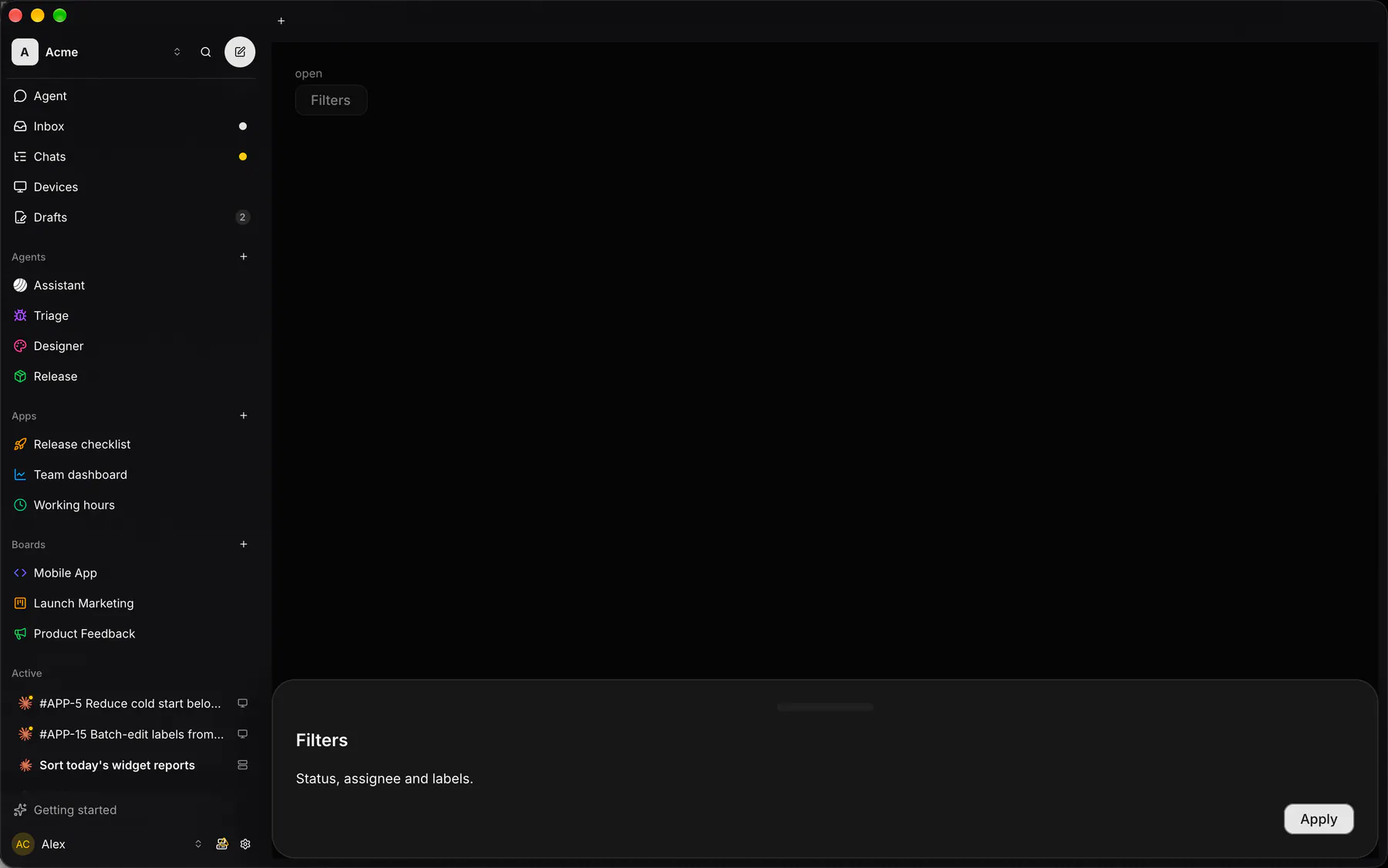
A panel sliding in from an edge (a bottom sheet on phones).
Group: Overlays · Kind: native
Preview
Section titled “Preview”open
Platforms
Section titled “Platforms”The same specimen painted by React, SwiftUI, Compose and gpui.

| Prop | Type | Required | Bindable | Description |
|---|---|---|---|---|
title |
string |
– | – | The drawer heading. |
description |
string |
– | – | A muted line under the heading. |
open |
boolean |
– | yes | Whether it shows; bind it to a boolean path. Default false. |
side |
top | right | bottom | left |
– | – | The edge it slides from; {base: "bottom", md: "right"} turns the phone sheet into a side panel on wide surfaces. Default "bottom". Responsive: takes a per-breakpoint object. |
dismissible |
boolean |
– | – | Closes on the backdrop or Escape. Default true. |
dragToDismiss |
boolean |
– | – | Lets a swipe toward its edge close it. Default true. |
Events
Section titled “Events”on.change: runs an action
trigger: one component by idfooter: one component by id
Children
Section titled “Children”many
A2UI basic mapping
Section titled “A2UI basic mapping”No basic catalog component maps here.
Built from
Section titled “Built from”A native component: every renderer paints it directly.
Accessibility
Section titled “Accessibility”Role: dialog
dialog (modal)
| Keys | Action |
|---|---|
| – | As Dialog; a swipe toward the edge closes when dragToDismiss |
Theming
Section titled “Theming”Recipe parts: Drawer/overlay Drawer/content Drawer/handle Drawer/title Drawer/description Drawer/footer
Keyed by: side dismissible :hover :pressed :focus :disabled :checked :open :selected :invalid :dragover
Related
Section titled “Related”DockCard · Dialog · AlertDialog · Popover · Tooltip · Menu · Toast