

Slider
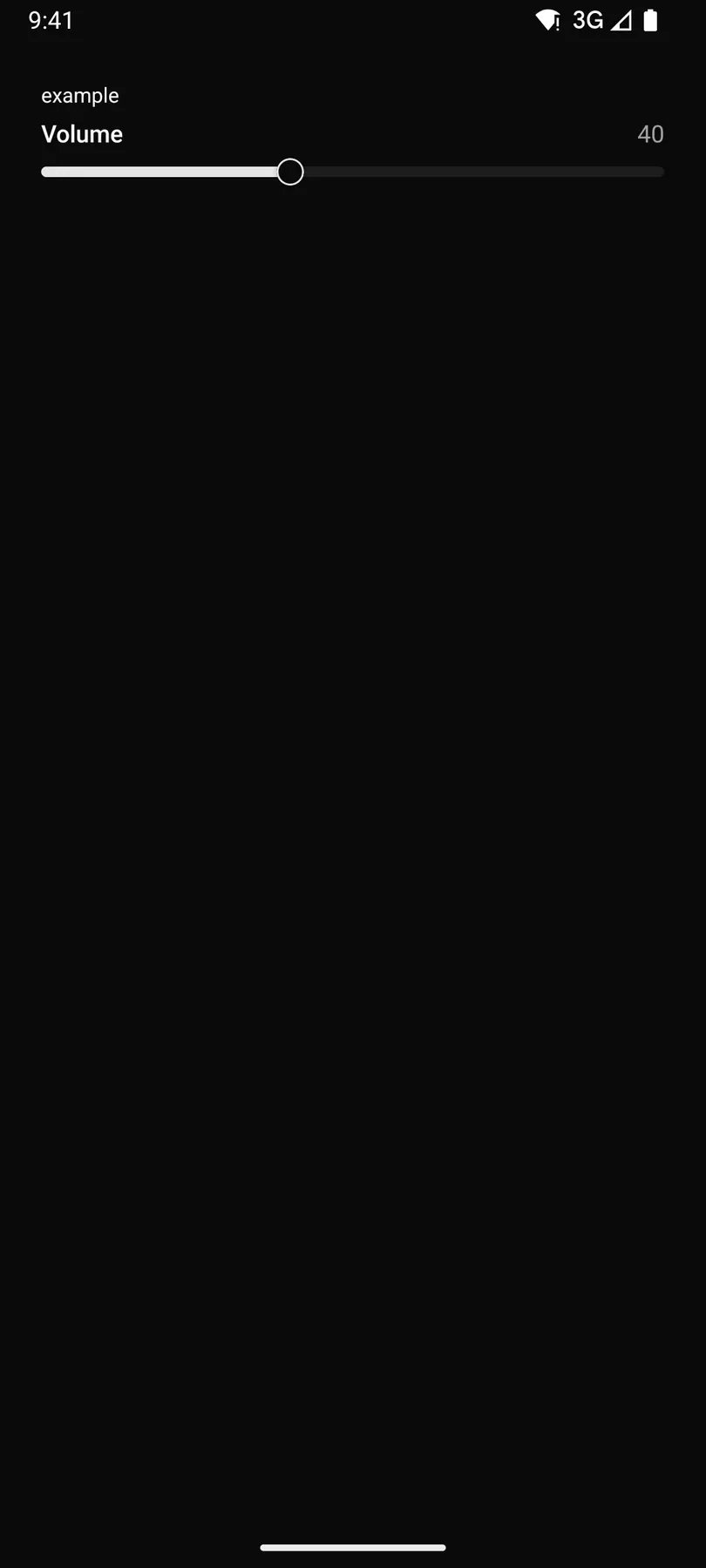
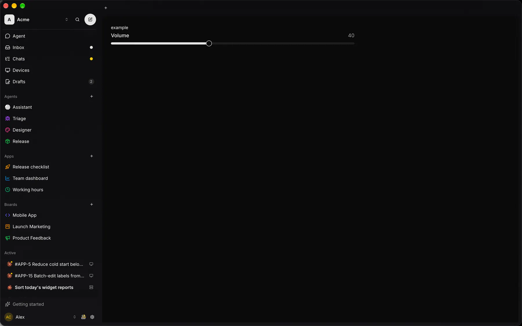
A range slider between min and max; bind value.
Group: Inputs · Kind: native
Preview
Section titled “Preview”Platforms
Section titled “Platforms”The same specimen painted by React, SwiftUI, Compose and gpui.


| Prop | Type | Required | Bindable | Description |
|---|---|---|---|---|
label |
string |
– | – | The field label. |
min |
number |
– | yes | The lowest value. Default 0. |
max |
number |
yes | yes | The highest value. |
step |
number |
– | – | The increment. Default 1. |
value |
number |
– | yes | The current value; bind it. |
Events
Section titled “Events”on.change: runs an action
None.
Children
Section titled “Children”none
A2UI basic mapping
Section titled “A2UI basic mapping”The basic catalog’s Slider renders as Slider.
Built from
Section titled “Built from”A native component: every renderer paints it directly.
Accessibility
Section titled “Accessibility”Role: slider
slider
| Keys | Action |
|---|---|
ArrowRight ArrowUp |
+ step; ArrowLeft/ArrowDown: - step |
PageUp PageDown |
± 10 steps |
Home End |
min/max |
Theming
Section titled “Theming”Recipe parts: Slider/root Slider/track Slider/range Slider/thumb Slider/label Slider/value Slider/header
Keyed by: :hover :pressed :focus :disabled :checked :open :selected :invalid :dragover
Related
Section titled “Related”Form · FieldGroup · FormActions · Input · Textarea · NumberField · Checkbox · Radio