

Accordion
Collapsible sections; the child at index i is the body of item i.
Group: Navigation · Kind: native
Preview
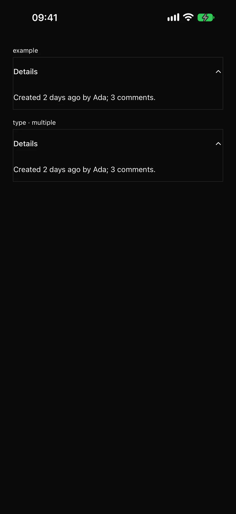
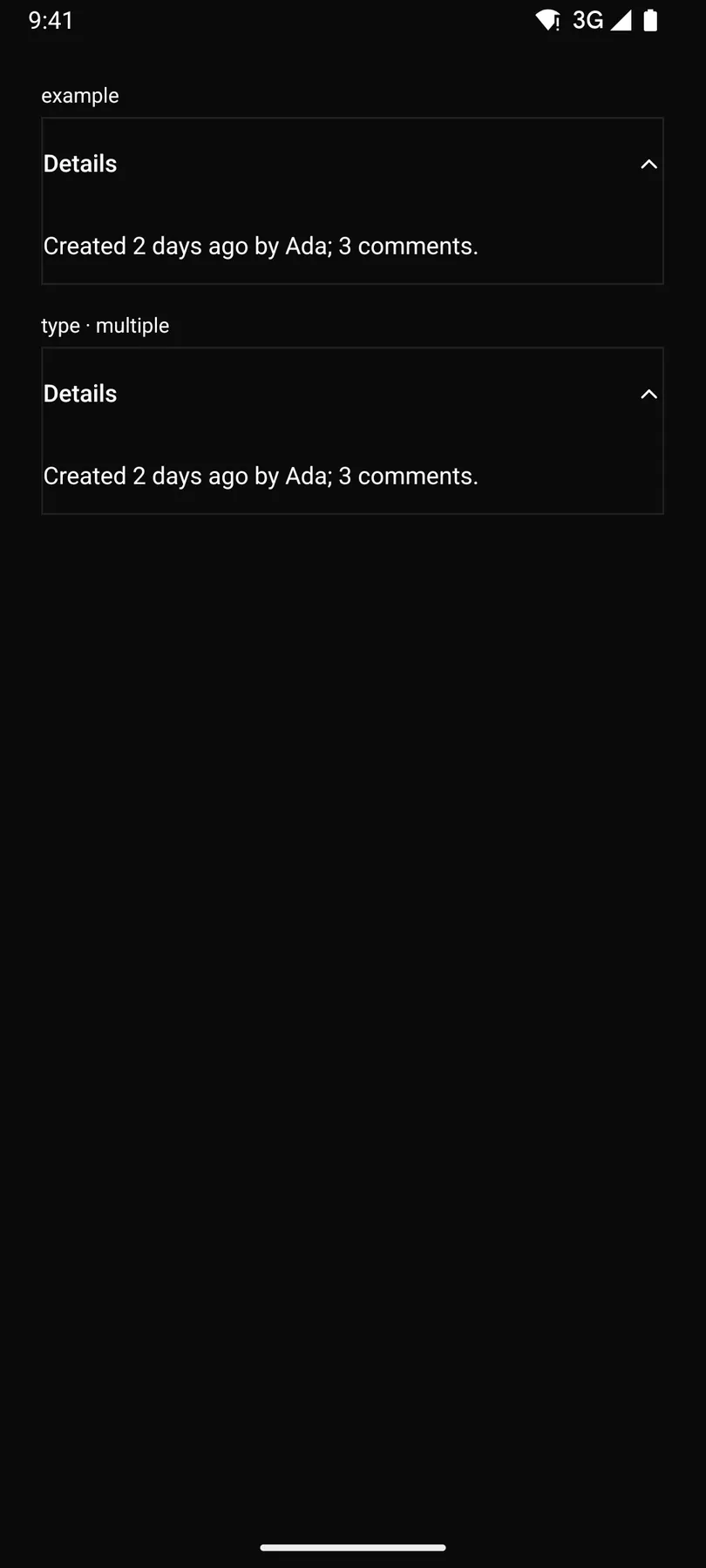
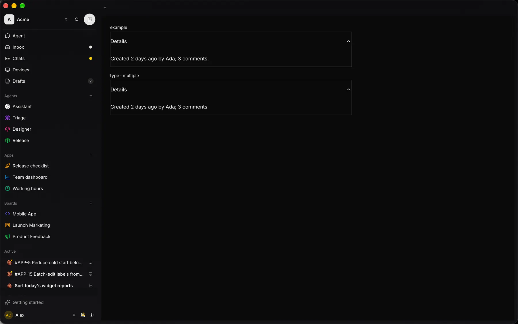
Section titled “Preview”example
Created 2 days ago by Ada; 3 comments.
type · multiple
Created 2 days ago by Ada; 3 comments.
Platforms
Section titled “Platforms”The same specimen painted by React, SwiftUI, Compose and gpui.

| Prop | Type | Required | Bindable | Description |
|---|---|---|---|---|
items |
[accordionItem] |
yes | – | The section headers in order. |
type |
single | multiple |
– | – | One section open at a time, or any number. Default "single". |
value |
string |
– | yes | The open section’s value (comma-joined when multiple); bind it. |
Events
Section titled “Events”on.change: runs an action
None.
Children
Section titled “Children”many
A2UI basic mapping
Section titled “A2UI basic mapping”No basic catalog component maps here.
Built from
Section titled “Built from”A native component: every renderer paints it directly.
Accessibility
Section titled “Accessibility”Role: group
headers = buttons with aria-expanded controlling regions
| Keys | Action |
|---|---|
Enter Space |
toggle the focused section |
ArrowDown ArrowUp |
next/previous header |
Home End |
first/last header |
Theming
Section titled “Theming”Recipe parts: Accordion/root Accordion/item Accordion/trigger Accordion/content Accordion/count
Keyed by: type :hover :pressed :focus :disabled :checked :open :selected :invalid :dragover
Related
Section titled “Related”Collapsible · Tabs · Segmented · Pagination · Breadcrumb · Outline · Stepper