

MessageBubble
A chat message bubble, in (left) or out (right).
Group: Lists · Kind: macro · in the lite catalog
Preview
Section titled “Preview”Platforms
Section titled “Platforms”The same specimen painted by React, SwiftUI, Compose and gpui.
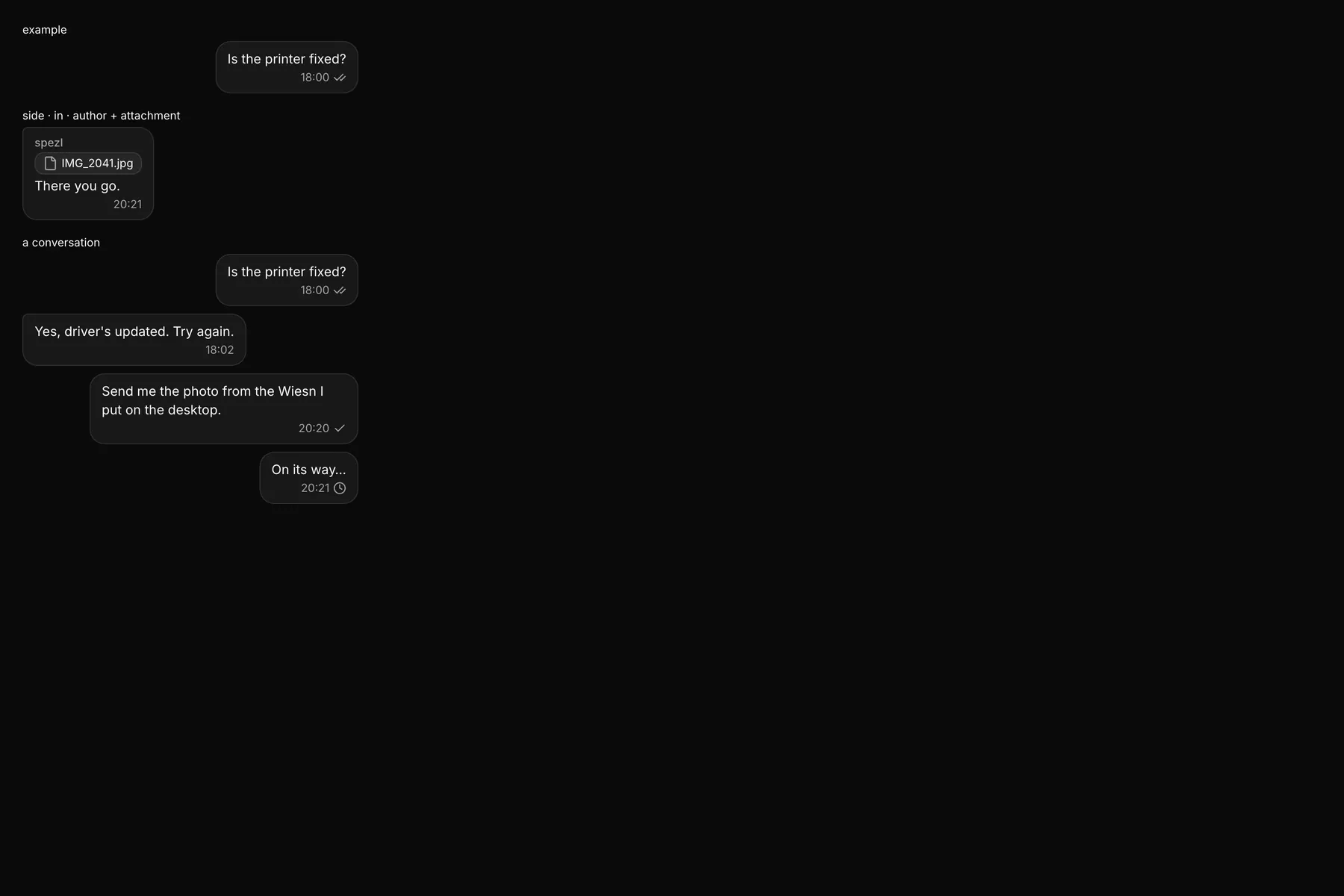
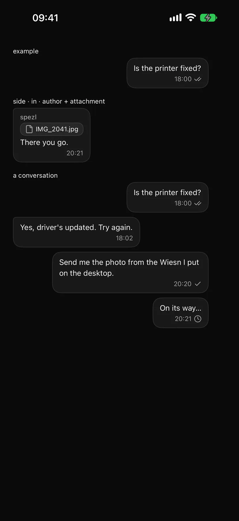
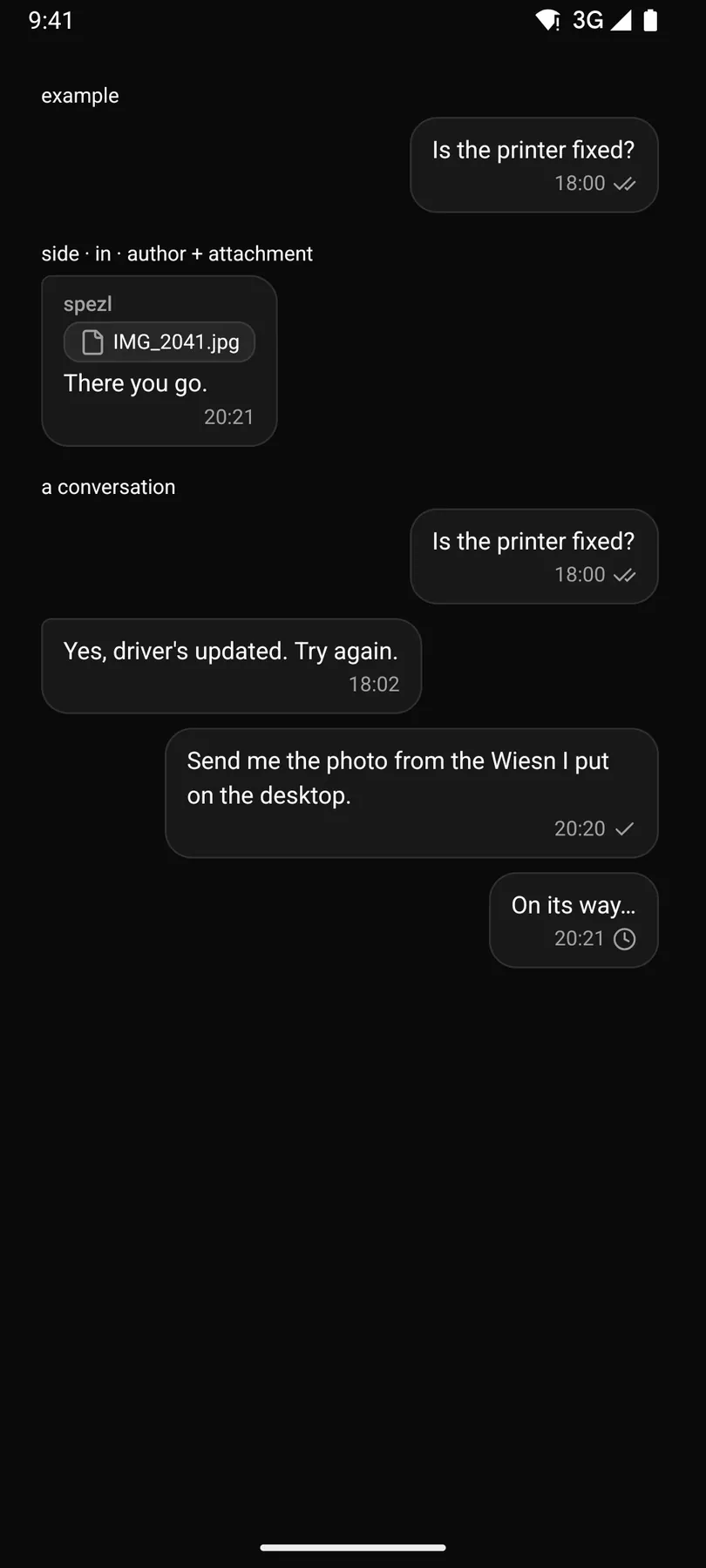
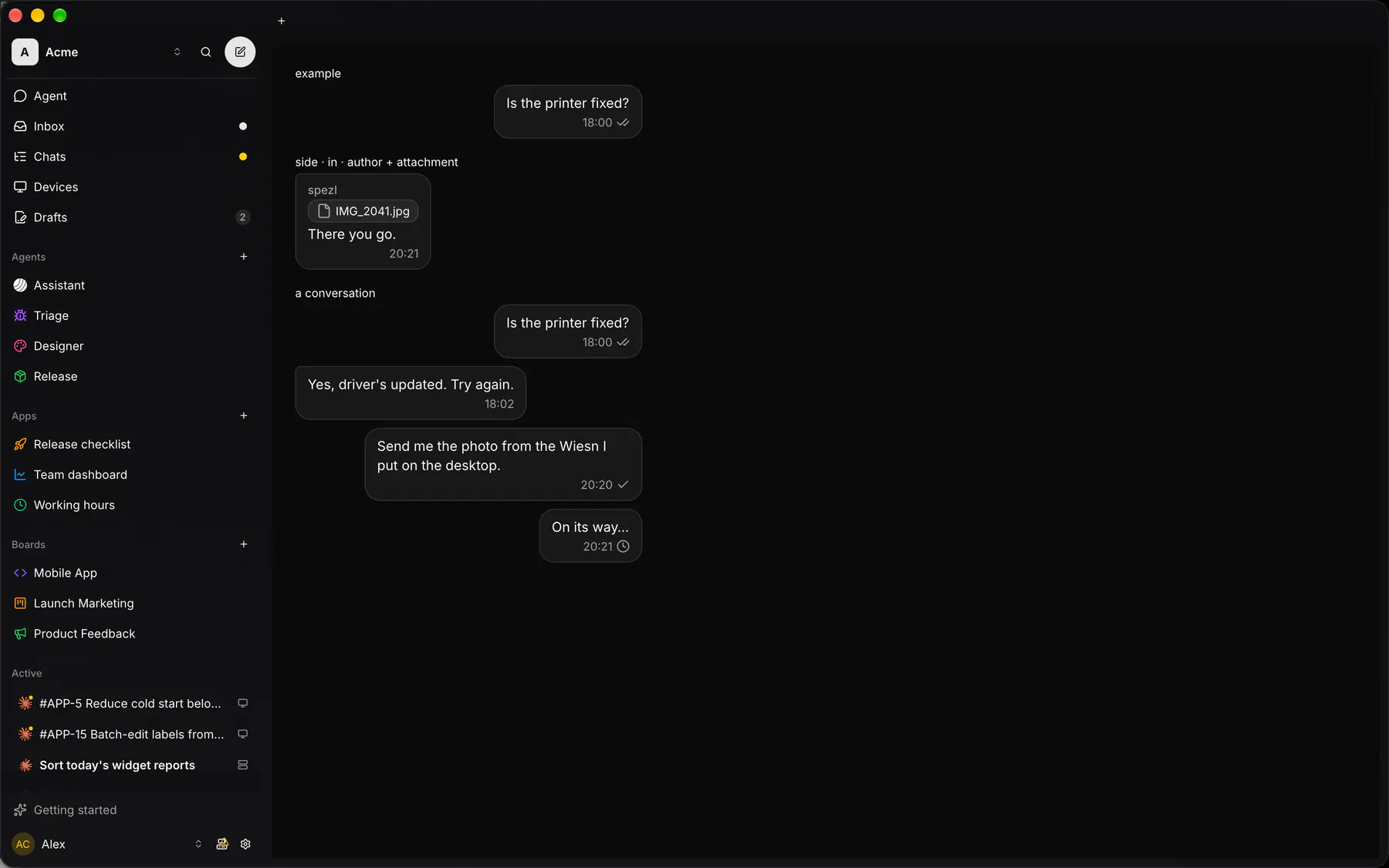
Variants
Section titled “Variants”| Prop | Type | Required | Bindable | Description |
|---|---|---|---|---|
text |
markdown |
yes | yes | The message. |
side |
in | out |
– | – | out = the viewer’s. Default "in". |
time |
string |
– | yes | Under the text. |
status |
sending | sent | read |
– | yes | Delivery, out only. |
author |
string |
– | yes | Caption above, in only. |
Events
Section titled “Events”None.
attachment: one component by id
Children
Section titled “Children”none
A2UI basic mapping
Section titled “A2UI basic mapping”No basic catalog component maps here.
Built from
Section titled “Built from”Accessibility
Section titled “Accessibility”Role: group
group labelled by author, else time; the delivery icon is labelled sending/sent/read
Not focusable; no keys.
Theming
Section titled “Theming”Recipe parts: MessageBubble/root MessageBubble/bubble MessageBubble/author MessageBubble/text MessageBubble/footer MessageBubble/time MessageBubble/status
Keyed by: side status :hover :pressed :focus :disabled :checked :open :selected :invalid :dragover
Related
Section titled “Related”Icon · Markdown · Text · Section · Group · Trace · TraceItem · Plan