

Text
A run of text in one of the type styles; prefer dedicated components over inline markdown.
Group: Text · Kind: native · in the lite catalog
Preview
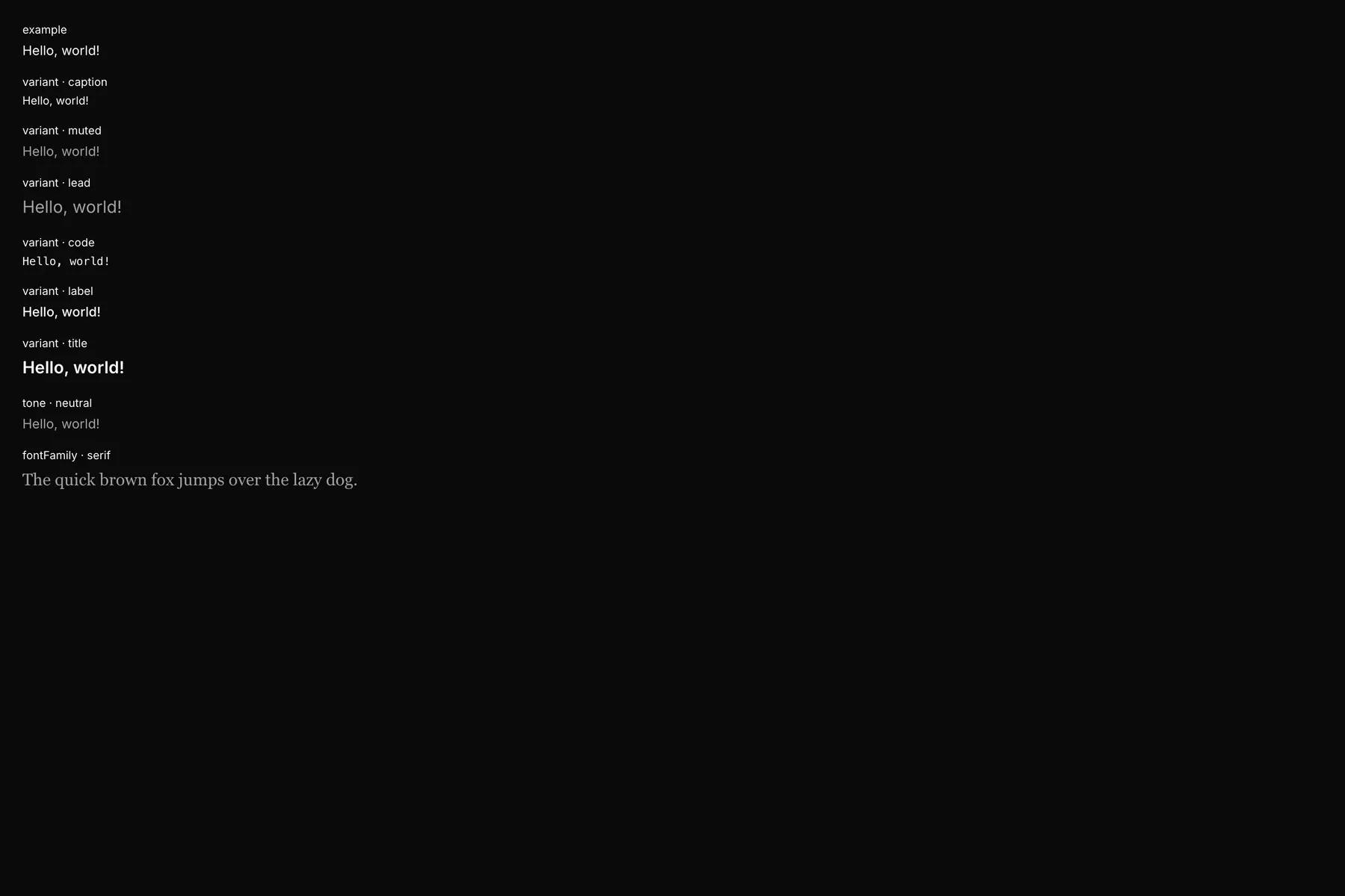
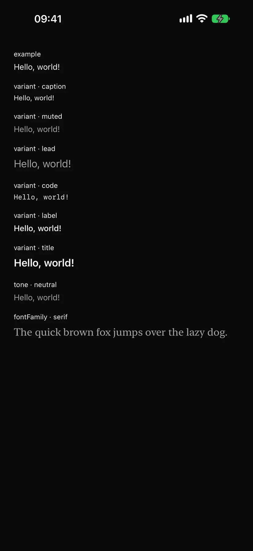
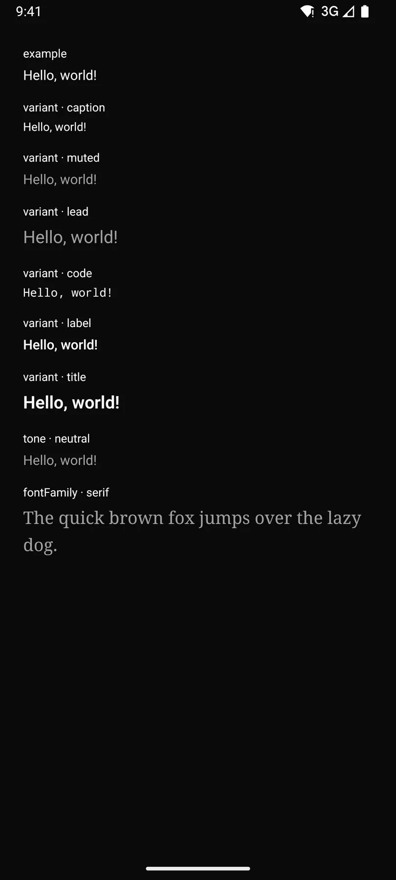
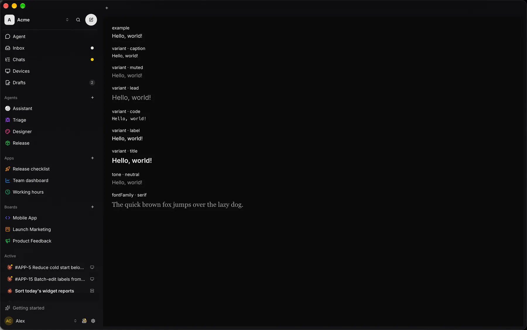
Section titled “Preview”exampleHello, world!
variant · captionHello, world!
variant · mutedHello, world!
variant · leadHello, world!
variant · codeHello, world!
variant · labelHello, world!
variant · titleHello, world!
tone · neutralHello, world!
fontFamily · serifThe quick brown fox jumps over the lazy dog.
Platforms
Section titled “Platforms”The same specimen painted by React, SwiftUI, Compose and gpui.
Variants
Section titled “Variants”tone · primaryHello, world!
tone · successHello, world!
tone · warningHello, world!
tone · dangerHello, world!
tone · infoHello, world!
shimmerHello, world!
| Prop | Type | Required | Bindable | Description |
|---|---|---|---|---|
text |
string |
yes | yes | The text to show. |
variant |
body | caption | muted | lead | code | label | title |
– | – | The type style. Default "body". |
align |
start | center | end |
– | – | Horizontal alignment inside its box. |
lines |
number |
– | – | Truncates to this many lines with an ellipsis. |
tone |
neutral | primary | success | warning | danger | info |
– | – | A colour tone instead of the default foreground. |
shimmer |
boolean |
– | – | Animates a highlight across the text while work runs. Default false. |
live |
off | polite | assertive |
– | – | Announces changes (assertive interrupts). Default "off". |
style |
style |
– | – | Extra Box styles for the text box. |
Events
Section titled “Events”None.
None.
Children
Section titled “Children”none
A2UI basic mapping
Section titled “A2UI basic mapping”The basic catalog’s Text renders as Text.
Built from
Section titled “Built from”A native component: every renderer paints it directly.
Accessibility
Section titled “Accessibility”Role: text
text (a live region when live is not off)
Not focusable; no keys.
Theming
Section titled “Theming”Recipe parts: Text/root
Keyed by: variant tone :hover :pressed :focus :disabled :checked :open :selected :invalid :dragover