

VoiceWave
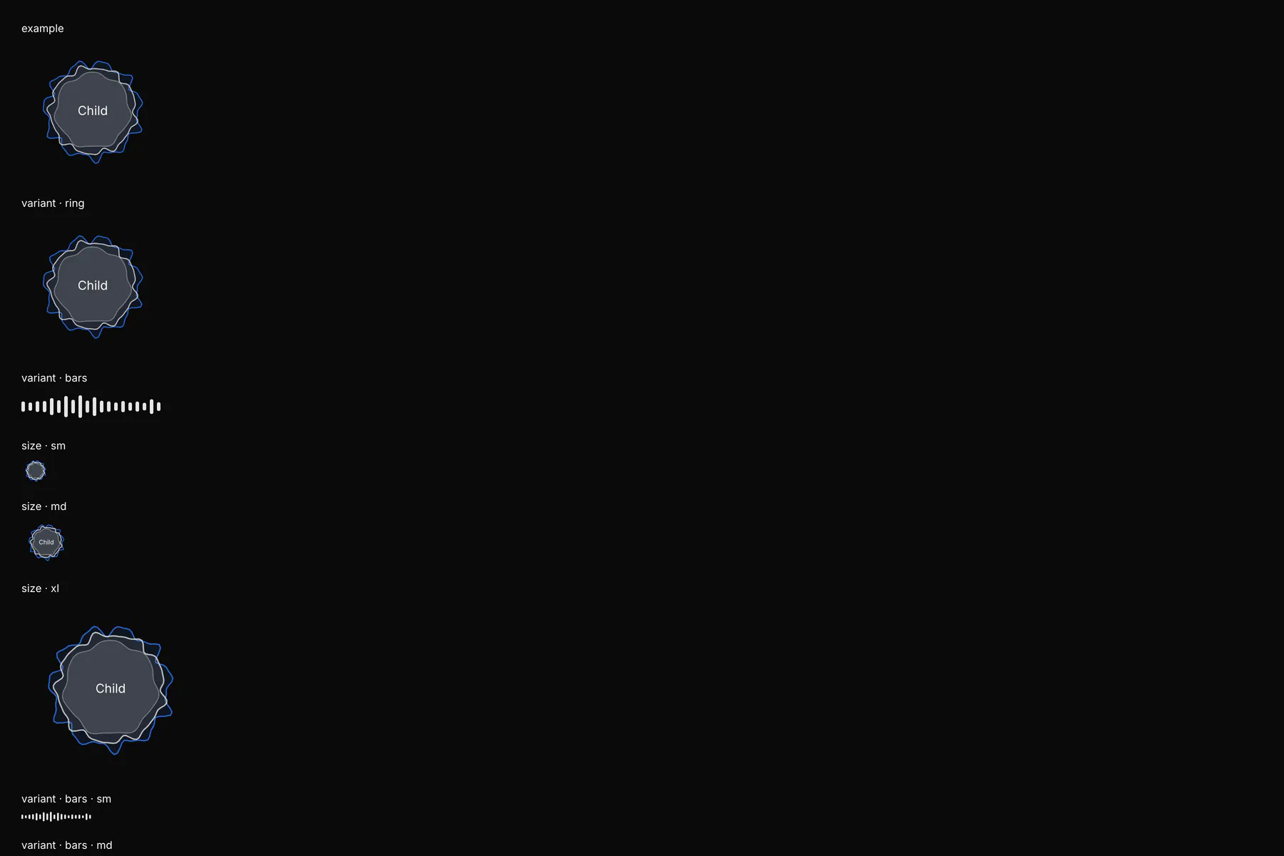
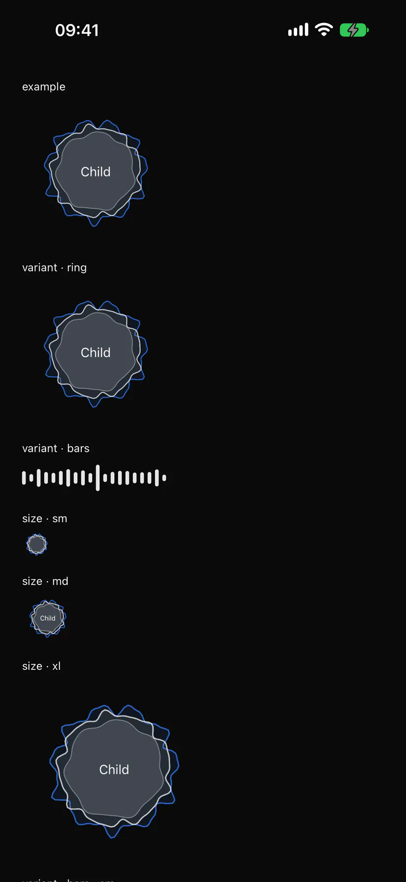
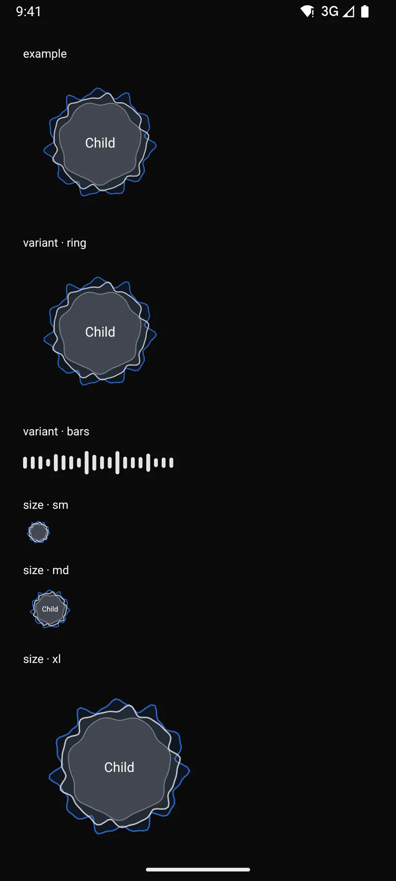
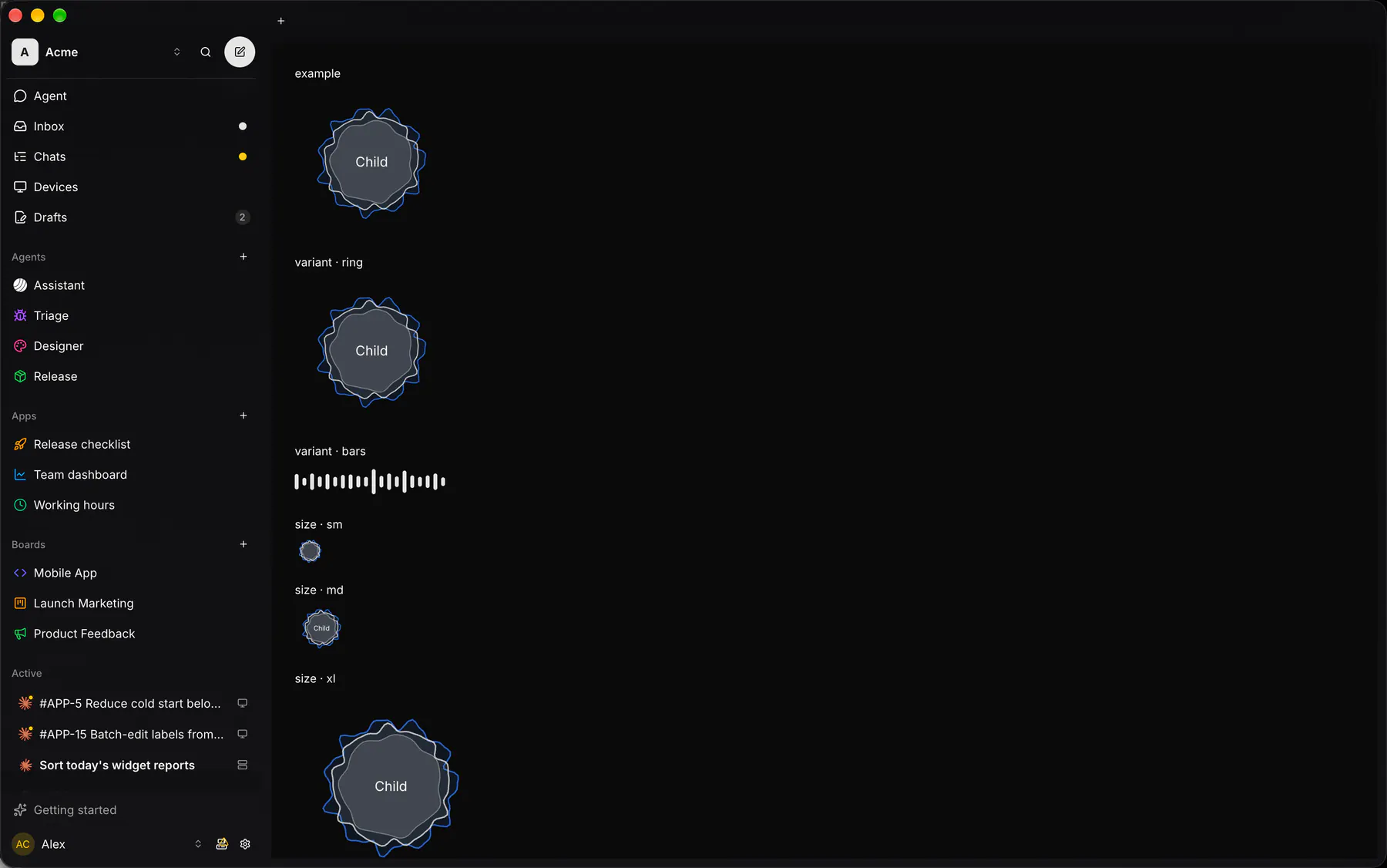
A live voice level: three waves around an optional decorative child.
Group: Feedback · Kind: native
Preview
Section titled “Preview”Platforms
Section titled “Platforms”The same specimen painted by React, SwiftUI, Compose and gpui.
Variants
Section titled “Variants”| Prop | Type | Required | Bindable | Description |
|---|---|---|---|---|
activity |
idle | listening | thinking | speaking | muted |
– | yes | What the voice is doing. Default "idle". |
variant |
ring | bars |
– | – | bars = a level meter. Default "ring". |
level |
number |
– | yes | Loudness 0 to 1. Default 0. |
bands |
[number] |
– | yes | Up to 8 band levels 0 to 1. |
size |
sm | md | lg | xl |
– | – | Edge class; sm hides the child. Default "md". |
label |
string |
– | – | An accessibility label. |
Events
Section titled “Events”None.
None.
Children
Section titled “Children”one
A2UI basic mapping
Section titled “A2UI basic mapping”No basic catalog component maps here.
Built from
Section titled “Built from”A native component: every renderer paints it directly.
Accessibility
Section titled “Accessibility”Role: img
img named by label (with the activity appended, e.g. Voice, listening); decorative (hidden) without a label; never focusable. The one child is DECORATIVE on every renderer: inside the img (or the hidden wave) assistive tech never reaches it, so it must be non-interactive (an Icon, Avatar or short Text); a control or text to read goes beside the wave, never in it
Not focusable; no keys.
Theming
Section titled “Theming”Recipe parts: VoiceWave/root VoiceWave/outer VoiceWave/mid VoiceWave/inner VoiceWave/child VoiceWave/bar
Keyed by: activity size variant :hover :pressed :focus :disabled :checked :open :selected :invalid :dragover
Related
Section titled “Related”CallSurface · Badge · Alert · Chip · EmptyState · Progress · Meter · Ring