

Icon
One icon from the shared Lucide registry, by name.
Group: Media · Kind: native · in the lite catalog
Preview
Section titled “Preview”Platforms
Section titled “Platforms”The same specimen painted by React, SwiftUI, Compose and gpui.

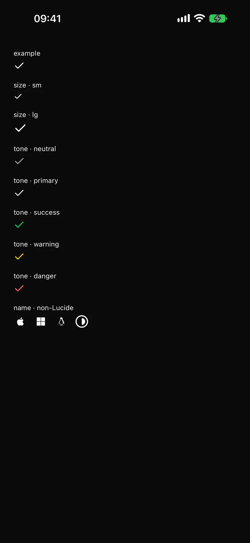
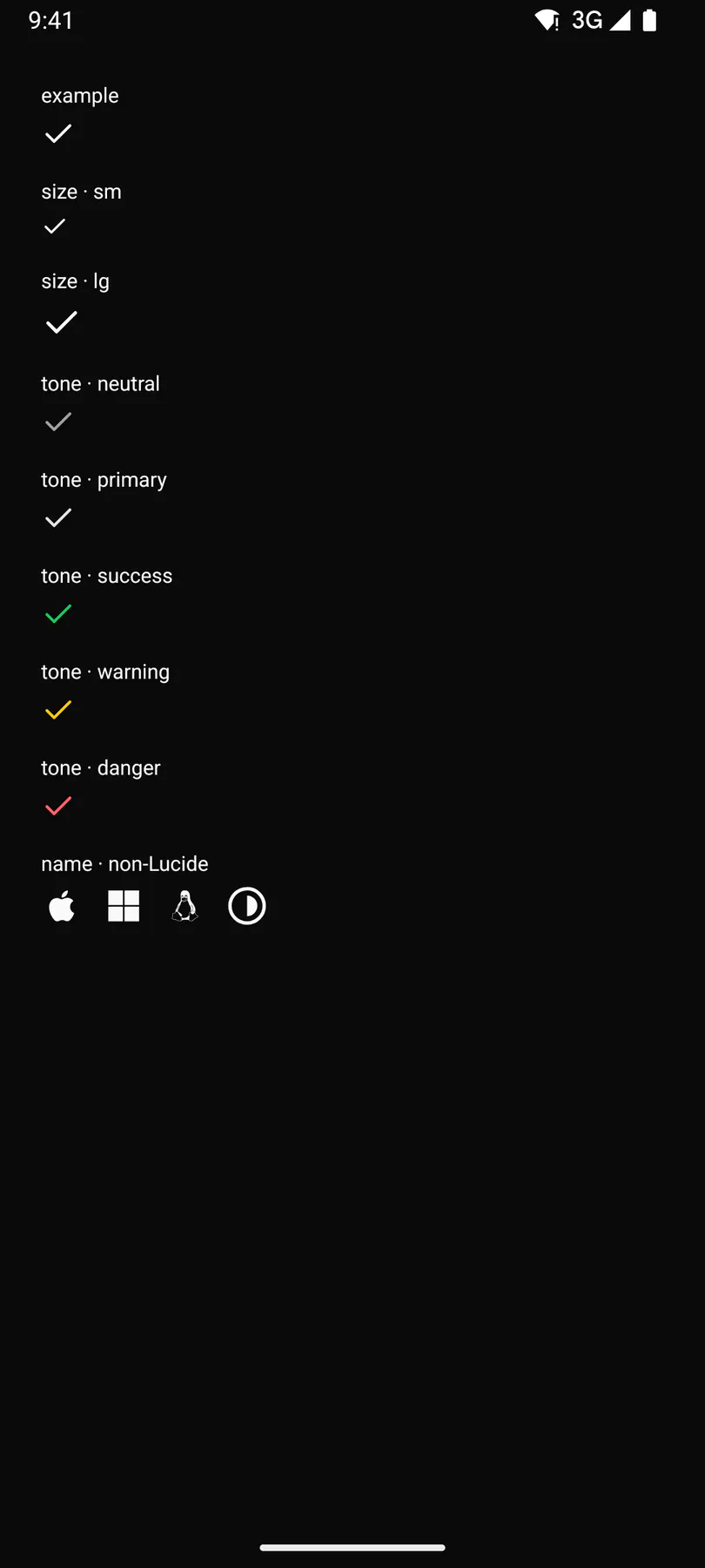

Variants
Section titled “Variants”| Prop | Type | Required | Bindable | Description |
|---|---|---|---|---|
name |
icon |
yes | yes | The icon name (an icons.json concept or Lucide name). |
size |
sm | default | lg |
– | – | Glyph size. Default "default". |
tone |
neutral | primary | success | warning | danger | info |
– | yes | A colour tone instead of the current text colour. |
label |
string |
– | – | An accessibility label when the icon stands alone. |
Events
Section titled “Events”None.
None.
Children
Section titled “Children”none
A2UI basic mapping
Section titled “A2UI basic mapping”The basic catalog’s Icon renders as Icon.
Built from
Section titled “Built from”A native component: every renderer paints it directly.
Accessibility
Section titled “Accessibility”Role: img
img when labelled, hidden otherwise
Not focusable; no keys.
Theming
Section titled “Theming”Recipe parts: Icon/root
Keyed by: size tone :hover :pressed :focus :disabled :checked :open :selected :invalid :dragover
Related
Section titled “Related”Section · Collapsible · TraceItem · Breadcrumb · Stepper · DockCard · Badge · Alert