

Row
THE list row: a lead glyph or slot, a mono identifier, title and subtitle, trailing meta or value, a slot and a chevron; flat or card, nestable.
Group: Lists · Kind: macro · in the lite catalog
Preview
Section titled “Preview”example
r/selfhosted
surface · flat
r/selfhosted
surface · card
r/selfhosted
chevron · none
r/selfhosted
chevron · right
r/selfhosted
chevron · selector
r/selfhosted
selected · true
r/selfhosted
Platforms
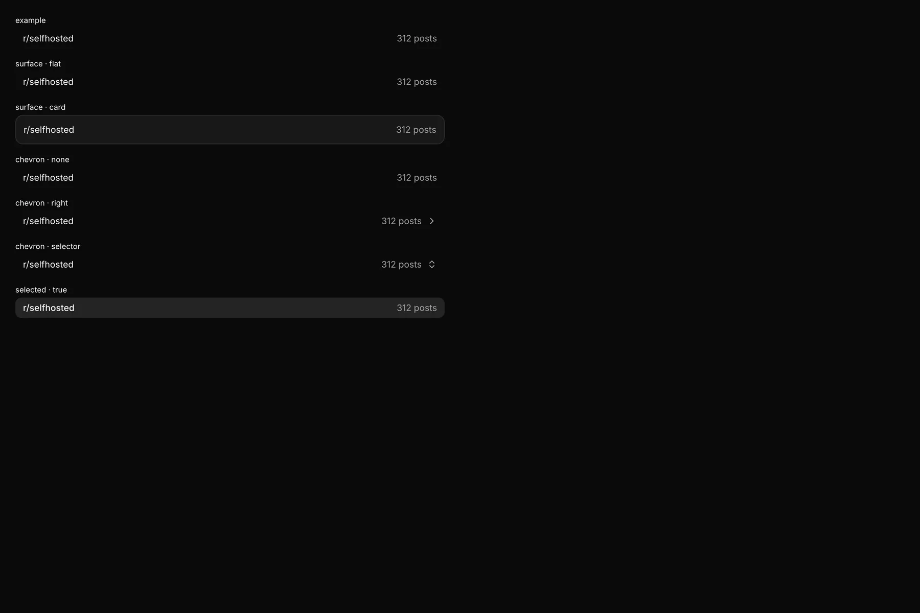
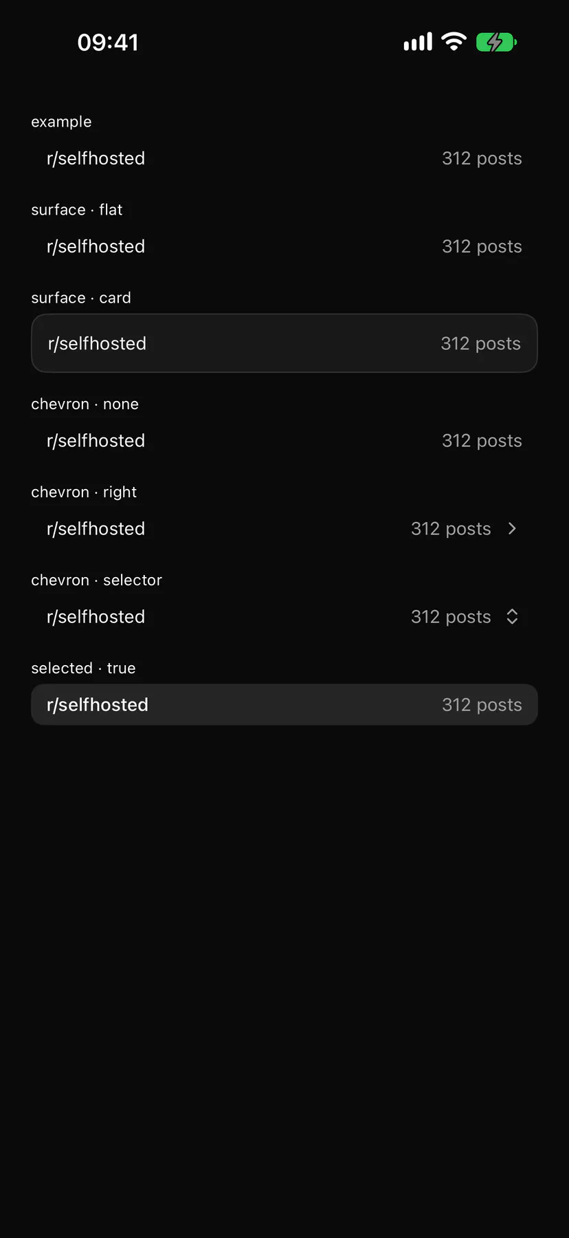
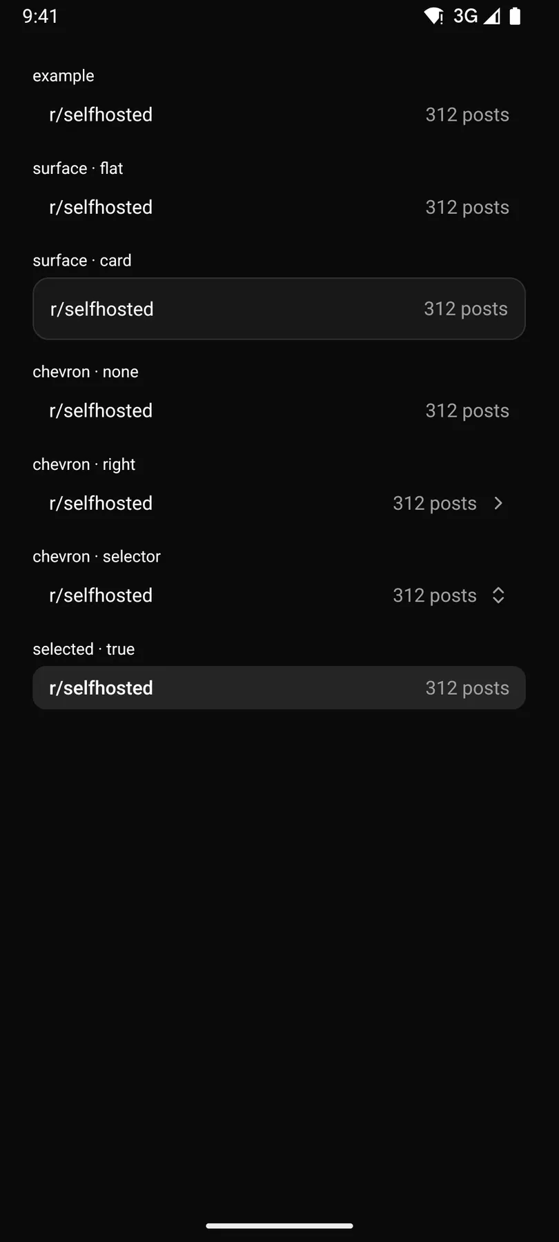
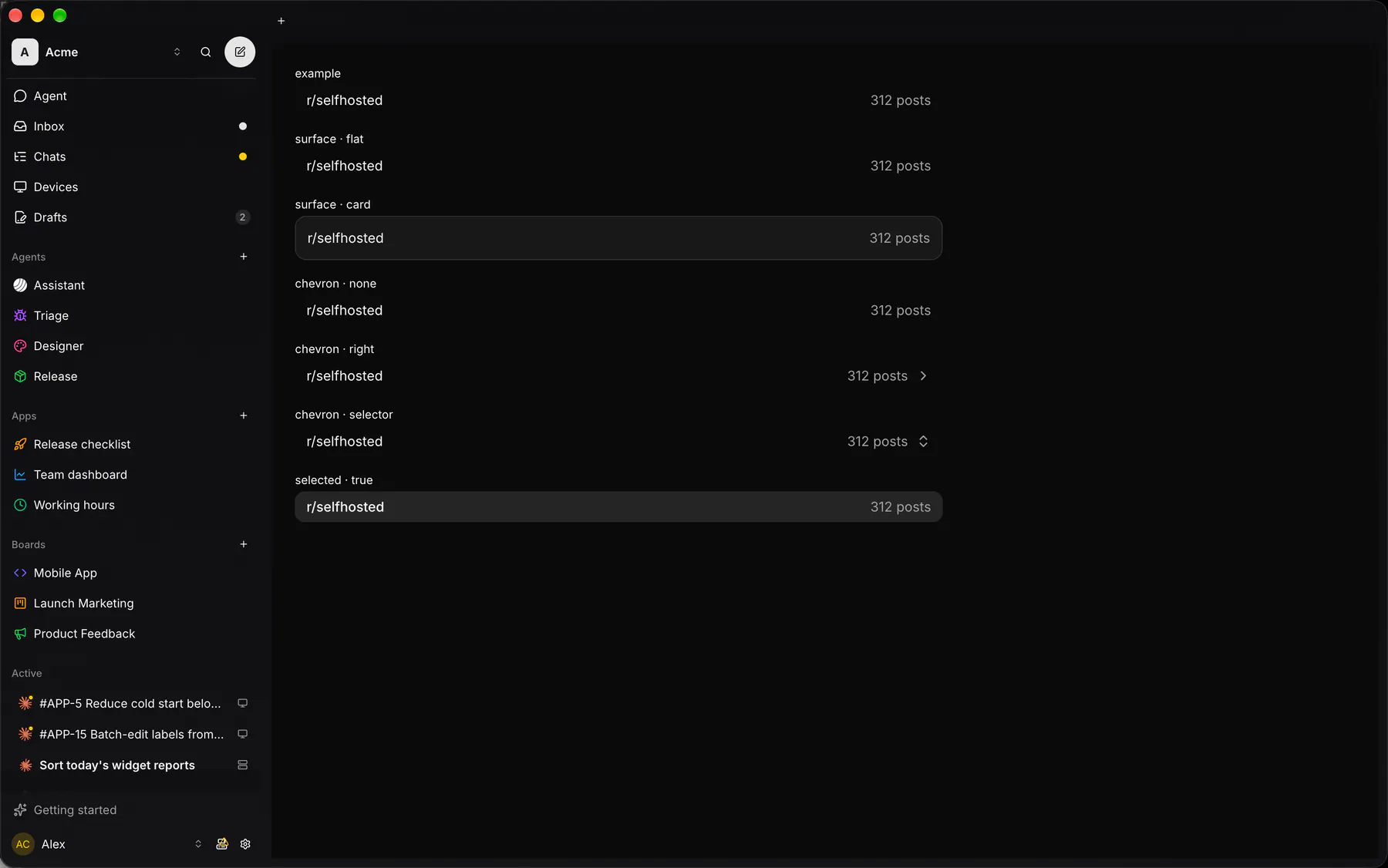
Section titled “Platforms”The same specimen painted by React, SwiftUI, Compose and gpui.
Variants
Section titled “Variants”density · default
r/selfhosted
density · compact
r/selfhosted
| Prop | Type | Required | Bindable | Description |
|---|---|---|---|---|
title |
string |
yes | yes | The main text. |
identifier |
string |
– | yes | A mono identifier before the title (EXP-12). |
subtitle |
string |
– | yes | A muted second line. |
meta |
string |
– | yes | Trailing muted text (a count, a time). |
value |
string |
– | yes | A trailing readable value (a property, a pick). |
placeholder |
string |
– | – | Muted trailing text while value is empty. |
icon |
icon |
– | yes | The lead glyph (the leading slot replaces it). |
chevron |
none | right | selector |
– | yes | Trailing disclosure or picker glyph. Default "none". |
selected |
boolean |
– | yes | Draws it as the active row. Default false. |
density |
default | compact |
– | – | Row height class. Default "default". |
surface |
flat | card |
– | – | A flat row, or a padded card with its own fill and border. Default "flat". |
pressable |
boolean |
– | – | Makes it a press target that fires press (an on.press implies it). Default false. |
depth |
number |
– | – | Depth under a tree Section (0 = root). Default 0. |
Events
Section titled “Events”on.press: runs an action
leading: one component by idtrailing: one component by id
Children
Section titled “Children”none
A2UI basic mapping
Section titled “A2UI basic mapping”No basic catalog component maps here.
Built from
Section titled “Built from”Accessibility
Section titled “Accessibility”Role: button
button (aria-selected when selected) when pressable, a group of its texts otherwise ($a11y); the guides are decorative
| Keys | Action |
|---|---|
Enter Space |
press (pressable only) |
Theming
Section titled “Theming”Recipe parts: Row/root Row/guides Row/icon Row/identifier Row/body Row/title Row/subtitle Row/meta Row/value Row/chevron
Keyed by: selected density surface depth :hover :pressed :focus :disabled :checked :open :selected :invalid :dragover
Related
Section titled “Related”Icon · Text · Section · Group · Trace · TraceItem · Plan · MessageBubble