

TraceItem
One step line: icon, title, muted detail; may expand to show its children.
Group: Lists · Kind: macro · in the lite catalog
Preview
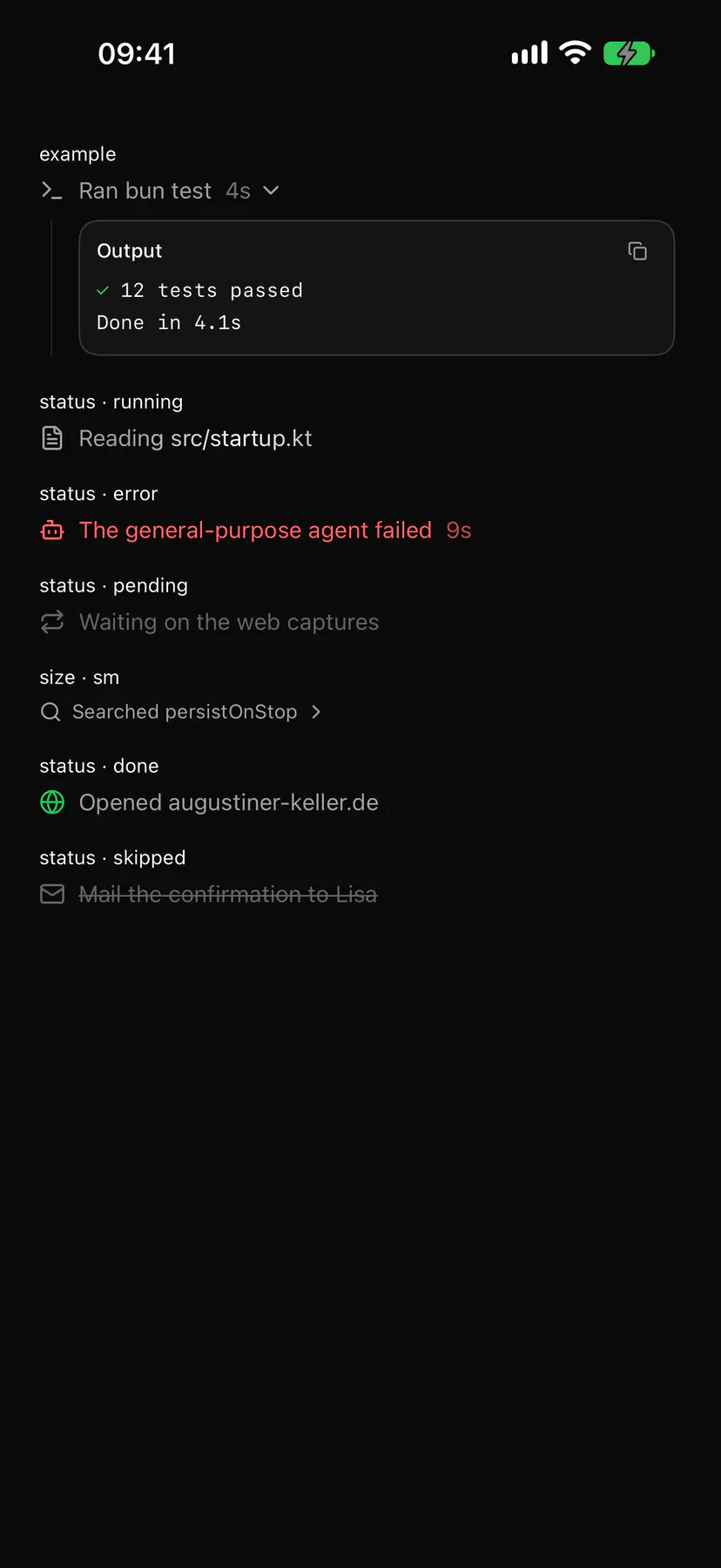
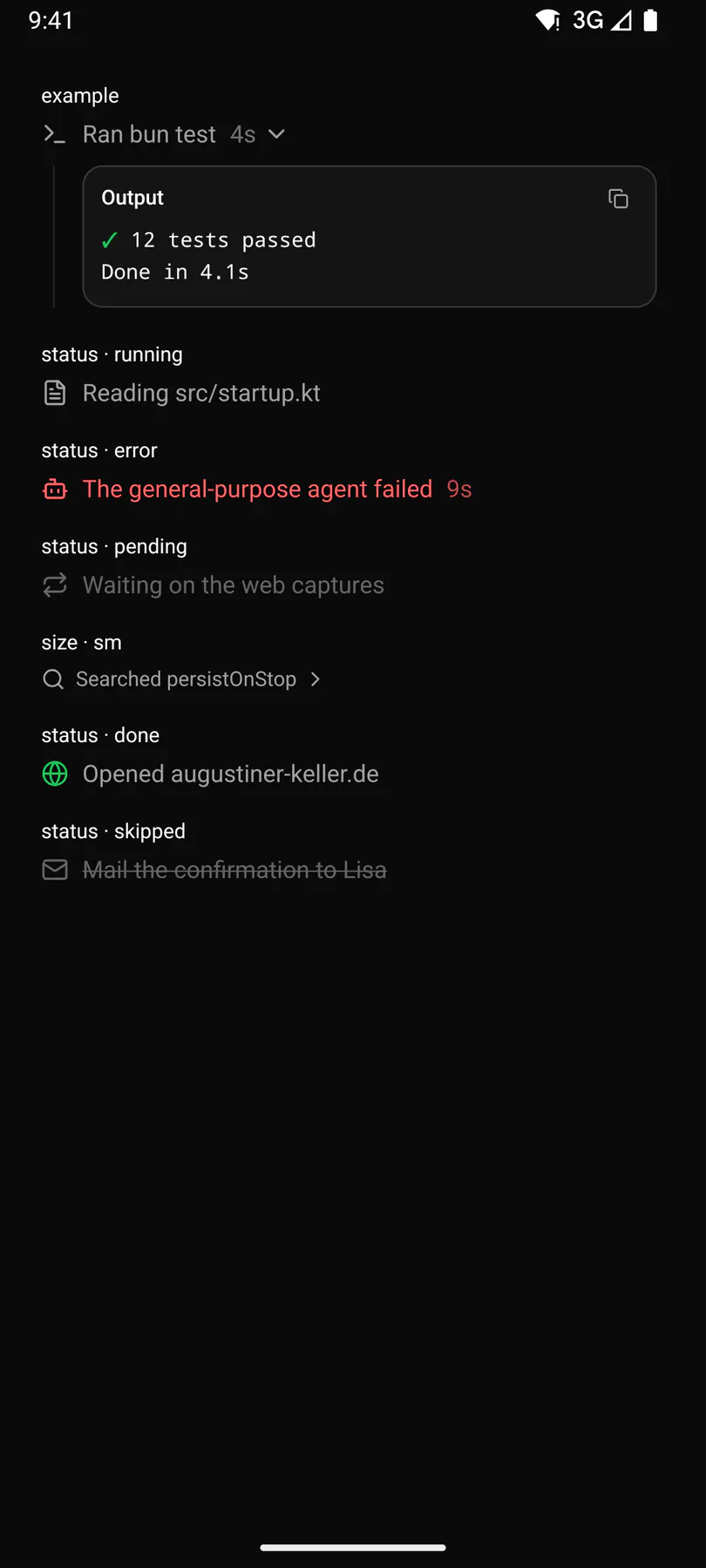
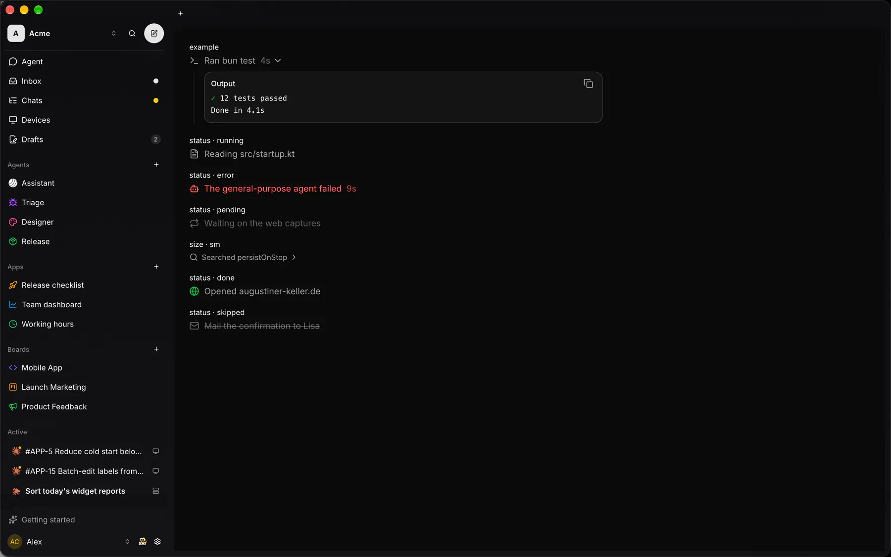
Section titled “Preview”example
Ran bun test4s
Output
✓ 12 tests passed
Done in 4.1s
status · running
Reading src/startup.kt
status · error
The general-purpose agent failed9s
status · pending
Waiting on the web captures
size · sm
Searched persistOnStop
status · done
Opened augustiner-keller.de
status · skipped
Mail the confirmation to Lisa
Platforms
Section titled “Platforms”The same specimen painted by React, SwiftUI, Compose and gpui.

Variants
Section titled “Variants”size · default
Ran bun test4s
| Prop | Type | Required | Bindable | Description |
|---|---|---|---|---|
title |
string |
yes | yes | What happened. |
icon |
icon |
– | – | The lead glyph. |
description |
string |
– | – | A muted detail (a duration). |
status |
running | error | pending | done | skipped |
– | – | running shimmers, error tints, pending dims, done ticks, skipped strikes. |
size |
default | sm |
– | – | sm = compact. Default "default". |
collapsible |
boolean |
– | – | The line toggles its children. Default false. |
open |
boolean |
– | yes | Whether the children show; bind it. Default false. |
Events
Section titled “Events”on.change: runs an action
None.
Children
Section titled “Children”many
A2UI basic mapping
Section titled “A2UI basic mapping”No basic catalog component maps here.
Built from
Section titled “Built from”Accessibility
Section titled “Accessibility”Role: group
A collapsible line is a button with aria-expanded = open ($a11y); a plain line is text; the icon is decorative.
| Keys | Action |
|---|---|
Enter Space |
toggle (collapsible only) |
Theming
Section titled “Theming”Recipe parts: TraceItem/root TraceItem/line TraceItem/icon TraceItem/title TraceItem/description TraceItem/chevron TraceItem/content
Keyed by: status size collapsible open :hover :pressed :focus :disabled :checked :open :selected :invalid :dragover
Related
Section titled “Related”Icon · Text · Plan · Section · Group · Trace · Row · MessageBubble