

Motion
A vector animation (Lottie-compatible) drawn identically everywhere: loaders, success states, illustrated empty states, small explainers.
Group: Media · Kind: native · in the lite catalog
Preview
Section titled “Preview”example
direction · forward
direction · reverse
direction · alternate
fit · contain
fit · cover
fit · fill
Platforms
Section titled “Platforms”The same specimen painted by React, SwiftUI, Compose and gpui.
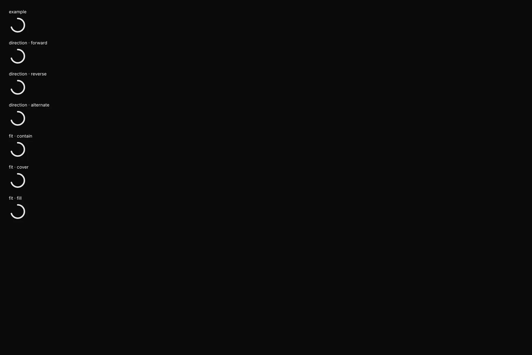
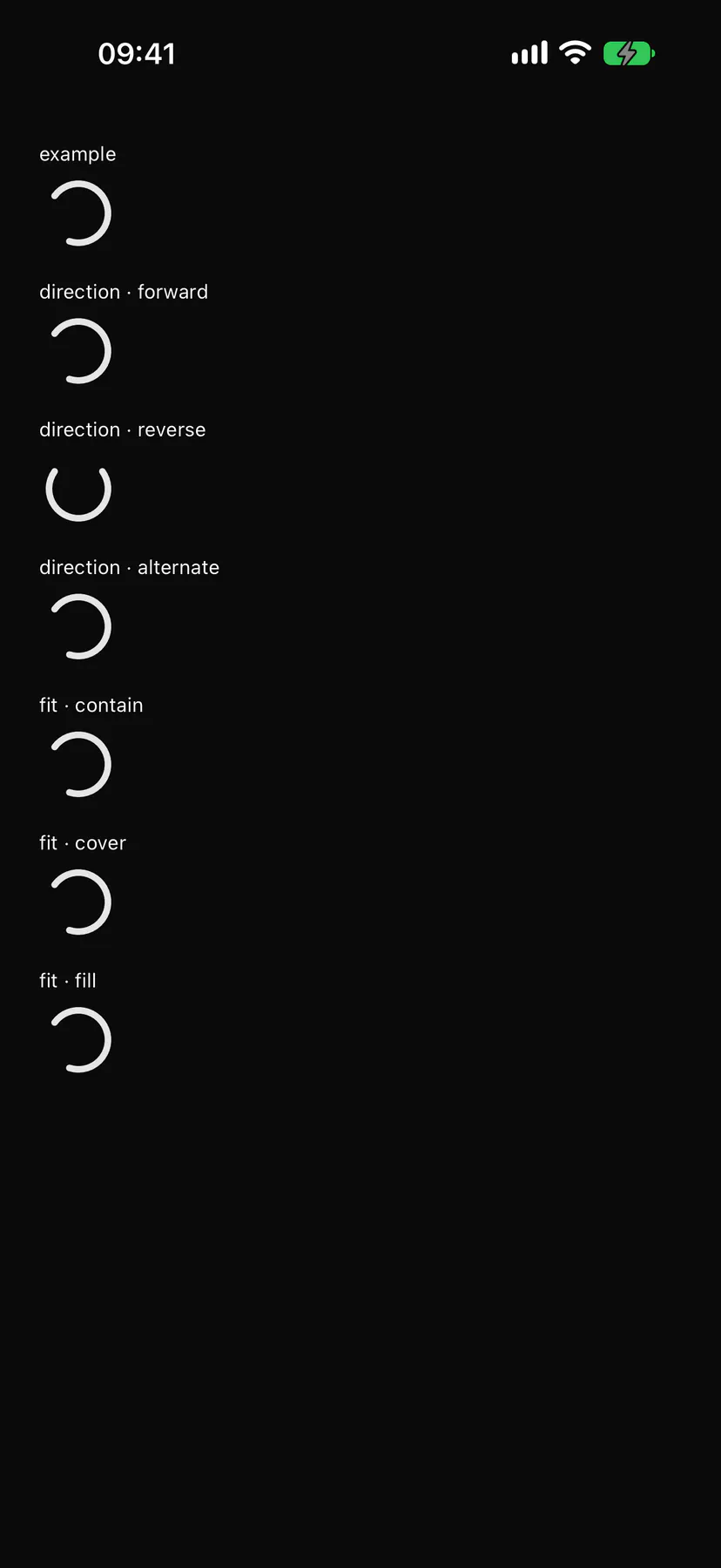
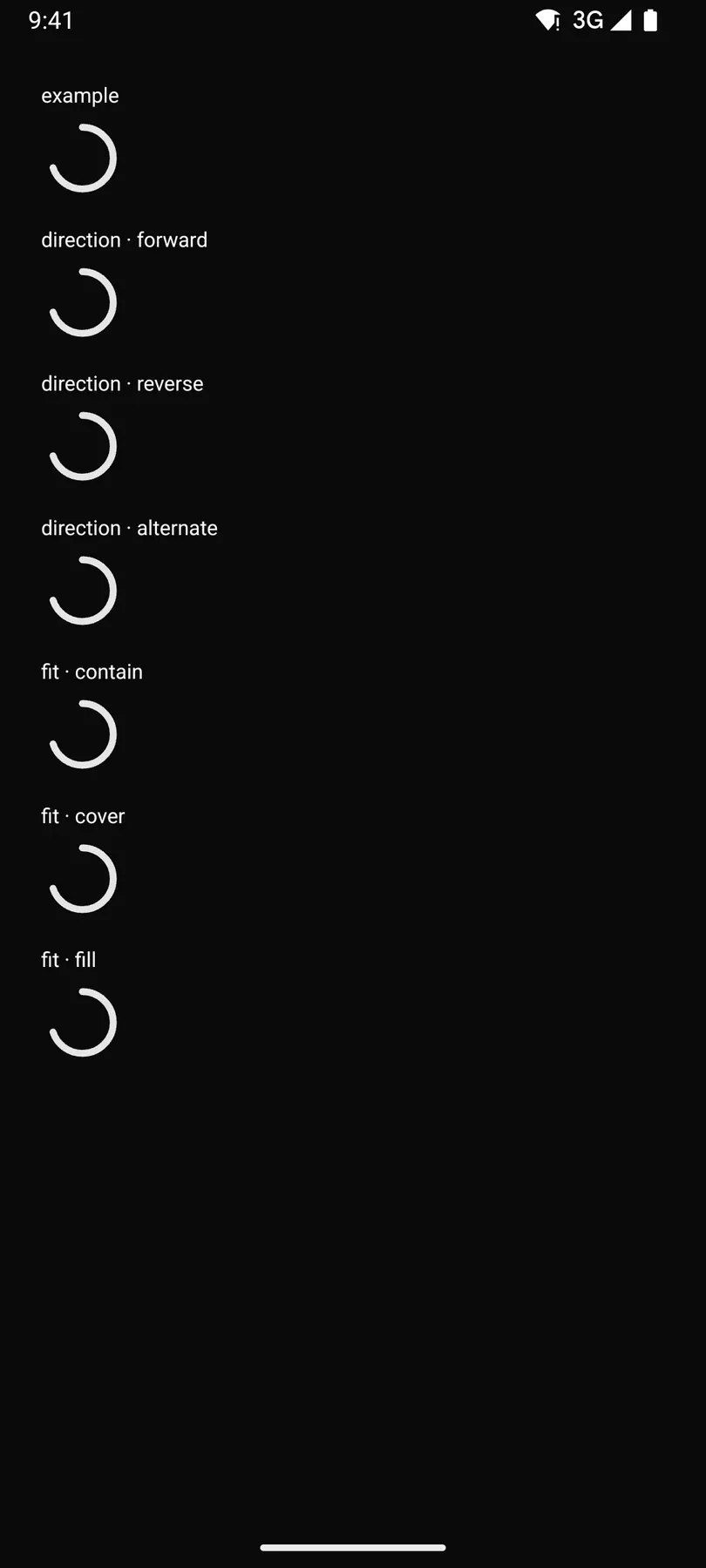
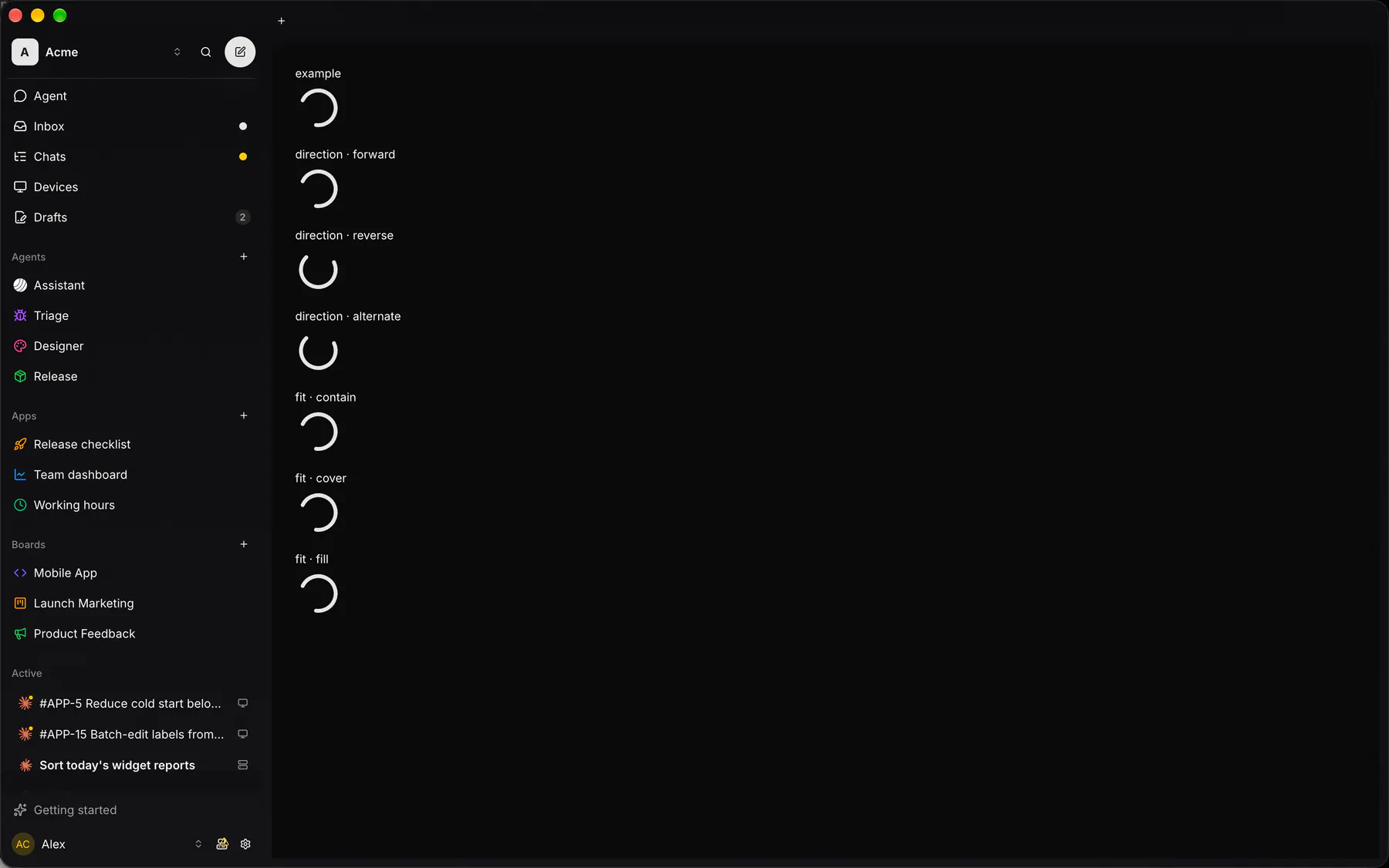
| Prop | Type | Required | Bindable | Description |
|---|---|---|---|---|
layers |
[object] |
– | – | The animation, top layer first, in the composition’s px (origin top-left). Layer: {type: shape|solid|null|precomp|text, id?, parent?: id, in?/out? ms, transform?: {anchor, position [x,y], scale [100,100] %, rotation deg clockwise, opacity 0–100}, shapes: […], matte?: {source: id, mode: alpha|luma}, masks?: [{path, mode: add|subtract|intersect}]}. Shapes draw top first; a style paints every shape before it in its group: rect {position (centre), size, radius}, ellipse {position, size}, star|polygon {points, outerRadius, innerRadius}, path {d: SVG path data}; fill {color}, stroke {color, width, cap, join, dash: [len, gap]}, gradient-fill {kind: linear|radial, start, end, stops: [[0, colour], [1, colour]]}; trim {start, end, offset} (percent, draw-on lines), repeater {copies, transform}, round-corners {radius}; group {shapes, transform}. Colours: $color.* tokens (follow light/dark), #hex, or {light, dark}. Animate any value: {keys: [{t: ms, v: value, ease: linear|ease-in|ease-out|ease-in-out|hold|[x1,y1,x2,y2]}, …]}; tokens cannot animate. Keep it small; loops end on their first pose. No expressions. |
size |
[number] |
– | – | The composition [width, height] px (with layers). |
duration |
number |
– | – | Length in ms (with layers). |
fps |
number |
– | – | Frames per second. Default 60. |
assets |
object |
– | – | Precomps {id: {layers}}. |
markers |
[object] |
– | – | Named segments [{name, time, duration}] ms. |
lottie |
object |
– | – | Lottie JSON instead of layers (no expressions). |
src |
url |
– | – | An attached .json or .lottie instead of layers. |
autoplay |
boolean |
– | – | Plays when visible; false shows the poster. Default true. |
loop |
boolean |
– | – | Repeats; false plays once and holds. Default true. |
plays |
number |
– | – | Plays this many times (overrides loop). |
direction |
forward | reverse | alternate |
– | – | Forward, reverse, or back and forth. Default "forward". |
speed |
number |
– | – | Speed multiplier. Default 1. |
segment |
[number] |
– | – | Plays only [from, to] ms. |
marker |
string |
– | – | Plays only this marker. |
progress |
number |
– | yes | Scrubs (0–1) instead of playing. |
play |
boolean |
– | yes | Pauses while false. Default true. |
poster |
number |
– | – | The still frame (ms) for reduced motion and before play. |
fit |
contain | cover | fill |
– | – | How it fills the box. Default "contain". |
slots |
object |
– | – | Lottie slot overrides {slotId: value}. |
stateMachine |
object |
– | – | A dotLottie state machine driving playback (a .lottie src brings its own). |
inputs |
object |
– | yes | State-machine inputs {name: value}; bind to drive states from data. |
label |
string |
– | – | What it shows, for screen readers. |
style |
style |
– | – | Extra Box styles for the box. |
Events
Section titled “Events”on.press: runs an actionon.hover: runs an actionon.visible: runs an actionon.complete: runs an actionon.state: runs an action
None.
Children
Section titled “Children”none
A2UI basic mapping
Section titled “A2UI basic mapping”No basic catalog component maps here.
Built from
Section titled “Built from”A native component: every renderer paints it directly.
Accessibility
Section titled “Accessibility”Role: img
img named by label; decorative (hidden) without one; with on.press it is a button (focusable, named by label) and its state machine gets the click
| Keys | Action |
|---|---|
Enter Space |
press (with on.press) |
Theming
Section titled “Theming”Recipe parts: Motion/root
Keyed by: fit :hover :pressed :focus :disabled :checked :open :selected :invalid :dragover
Related
Section titled “Related”Image · ZoomableImage · Icon · Video · AudioPlayer · Avatar · QrCode · Carousel