

Card
A bordered card with an optional title and description, for grouped content, not page headers.
Group: Layout · Kind: macro · in the lite catalog
Preview
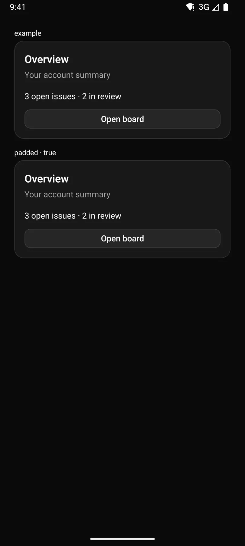
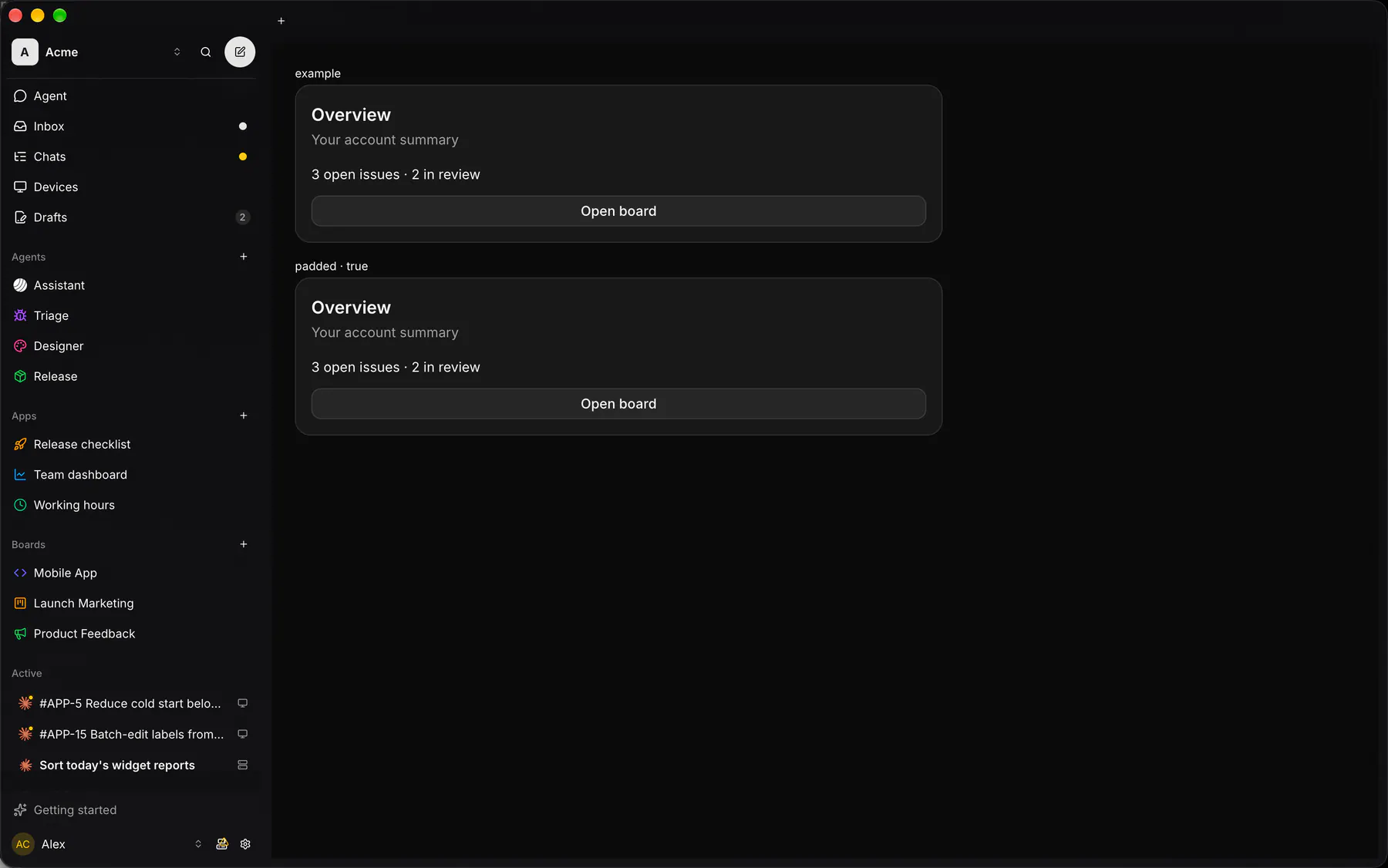
Section titled “Preview”example
OverviewYour account summary
3 open issues · 2 in review
padded · true
OverviewYour account summary
3 open issues · 2 in review
Platforms
Section titled “Platforms”The same specimen painted by React, SwiftUI, Compose and gpui.


| Prop | Type | Required | Bindable | Description |
|---|---|---|---|---|
title |
string |
– | – | The card heading. |
description |
string |
– | – | A muted line under the heading. |
padded |
boolean |
– | – | Pads the body; off for edge-to-edge rows. Default true. |
style |
style |
– | – | Extra Box styles merged over the card’s own. |
Events
Section titled “Events”None.
None.
Children
Section titled “Children”many
A2UI basic mapping
Section titled “A2UI basic mapping”The basic catalog’s Card renders as Card.
Built from
Section titled “Built from”Accessibility
Section titled “Accessibility”Role: group
group labelled by its title
Not focusable; no keys.
Theming
Section titled “Theming”Recipe parts: Card/root Card/header Card/title Card/description Card/body
Keyed by: :hover :pressed :focus :disabled :checked :open :selected :invalid :dragover
Related
Section titled “Related”Text · Plan · StatTile · Box · Stack · Grid · Separator · List