

Composer
The chat input box: a growing text field with a submit button and optional attachments.
Group: Inputs · Kind: native · in the lite catalog
Preview
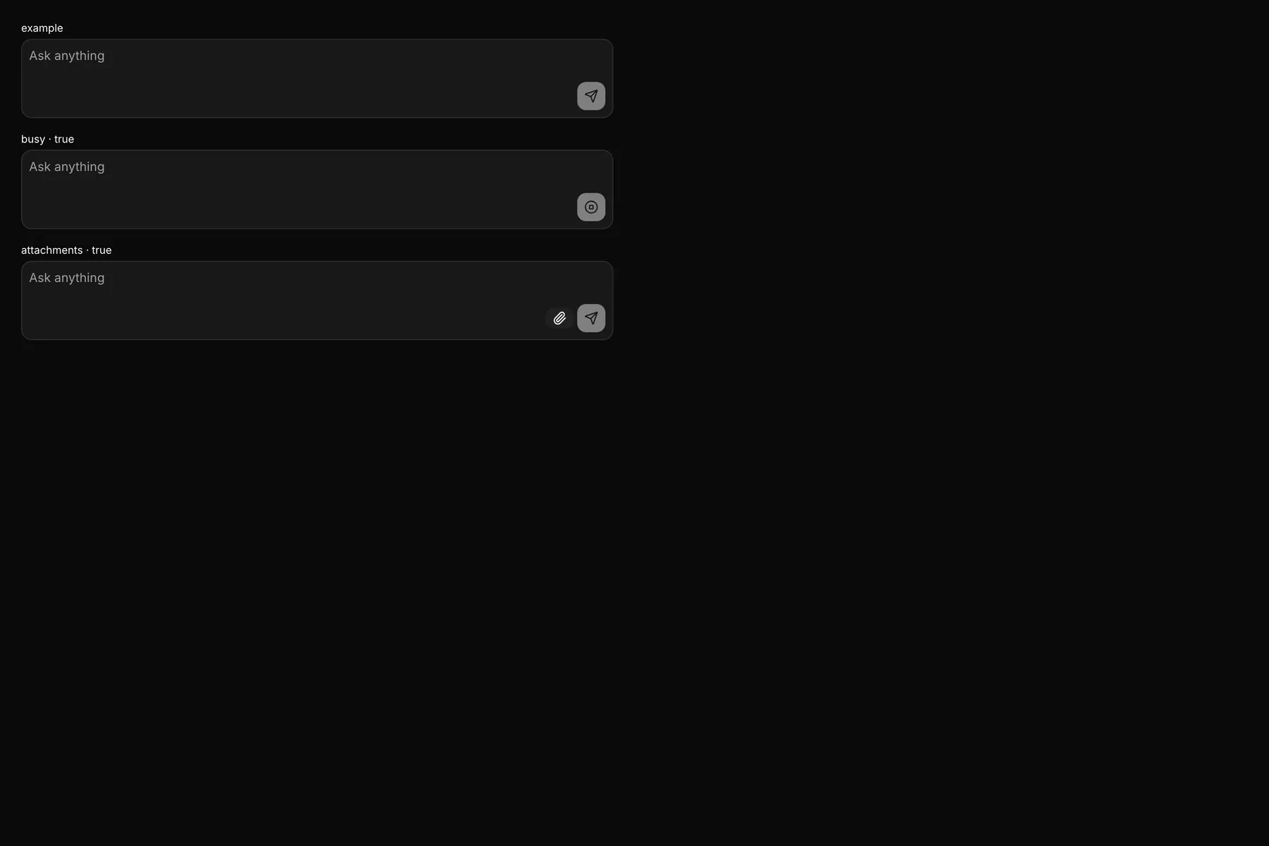
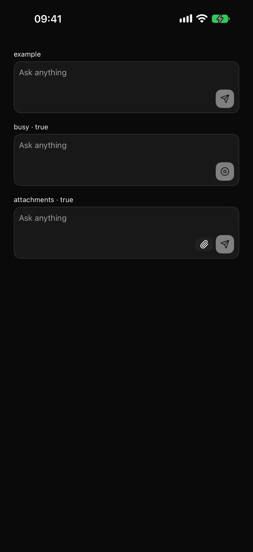
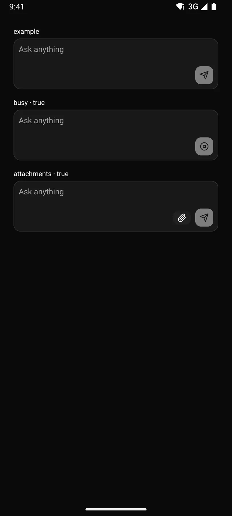
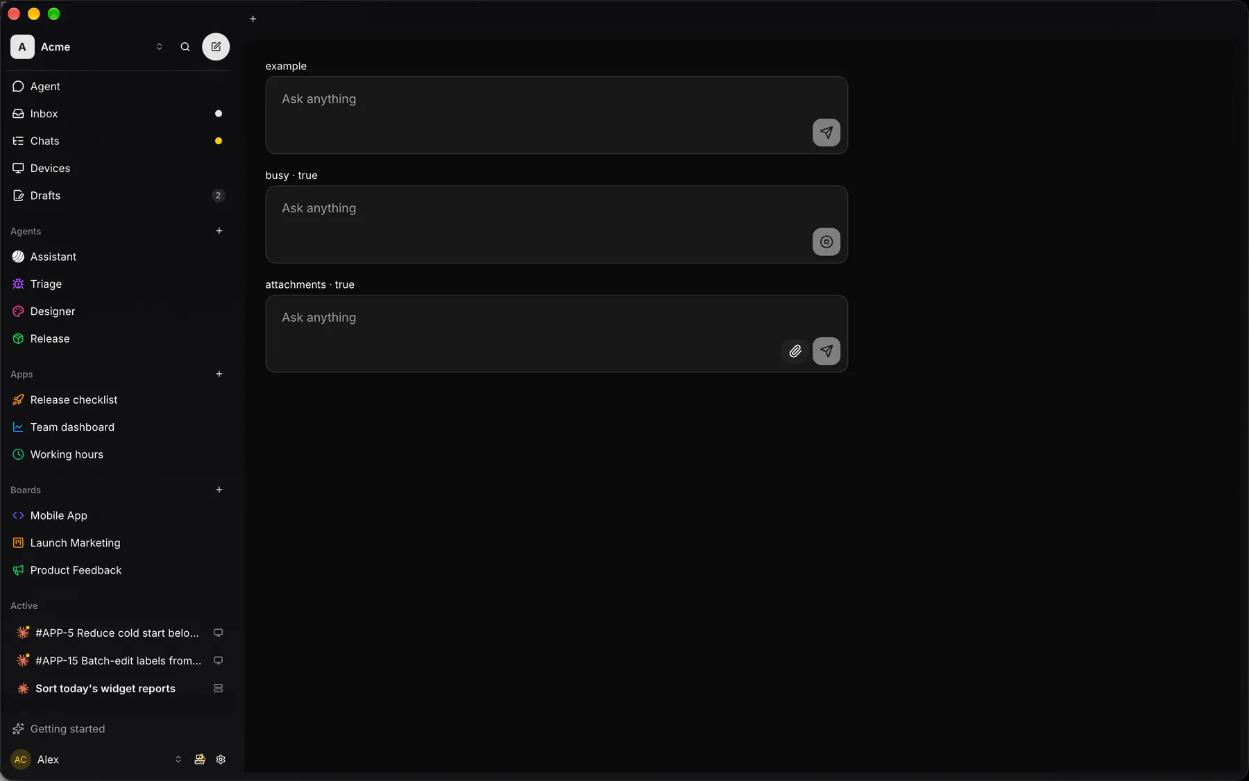
Section titled “Preview”example
busy · true
attachments · true
Platforms
Section titled “Platforms”The same specimen painted by React, SwiftUI, Compose and gpui.
| Prop | Type | Required | Bindable | Description |
|---|---|---|---|---|
placeholder |
string |
– | – | Hint text while empty. |
value |
string |
– | yes | The draft text; bind it. |
submitLabel |
string |
– | – | The submit button’s accessibility label. Default "$string.send". |
attachments |
boolean |
– | – | Shows the attach control. Default false. |
busy |
boolean |
– | – | Turns submit into a stop while a reply streams. Default false. |
Events
Section titled “Events”on.submit: runs an actionon.change: runs an actionon.stop: runs an action
None.
Children
Section titled “Children”none
A2UI basic mapping
Section titled “A2UI basic mapping”No basic catalog component maps here.
Built from
Section titled “Built from”A native component: every renderer paints it directly.
Accessibility
Section titled “Accessibility”Role: textbox
textbox (multiline) + send button
| Keys | Action |
|---|---|
Enter |
submit; Shift+Enter: newline |
Escape while busy |
stop |
Theming
Section titled “Theming”Recipe parts: Composer/root Composer/field Composer/placeholder Composer/attachment Composer/send
Keyed by: attachments busy :hover :pressed :focus :disabled :checked :open :selected :invalid :dragover
Related
Section titled “Related”Form · FieldGroup · FormActions · Input · Textarea · NumberField · Checkbox · Radio