

DockCard
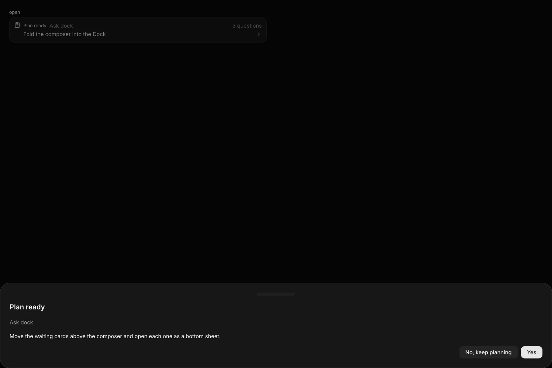
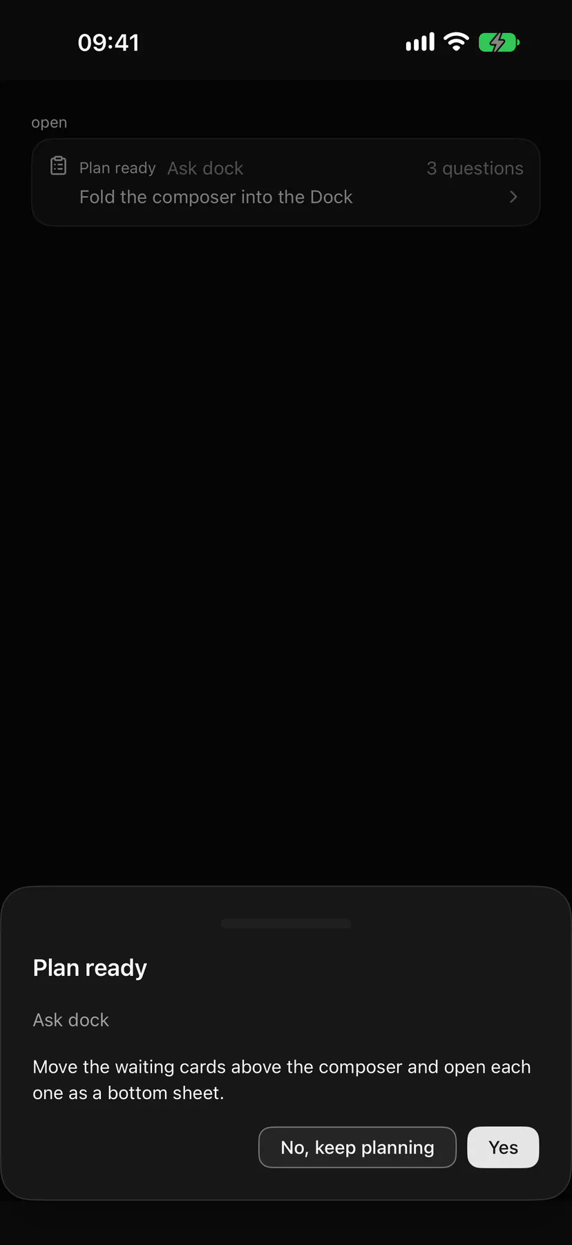
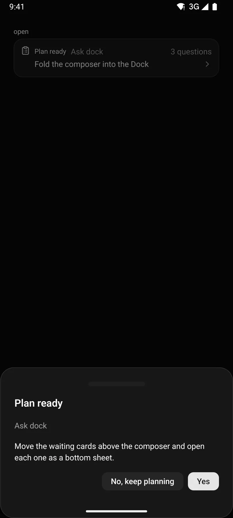
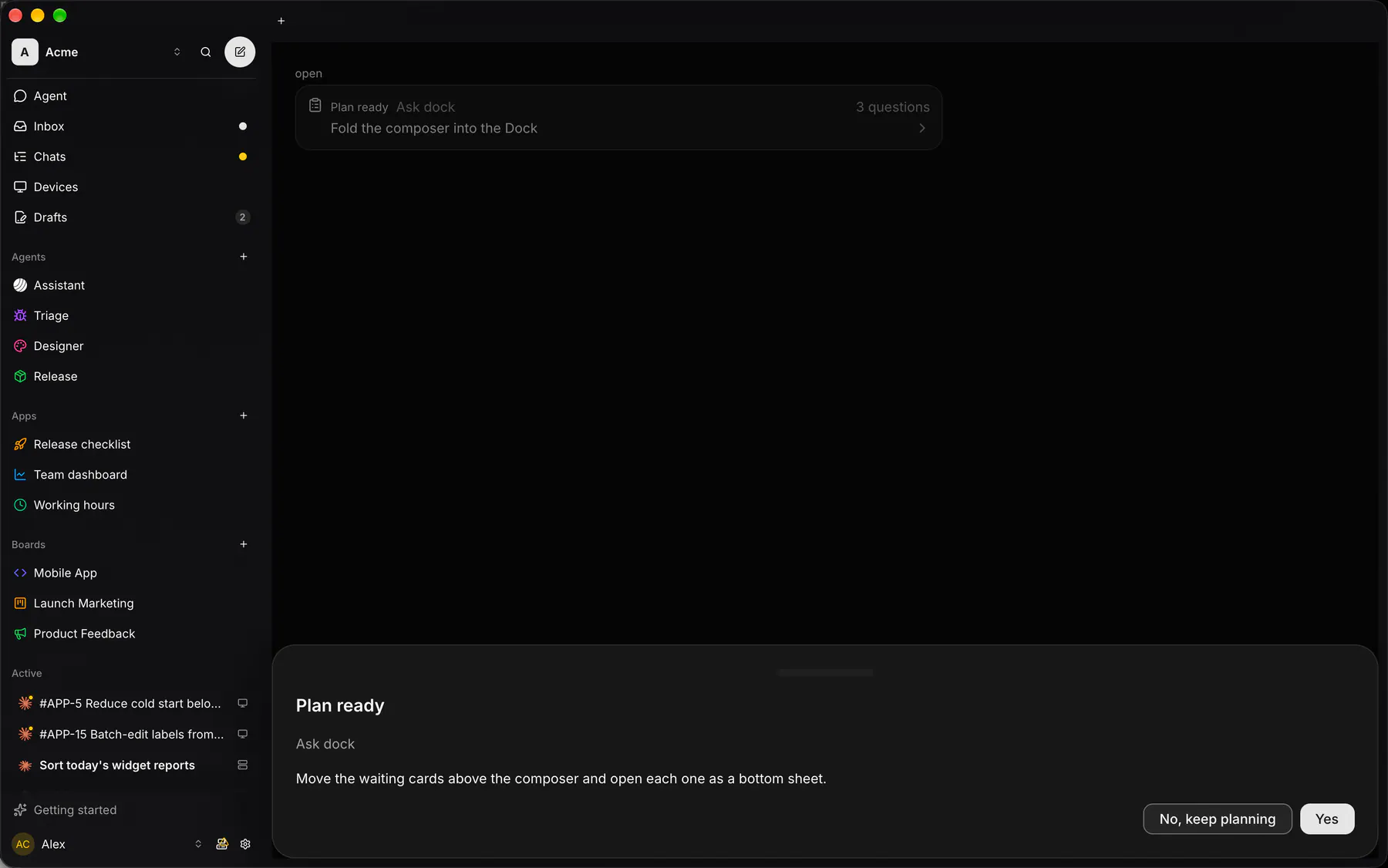
A floating one-row card whose children open in a bottom sheet with a pinned footer.
Group: Overlays · Kind: macro
Preview
Section titled “Preview”open
Plan readyAsk dock
Fold the composer into the Dock
Platforms
Section titled “Platforms”The same specimen painted by React, SwiftUI, Compose and gpui.
| Prop | Type | Required | Bindable | Description |
|---|---|---|---|---|
label |
string |
yes | yes | The tinted header word. |
title |
string |
yes | yes | The one line under the header. |
caption |
string |
– | yes | Muted text after the label. |
meta |
string |
– | yes | Muted text at the header’s end. |
icon |
icon |
– | – | The glyph before the label. |
tone |
neutral | primary | success | warning | danger | info |
– | – | The glyph’s and the label’s tone. Default "neutral". |
open |
boolean |
– | yes | Whether the sheet shows; bind it. Default false. |
Events
Section titled “Events”on.press: runs an actionon.change: runs an action
footer: one component by id
Children
Section titled “Children”many
A2UI basic mapping
Section titled “A2UI basic mapping”No basic catalog component maps here.
Built from
Section titled “Built from”Accessibility
Section titled “Accessibility”Role: button
trigger = button named label: title ($a11y); the sheet is a Drawer (dialog, modal).
| Keys | Action |
|---|---|
Enter Space |
open the sheet |
| – | As Drawer once open |
Theming
Section titled “Theming”Recipe parts: DockCard/root DockCard/trigger DockCard/icon DockCard/body DockCard/header DockCard/label DockCard/caption DockCard/spacer DockCard/meta DockCard/row DockCard/title DockCard/chevron DockCard/sheet
Keyed by: tone :hover :pressed :focus :disabled :checked :open :selected :invalid :dragover
Related
Section titled “Related”Drawer · Icon · Text · Dialog · AlertDialog · Popover · Tooltip · Menu