

Stepper
Wizard progress: numbered steps, finished ones ticked.
Group: Navigation · Kind: macro · in the lite catalog
Preview
Section titled “Preview”example
Account
Team
Done
orientation · horizontal
Account
Team
Done
orientation · vertical
Account
Team
Done
Platforms
Section titled “Platforms”The same specimen painted by React, SwiftUI, Compose and gpui.
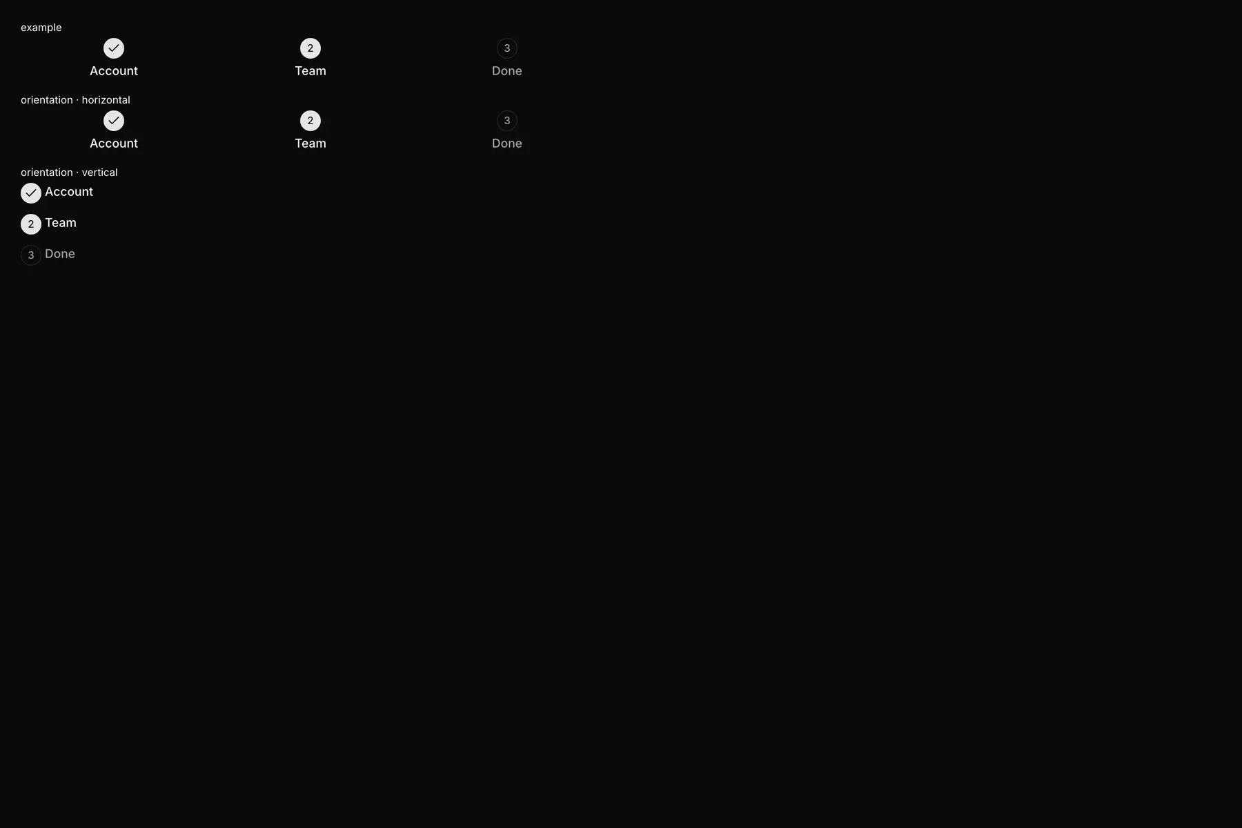
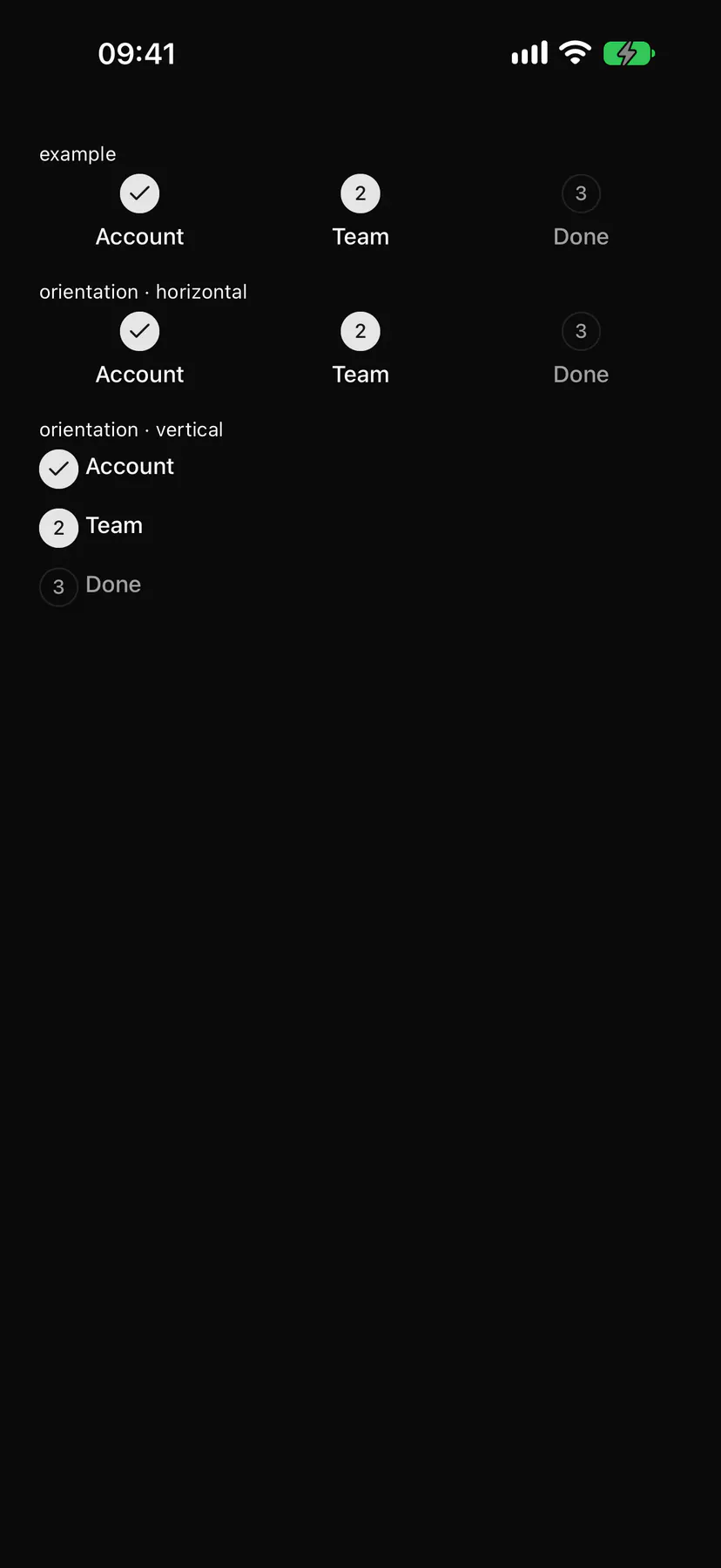
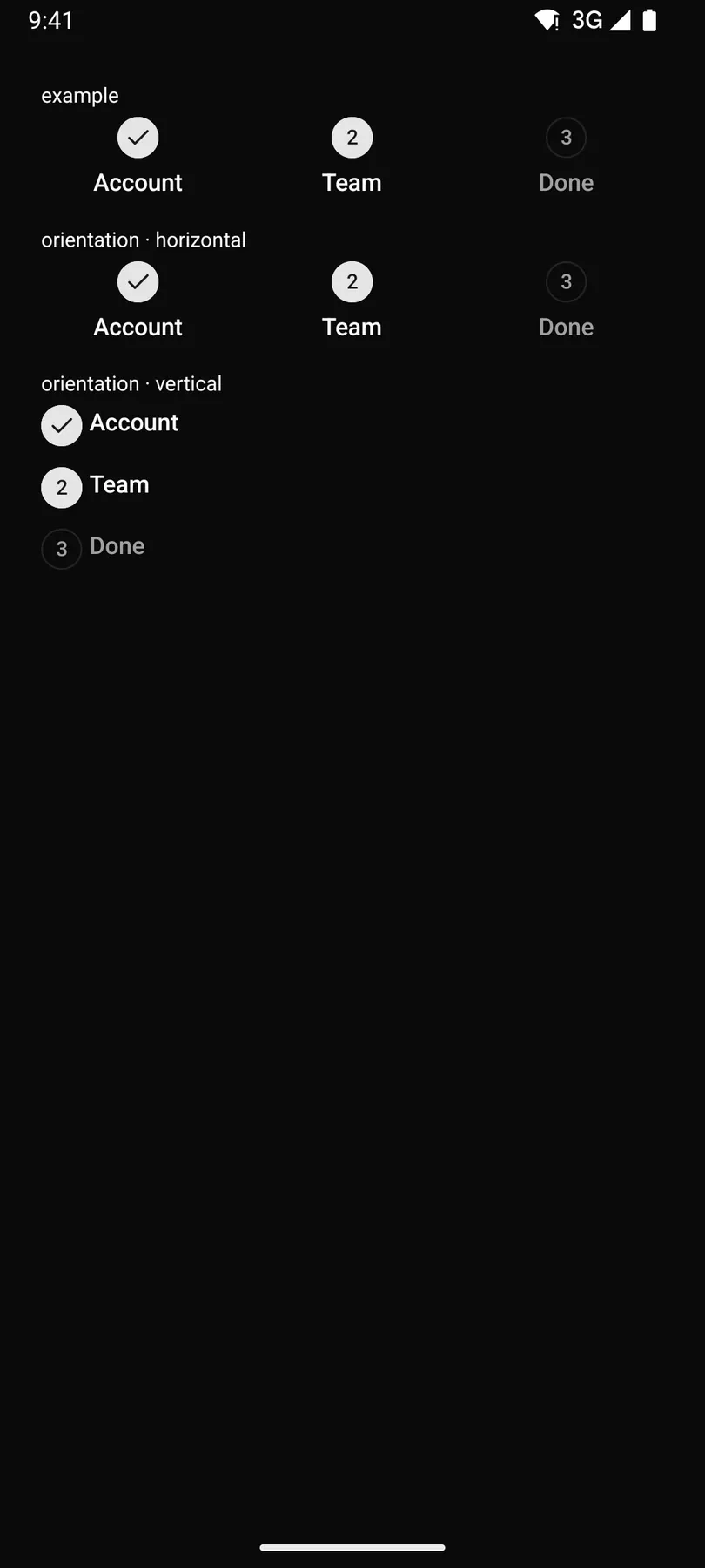
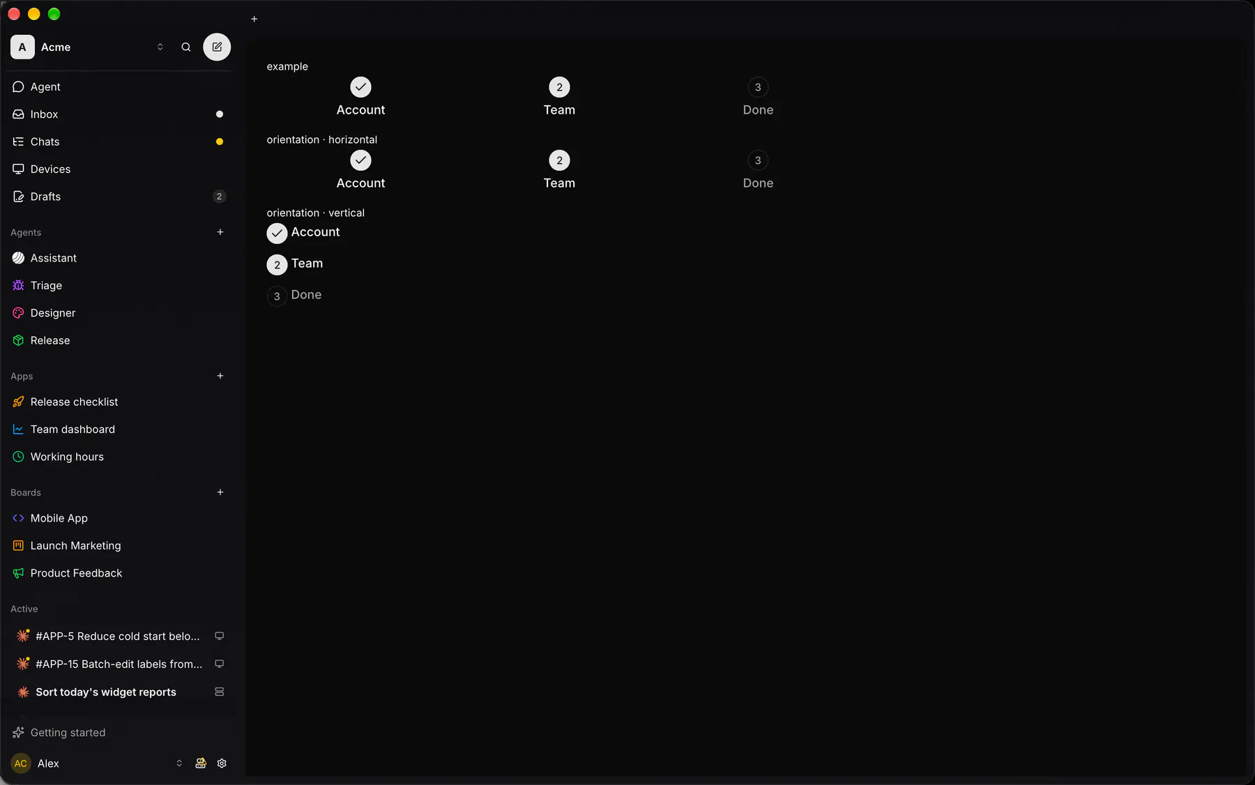
| Prop | Type | Required | Bindable | Description |
|---|---|---|---|---|
steps |
[step] |
yes | – | The steps in order. |
current |
number |
– | yes | The 0-based index of the active step. Default 0. |
orientation |
horizontal | vertical |
– | – | In a row or stacked. Default "horizontal". |
Events
Section titled “Events”None.
None.
Children
Section titled “Children”none
A2UI basic mapping
Section titled “A2UI basic mapping”No basic catalog component maps here.
Built from
Section titled “Built from”Accessibility
Section titled “Accessibility”Role: list
list; the current step aria-current=step. Each step a listitem labelled stepDone/stepCurrent/stepUpcoming; the current one aria-current=step ($a11y).
Not focusable; no keys.
Theming
Section titled “Theming”Recipe parts: Stepper/root Stepper/step Stepper/marker Stepper/check Stepper/number Stepper/body Stepper/label Stepper/description
Keyed by: orientation status :hover :pressed :focus :disabled :checked :open :selected :invalid :dragover
Related
Section titled “Related”Icon · Text · Tabs · Segmented · Accordion · Collapsible · Pagination · Breadcrumb