

Menu
A menu of actions, checkboxes, groups and submenus, opened by pressing its child or right-click / long-press.
Group: Overlays · Kind: native
Preview
Section titled “Preview”Platforms
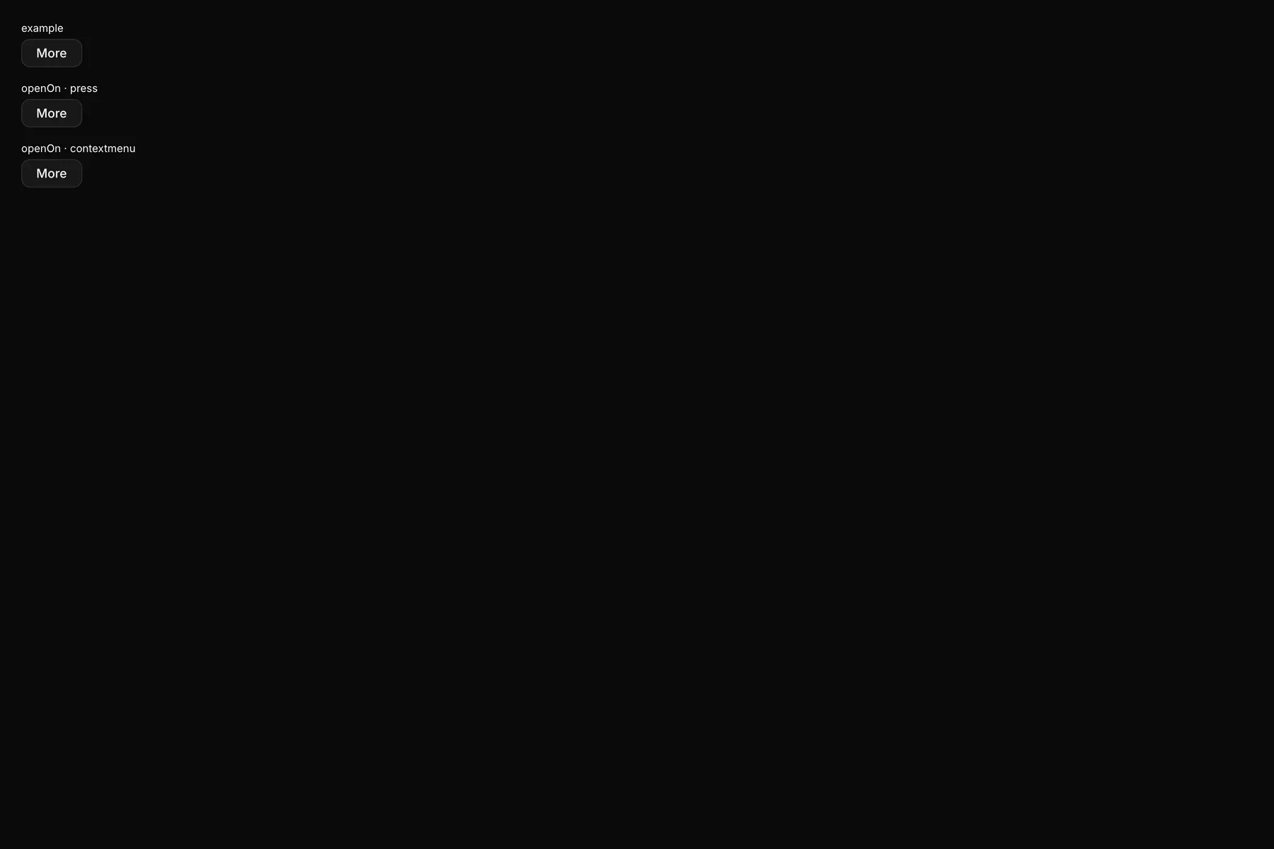
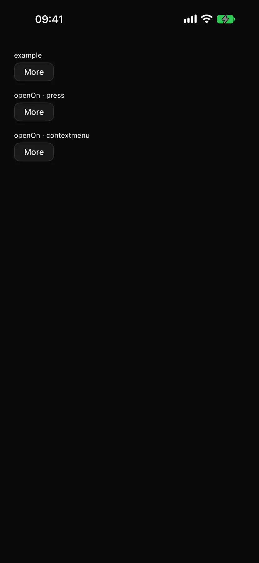
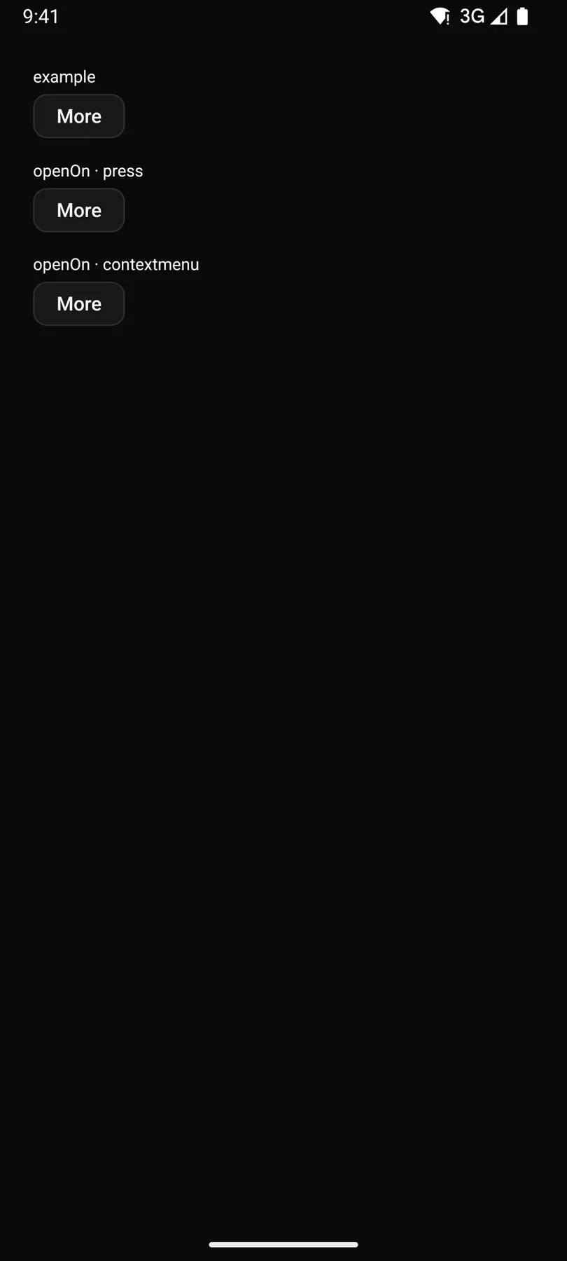
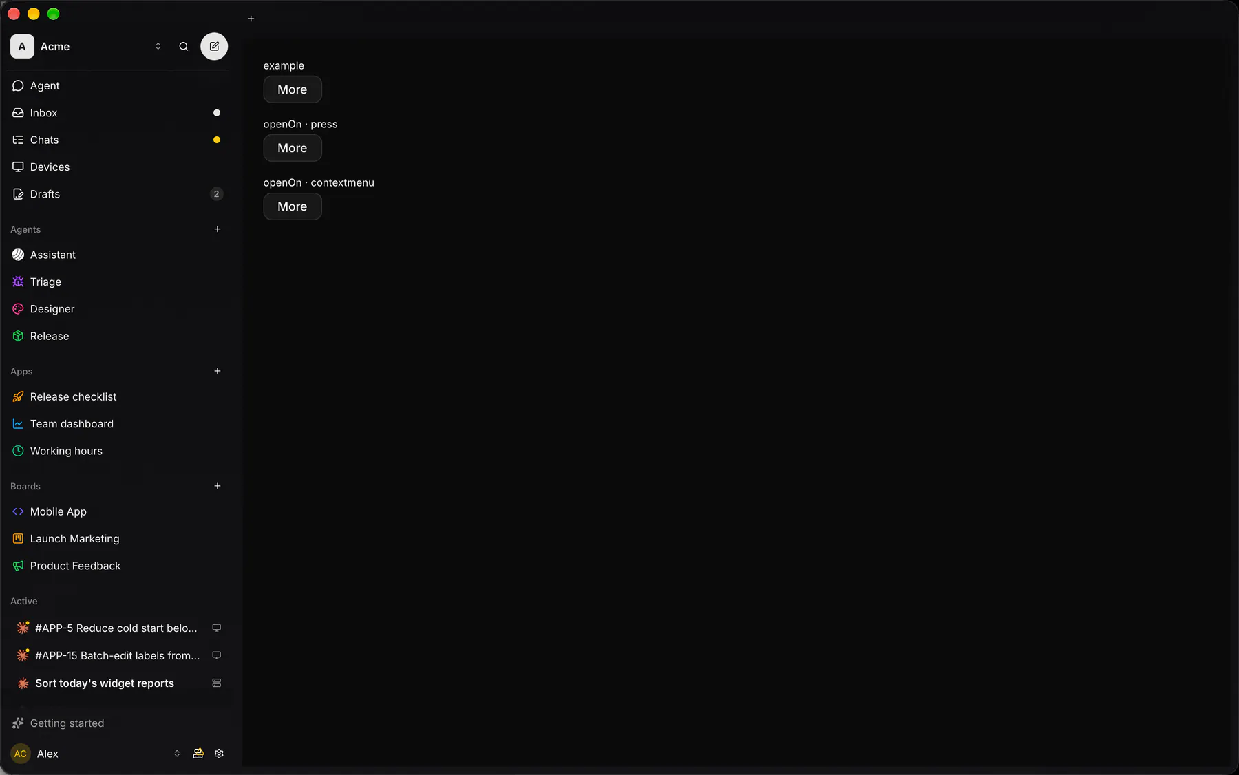
Section titled “Platforms”The same specimen painted by React, SwiftUI, Compose and gpui.
| Prop | Type | Required | Bindable | Description |
|---|---|---|---|---|
label |
string |
– | – | The default trigger’s text when no child is given. |
icon |
icon |
– | – | The default trigger’s icon. |
items |
[menuItem] |
yes | – | The entries in order. |
openOn |
press | contextmenu |
– | – | A press on the child, or the context gesture over it. Default "press". |
Events
Section titled “Events”on.select: runs an action
None.
Children
Section titled “Children”one
A2UI basic mapping
Section titled “A2UI basic mapping”No basic catalog component maps here.
Built from
Section titled “Built from”A native component: every renderer paints it directly.
Accessibility
Section titled “Accessibility”Role: menu
menu / menuitem / menuitemcheckbox / group / separator; openOn: contextmenu opens at the pointer
| Keys | Action |
|---|---|
Enter Space ArrowDown on the trigger |
open on the first item; ArrowUp: open on the last |
| – | Shift+F10 or the Menu key on the focused child (contextmenu): open at the child |
ArrowDown ArrowUp |
next/previous item (wraps, skips disabled) |
Home End |
first/last item |
Enter Space |
run the item (a checkbox item toggles and stays open) |
ArrowRight on a submenu |
open it; ArrowLeft or Escape inside: close it |
| – | A searchable submenu opens with its filter input focused: typing filters, ArrowDown/ArrowUp move the active row, Enter picks it, ArrowLeft with the caret at the start or Escape closes it |
Escape |
close and return focus to the trigger |
Typing a letter |
the next item starting with it |
Theming
Section titled “Theming”Recipe parts: Menu/trigger Menu/content Menu/item Menu/separator Menu/label Menu/shortcut Menu/check Menu/submenuIndicator Menu/head Menu/search Menu/count Menu/list Menu/empty Menu/fade
Keyed by: openOn :hover :pressed :focus :disabled :checked :open :selected :invalid :dragover
Related
Section titled “Related”Dialog · Drawer · DockCard · AlertDialog · Popover · Tooltip · Toast