

Toggle
A two-state button that stays pressed.
Group: Actions · Kind: native
Preview
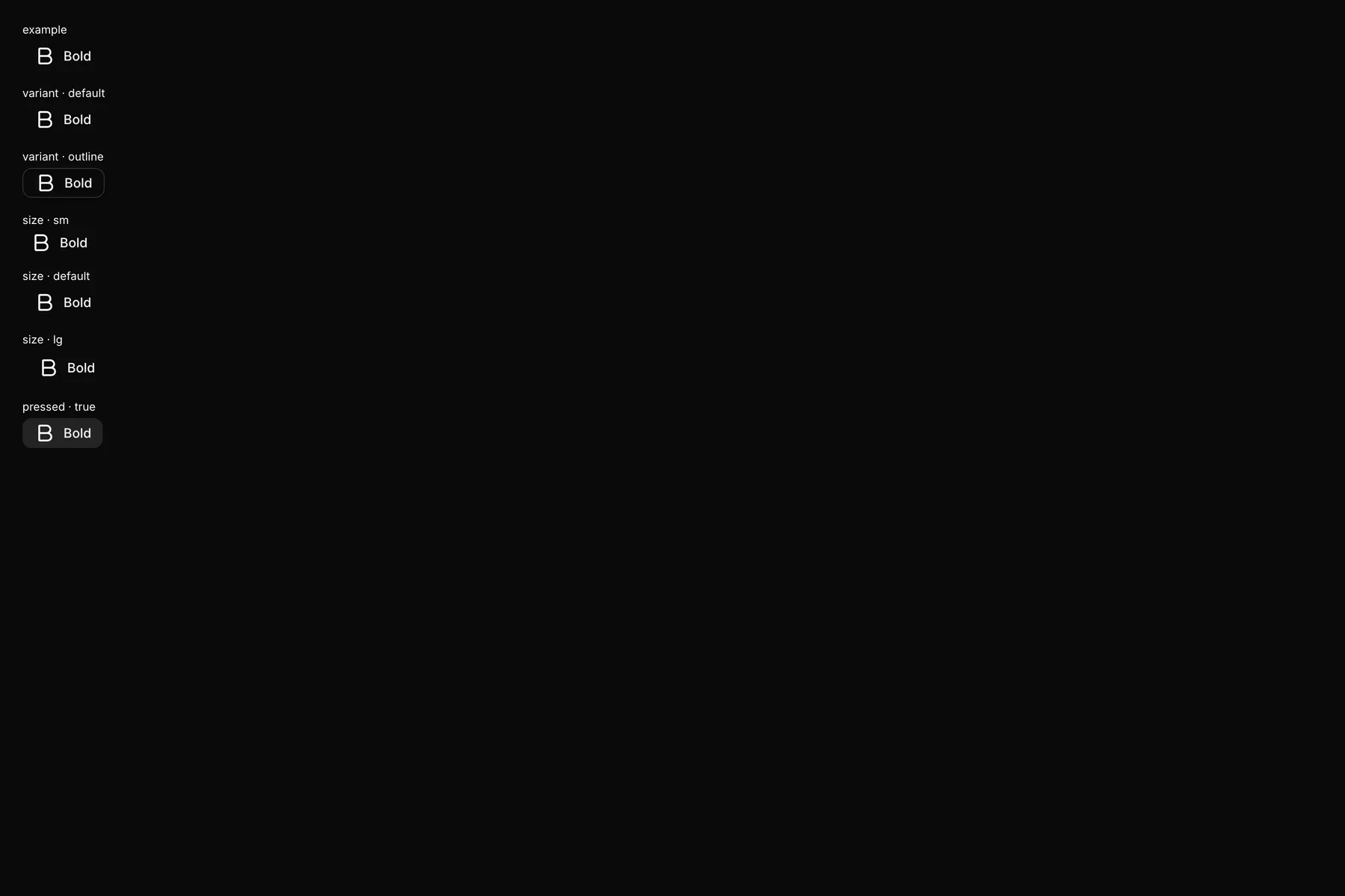
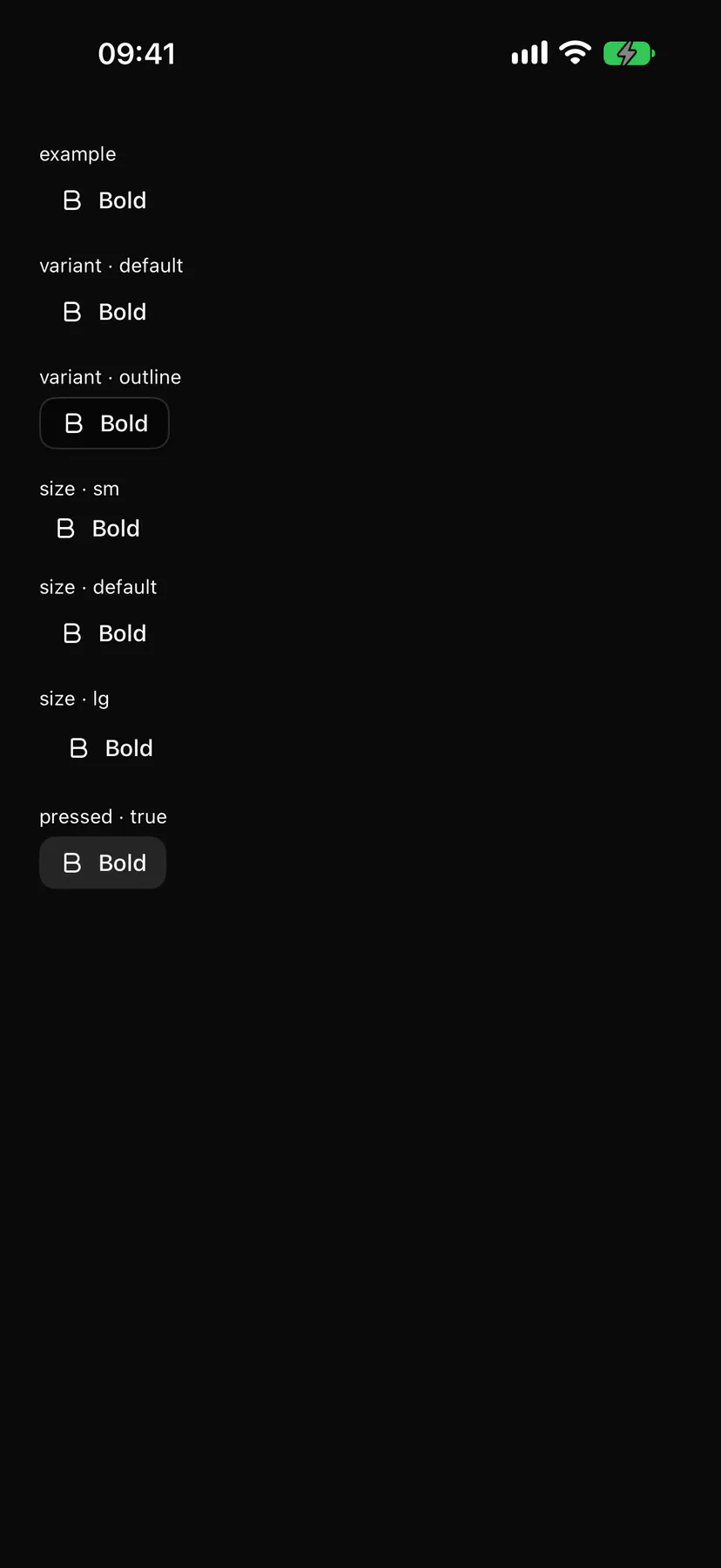
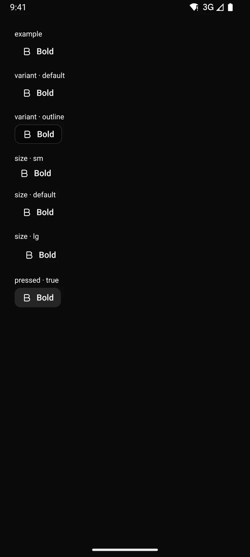
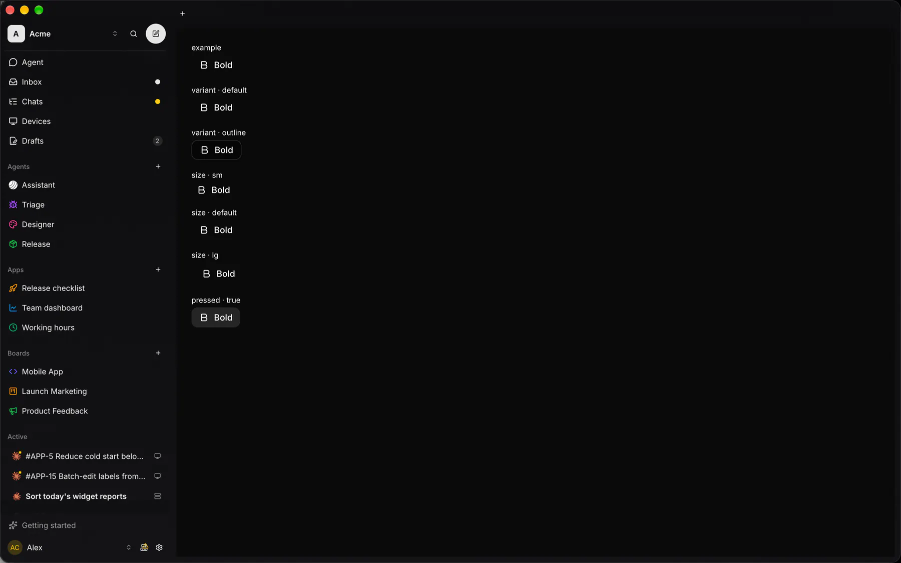
Section titled “Preview”example
variant · default
variant · outline
size · sm
size · default
size · lg
pressed · true
Platforms
Section titled “Platforms”The same specimen painted by React, SwiftUI, Compose and gpui.
| Prop | Type | Required | Bindable | Description |
|---|---|---|---|---|
label |
string |
yes | – | The button text or accessibility label. |
icon |
icon |
– | – | An icon before or instead of the label. |
pressed |
boolean |
– | yes | The state; bind it. Default false. |
variant |
default | outline |
– | – | Plain or outlined. Default "default". |
size |
sm | default | lg |
– | – | Control height class. Default "default". |
Events
Section titled “Events”on.change: runs an action
None.
Children
Section titled “Children”none
A2UI basic mapping
Section titled “A2UI basic mapping”No basic catalog component maps here.
Built from
Section titled “Built from”A native component: every renderer paints it directly.
Accessibility
Section titled “Accessibility”Role: button
button with aria-pressed
| Keys | Action |
|---|---|
Enter Space |
toggle |
Theming
Section titled “Theming”Recipe parts: Toggle/root Toggle/icon Toggle/label
Keyed by: variant size pressed :hover :pressed :focus :disabled :checked :open :selected :invalid :dragover