

Image
A picture from a URL, or a placeholder box when it has none.
Group: Media · Kind: native
Preview
Section titled “Preview”example
fit · contain
fit · fill
fit · none
fit · scaleDown
Platforms
Section titled “Platforms”The same specimen painted by React, SwiftUI, Compose and gpui.
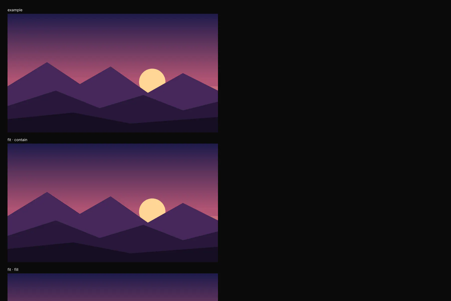
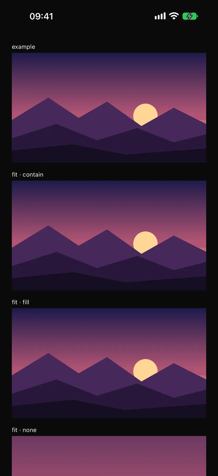
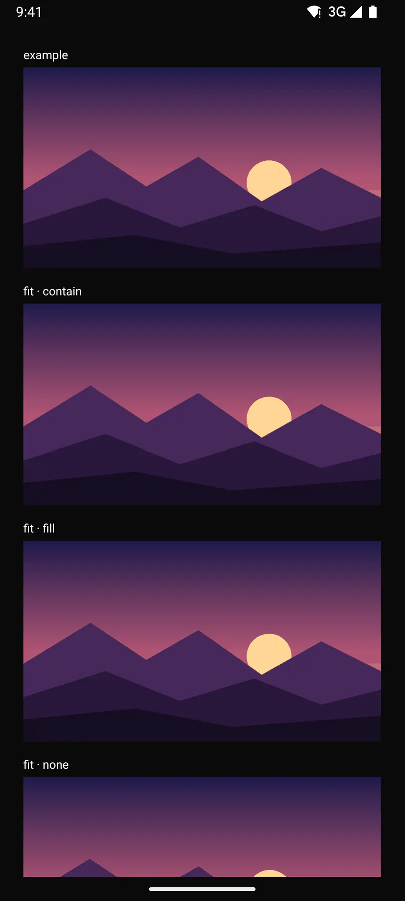
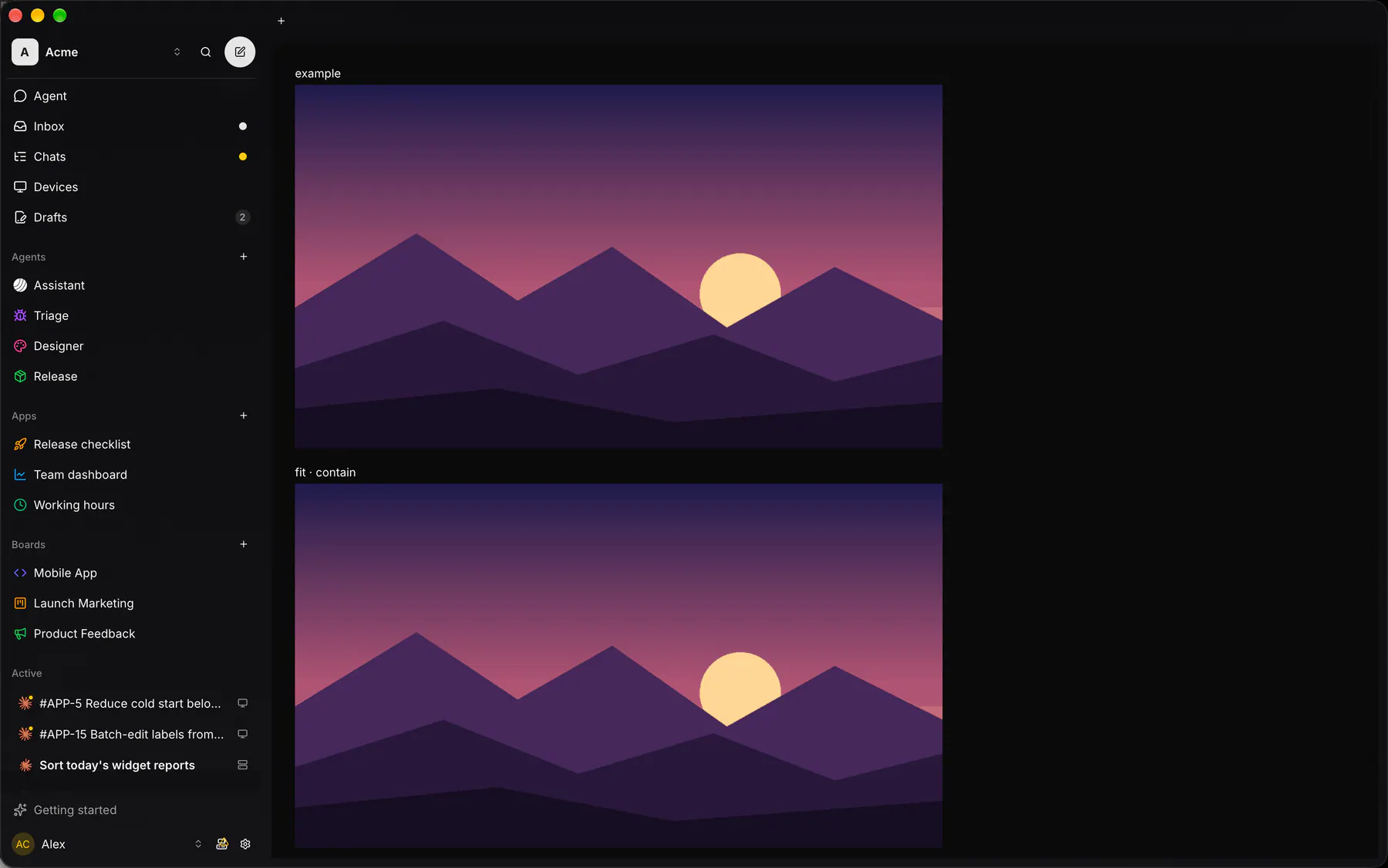
| Prop | Type | Required | Bindable | Description |
|---|---|---|---|---|
src |
url |
– | yes | The image URL; omit for a placeholder. |
alt |
string |
yes | yes | The accessibility description. |
fit |
contain | cover | fill | none | scaleDown |
– | – | How the picture fills its box. Default "cover". |
width |
number |
– | – | Fixed width in px; otherwise the box decides. |
height |
number |
– | – | Fixed height in px. |
aspectRatio |
number |
– | – | Width over height (16:9 when unset and no height); the box never waits for the picture. |
fallback |
icon |
– | – | An icon shown when the picture fails or is missing. |
loading |
lazy | eager |
– | – | Defer loading until near the viewport, or load at once. Default "lazy". |
focalX |
number |
– | – | Horizontal focal point 0..1 kept when cropped (0.5). |
focalY |
number |
– | – | Vertical focal point 0..1 kept when cropped (0.5). |
style |
style |
– | – | Extra Box styles for the image box. |
Events
Section titled “Events”None.
None.
Children
Section titled “Children”none
A2UI basic mapping
Section titled “A2UI basic mapping”The basic catalog’s Image renders as Image.
Built from
Section titled “Built from”A native component: every renderer paints it directly.
Accessibility
Section titled “Accessibility”Role: img
img (alt = name; decorative when alt is empty)
Not focusable; no keys.
Theming
Section titled “Theming”Recipe parts: Image/root Image/fallback
Keyed by: fit :hover :pressed :focus :disabled :checked :open :selected :invalid :dragover
Related
Section titled “Related”Mosaic · Chip · ZoomableImage · Icon · Video · AudioPlayer · Avatar · QrCode