

ScrollArea
A scrolling region of bounded height or width.
Group: Layout · Kind: macro · in the lite catalog
Preview
Section titled “Preview”example
Issue 1
Issue 2
Issue 3
Issue 4
Issue 5
Issue 6
Issue 7
Issue 8
direction · horizontal
Issue 1
Issue 2
Issue 3
Issue 4
Issue 5
Issue 6
Issue 7
Issue 8
direction · both
Issue 1
Issue 2
Issue 3
Issue 4
Issue 5
Issue 6
Issue 7
Issue 8
Platforms
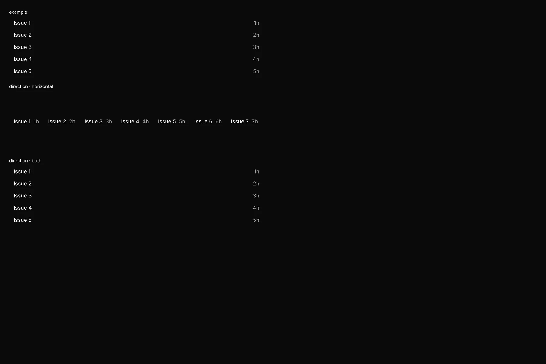
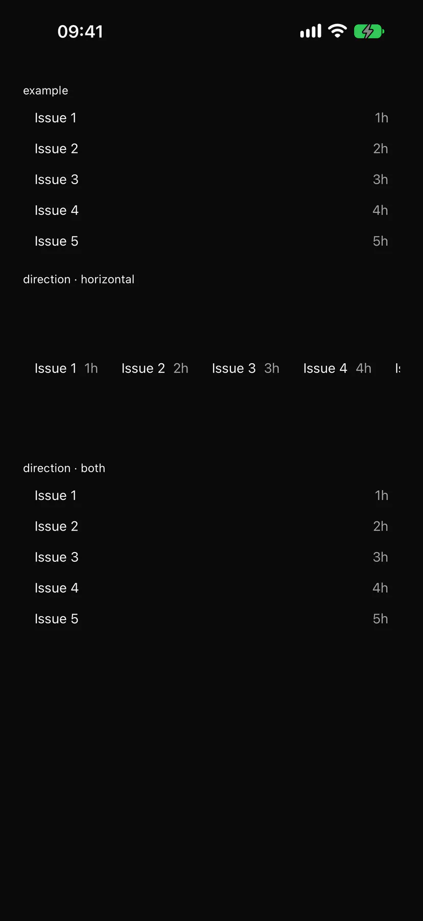
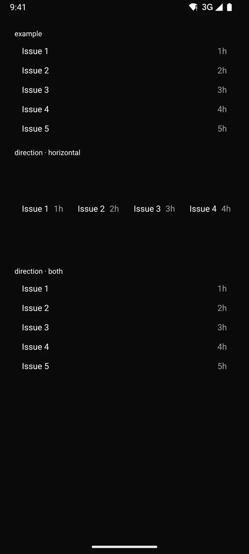
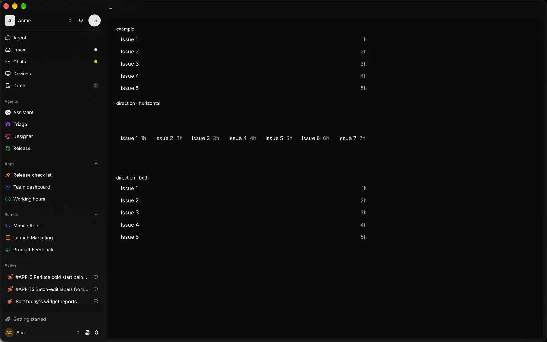
Section titled “Platforms”The same specimen painted by React, SwiftUI, Compose and gpui.
| Prop | Type | Required | Bindable | Description |
|---|---|---|---|---|
direction |
vertical | horizontal | both |
– | – | Which axis scrolls. Default "vertical". |
maxHeight |
number |
– | – | Px it scrolls within; omit to fill the parent. |
style |
style |
– | – | Extra Box styles merged over the region’s own. |
Events
Section titled “Events”None.
None.
Children
Section titled “Children”many
A2UI basic mapping
Section titled “A2UI basic mapping”No basic catalog component maps here.
Built from
Section titled “Built from”Accessibility
Section titled “Accessibility”Role: region
region (scrollable, focusable when it overflows)
| Keys | Action |
|---|---|
| – | Arrow keys, PageUp/PageDown, Home/End scroll while focused |
Theming
Section titled “Theming”Recipe parts: ScrollArea/root
Keyed by: :hover :pressed :focus :disabled :checked :open :selected :invalid :dragover
Related
Section titled “Related”Box · Stack · Grid · Card · Separator · List · Resizable · Sidebar