

Separator
A hairline that divides content.
Group: Layout · Kind: macro · in the lite catalog
Preview
Section titled “Preview”example
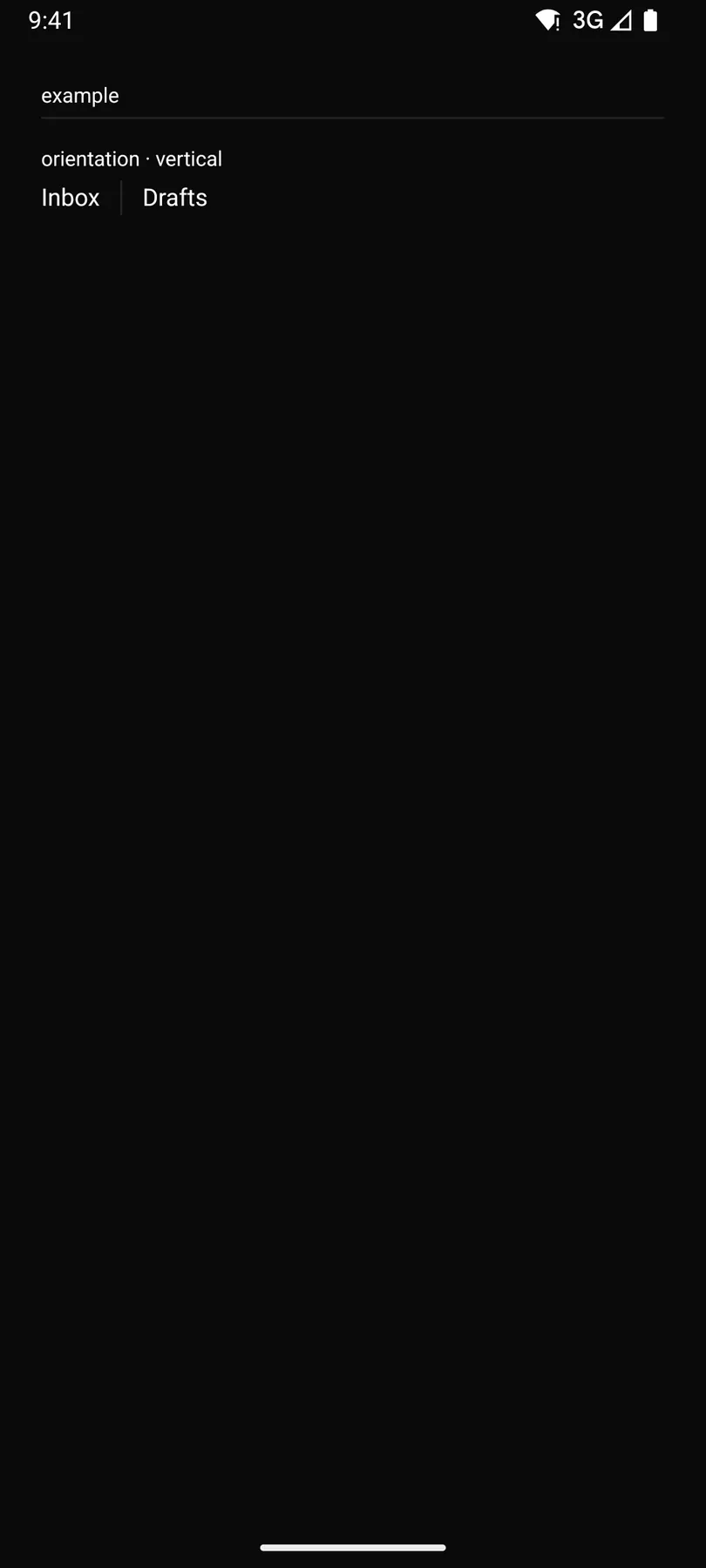
orientation · vertical
Platforms
Section titled “Platforms”The same specimen painted by React, SwiftUI, Compose and gpui.



| Prop | Type | Required | Bindable | Description |
|---|---|---|---|---|
orientation |
horizontal | vertical |
– | – | A horizontal rule or a vertical bar. Default "horizontal". |
Events
Section titled “Events”None.
None.
Children
Section titled “Children”none
A2UI basic mapping
Section titled “A2UI basic mapping”The basic catalog’s Divider renders as Separator.
Built from
Section titled “Built from”Accessibility
Section titled “Accessibility”Role: separator
separator
Not focusable; no keys.
Theming
Section titled “Theming”Recipe parts: Separator/root
Keyed by: :hover :pressed :focus :disabled :checked :open :selected :invalid :dragover
Related
Section titled “Related”SplitView · Box · Stack · Grid · Card · List · Resizable · ScrollArea