

SettingsRow
Settings line: label (+ description), then the control (children).
Group: Inputs · Kind: macro · in the lite catalog
Preview
Section titled “Preview”example · a settings group
Notifications
Email notifications
DigestHow often the summary email goes out.
Ring volume
stackBelow · xl (stacked)
DigestHow often the summary email goes out.
Platforms
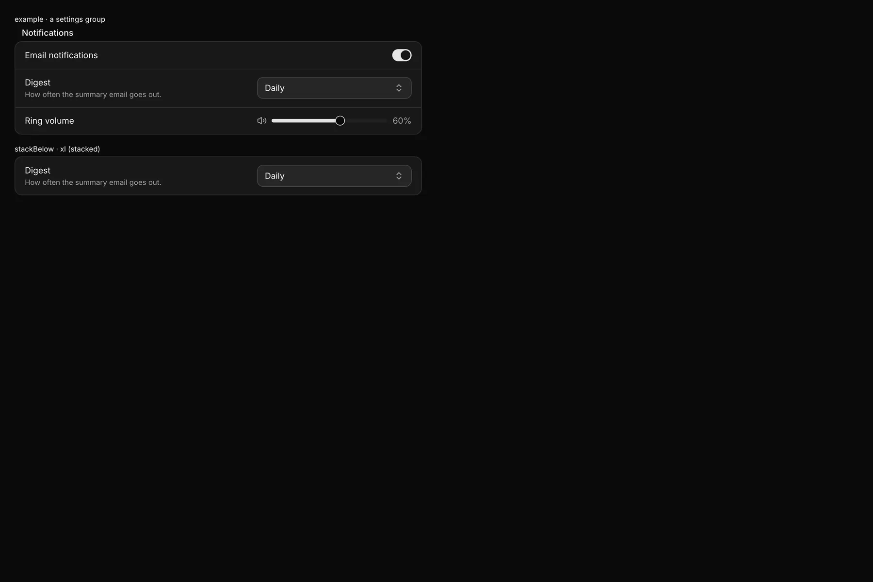
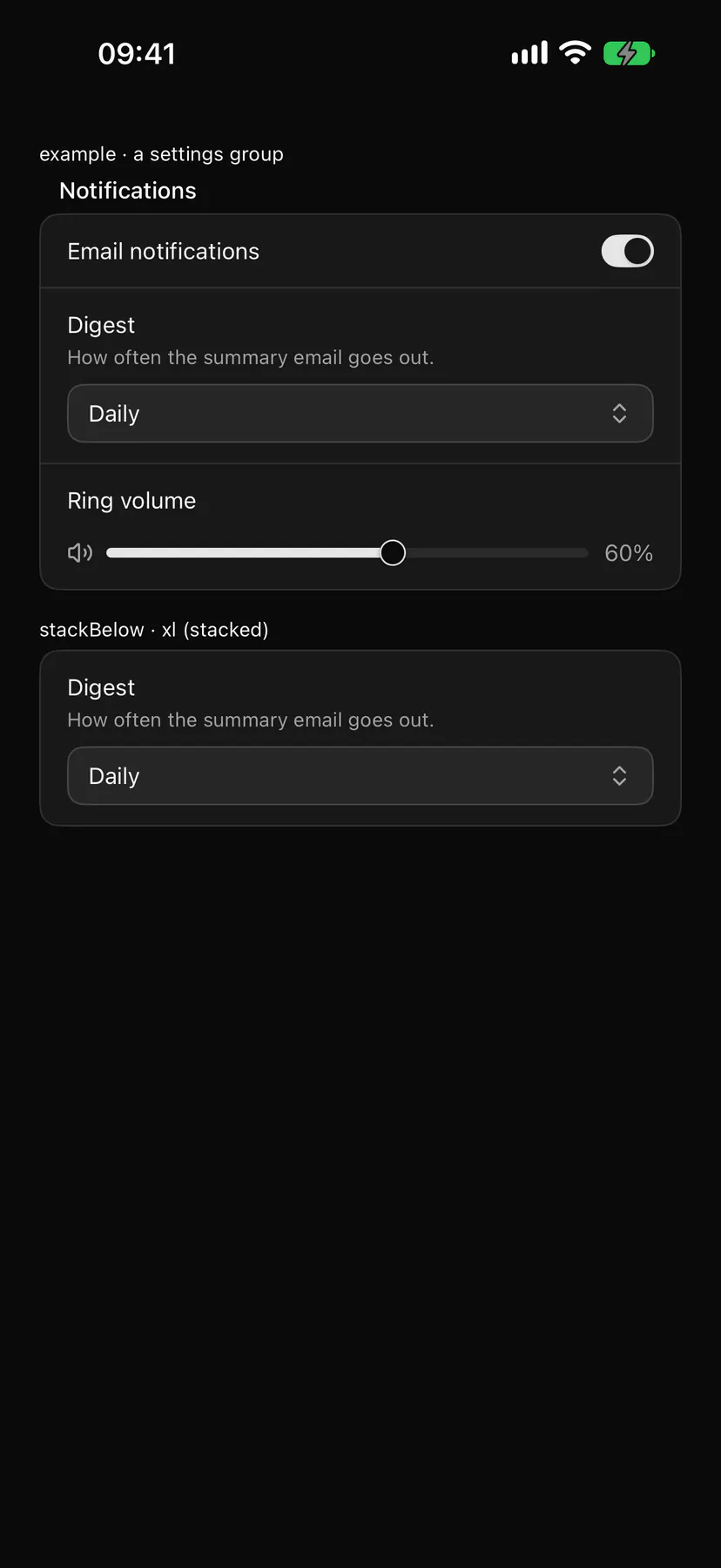
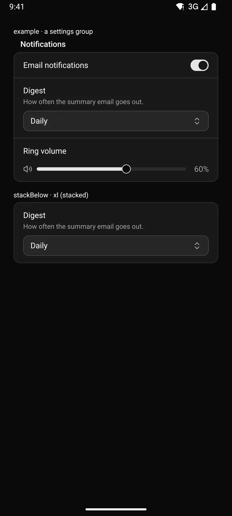
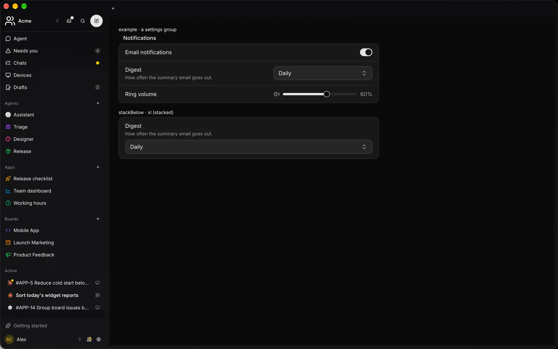
Section titled “Platforms”The same specimen painted by React, SwiftUI, Compose and gpui.
Variants
Section titled “Variants”stackBelow · sm
Email notificationsOne email a day at 8:00.
stackBelow · md
Email notificationsOne email a day at 8:00.
stackBelow · lg
Email notificationsOne email a day at 8:00.
stackBelow · xl
Email notificationsOne email a day at 8:00.
| Prop | Type | Required | Bindable | Description |
|---|---|---|---|---|
label |
string |
yes | yes | Setting’s name. |
description |
string |
– | yes | Muted line under the label. |
stackBelow |
never | sm | md | lg | xl |
– | – | Below this, control under the label. Default "sm". |
Events
Section titled “Events”None.
None.
Children
Section titled “Children”many
A2UI basic mapping
Section titled “A2UI basic mapping”No basic catalog component maps here.
Built from
Section titled “Built from”Accessibility
Section titled “Accessibility”Role: group
group named by the label, described by the description; the control inside needs no label of its own
Not focusable; no keys.
Theming
Section titled “Theming”Recipe parts: SettingsRow/root SettingsRow/text SettingsRow/label SettingsRow/description SettingsRow/control
Keyed by: :hover :pressed :focus :disabled :checked :open :selected :invalid :dragover :warning :info
Related
Section titled “Related”Text · Form · FieldGroup · FormActions · Input · Textarea · NumberField · Checkbox