
Canvas
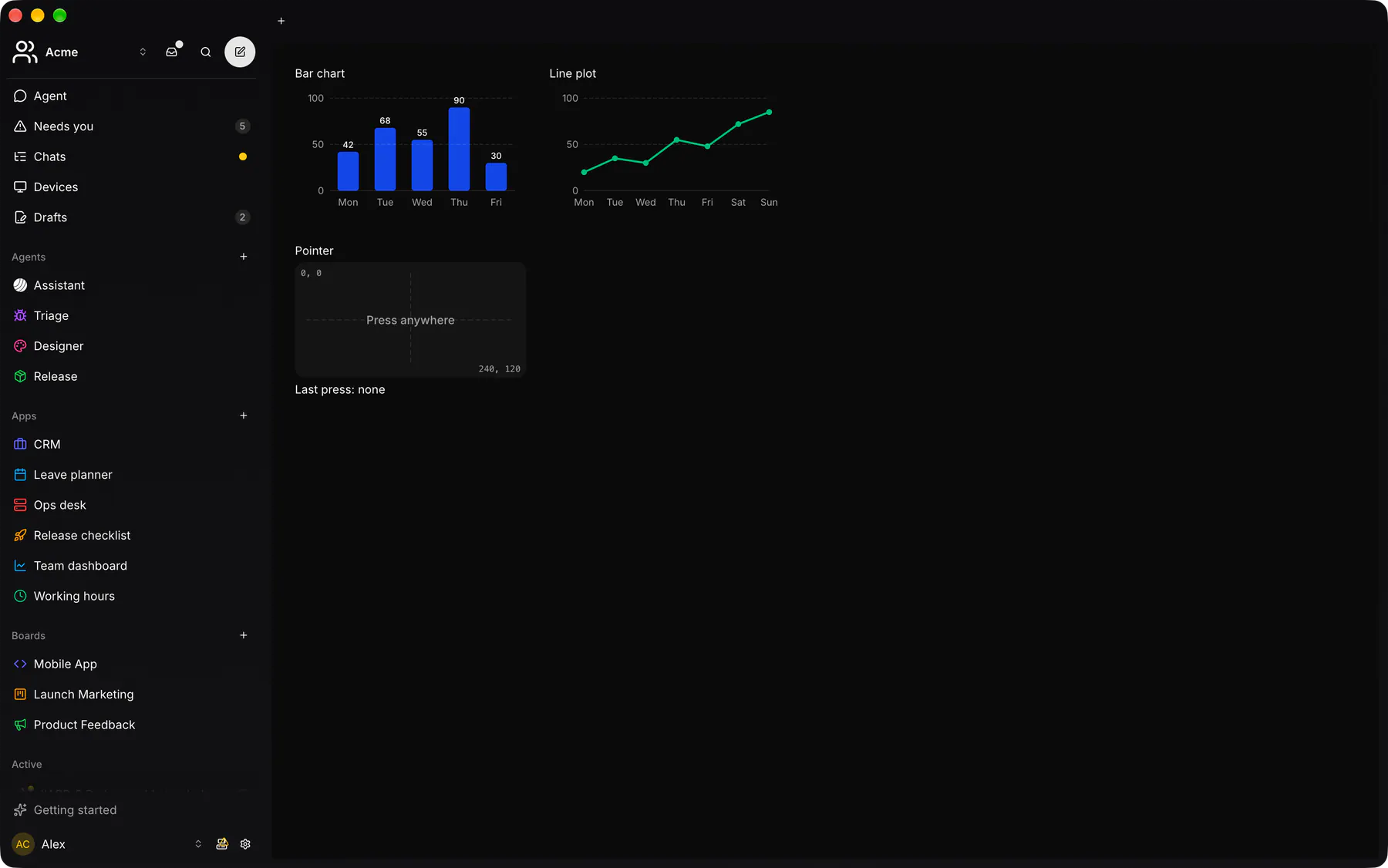
Static drawing of shapes and text (charts, diagrams); Motion animates.
Group: Media · Kind: native · in the lite catalog
Preview
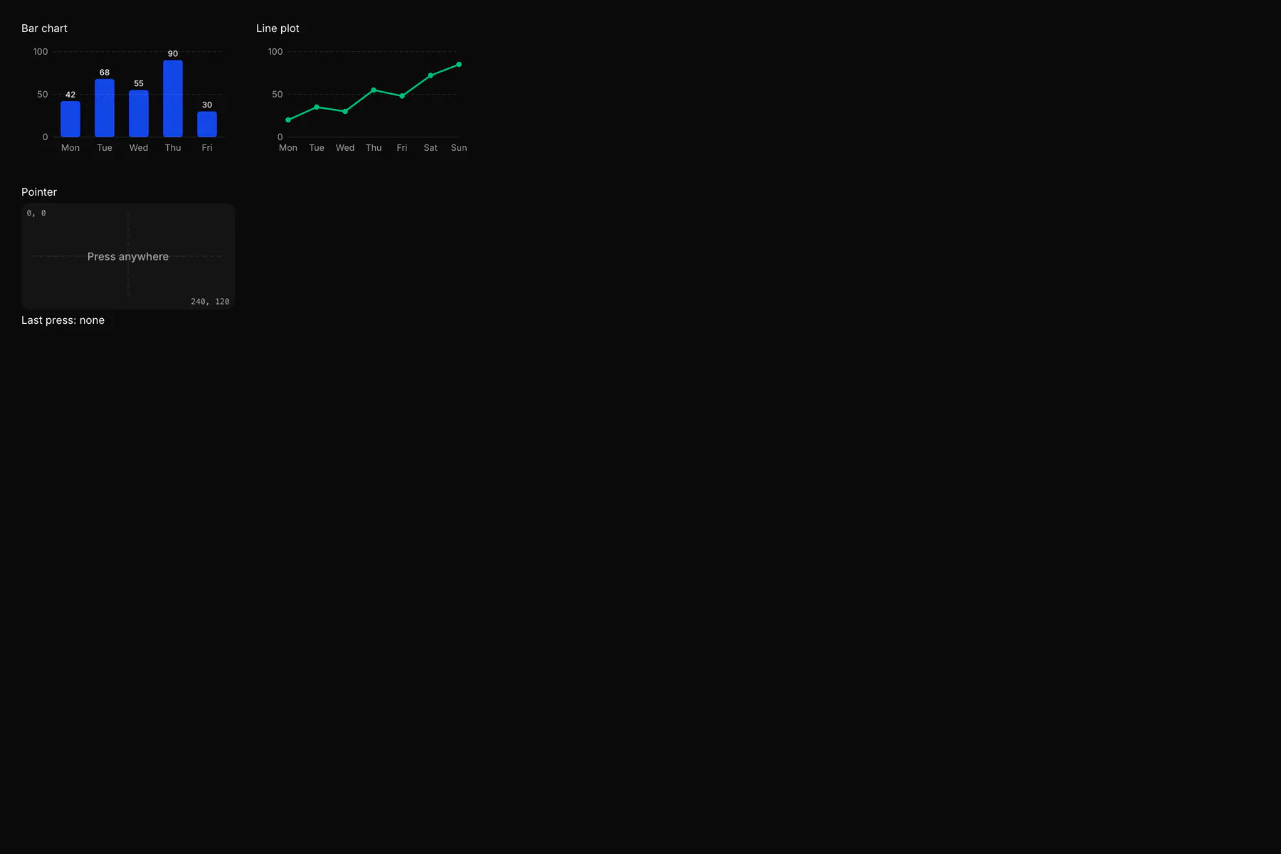
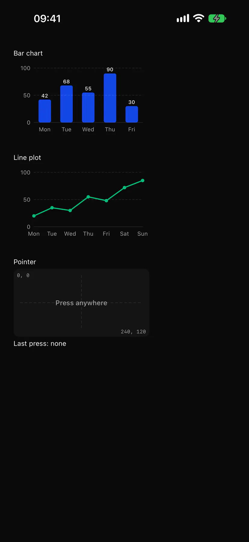
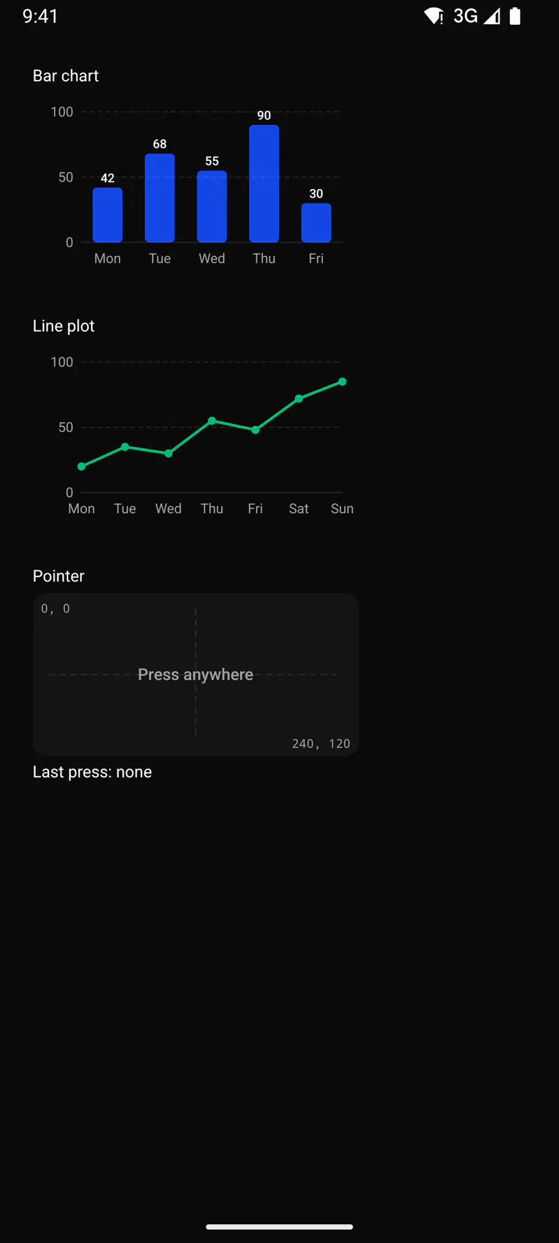
Section titled “Preview”Line plot
PointerLast press: none
Platforms
Section titled “Platforms”The same specimen painted by React, SwiftUI, Compose and gpui.
Variants
Section titled “Variants”fit · contain
fit · cover
fit · fill
pointer
| Prop | Type | Required | Bindable | Description |
|---|---|---|---|---|
size |
[number] |
yes | – | Drawing units [w, h], origin top-left. |
shapes |
[object] |
yes | yes | Motion’s shapes (no keys) + upright text on top {text, position, size, weight, align start|center|end, baseline top|middle|alphabetic, font sans|mono, color}. |
fit |
contain | cover | fill |
– | – | How it fills the box. Default "contain". |
label |
string |
– | – | What it shows, for screen readers. |
pointer |
boolean |
– | – | press/move/leave get {x, y} in drawing units. Default false. |
style |
style |
– | – | Extra Box styles for the box. |
Events
Section titled “Events”on.press: runs an actionon.move: runs an actionon.leave: runs an action
None.
Children
Section titled “Children”none
A2UI basic mapping
Section titled “A2UI basic mapping”No basic catalog component maps here.
Built from
Section titled “Built from”A native component: every renderer paints it directly.
Accessibility
Section titled “Accessibility”Role: img
img named by label; decorative (hidden) without one. pointer adds no focus stop or role: press/move/leave carry drawing coordinates for pointer users, so put what it shows in the label (or a Table beside it)
| Keys | Action |
|---|---|
None |
press/move/leave are pointer-only (keyboard users read the label) |
Theming
Section titled “Theming”Recipe parts: Canvas/root
Keyed by: fit :hover :pressed :focus :disabled :checked :open :selected :invalid :dragover :warning :info
Related
Section titled “Related”Motion · Image · ZoomableImage · Icon · Video · AudioPlayer · Avatar · QrCode