

IconPicker
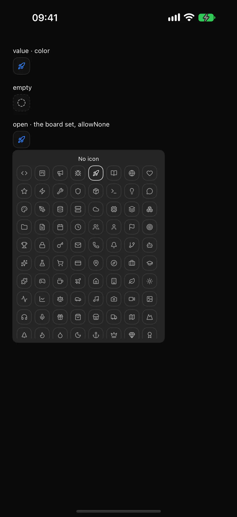
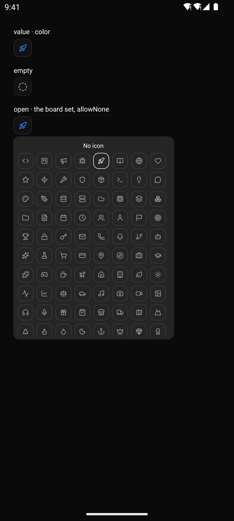
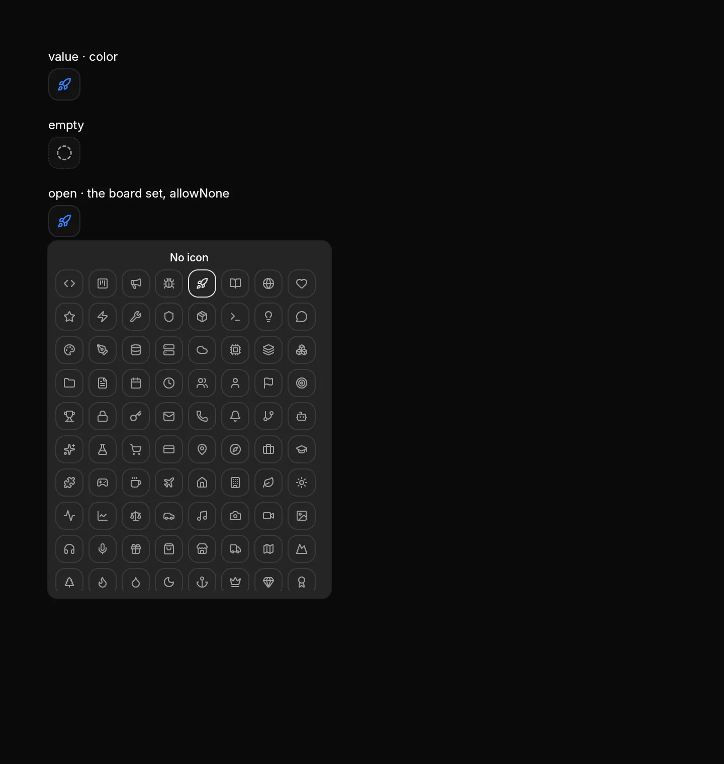
Icon field: a square with the pick opens an icon grid.
Group: Inputs · Kind: macro
Preview
Section titled “Preview”Platforms
Section titled “Platforms”The same specimen painted by React, SwiftUI, Compose and gpui.

Variants
Section titled “Variants”| Prop | Type | Required | Bindable | Description |
|---|---|---|---|---|
value |
string |
– | yes | Picked icon name. |
icons |
[icon] |
– | – | Offered; default the board set. |
color |
string |
– | – | Hex tint of the pick. |
allowNone |
boolean |
– | – | Adds a No icon row. Default false. |
open |
boolean |
– | yes | Grid shows; bind it. Default false. |
Events
Section titled “Events”on.change: runs an action
None.
Children
Section titled “Children”none
A2UI basic mapping
Section titled “A2UI basic mapping”No basic catalog component maps here.
Built from
Section titled “Built from”Box · Button · Icon · Popover · Text
Accessibility
Section titled “Accessibility”Role: button
trigger = button named by the pick (Icon: rocket, else Pick an icon) opening a dialog; each cell a toggle button named by its icon, aria-pressed on the pick
| Keys | Action |
|---|---|
Enter Space |
open; Tab moves through the cells |
Enter Space on a cell |
pick it and close; Escape: close |
Theming
Section titled “Theming”Recipe parts: IconPicker/root IconPicker/none IconPicker/noneLabel IconPicker/scroll IconPicker/grid IconPicker/cell IconPicker/glyph IconPicker/trigger IconPicker/pick IconPicker/placeholder IconPicker/content
Keyed by: allowNone selected empty :hover :pressed :focus :disabled :checked :open :selected :invalid :dragover :warning :info
Related
Section titled “Related”Icon · Button · Popover · Text · Form · FieldGroup · FormActions · SettingsRow